Maybe I'm wrong
@CH23. I am indeed a layman, so it could my misunderstanding of how such things work. I do know that I was an early adopter of Fiio DAPs and took part in discussions trying to help people troubleshoot issues such as stuttering and skipping which were resolved once they downsized or removed embedded album art. I'd just hate to see more graphics scaling features added that might compromise music playback.
I would expect the larger album art images (initially limited to 2MB on the X3, possibly still at that same limit) to have simply take more system resources to load and scale (read time, memory usage). Therefore smaller album art images would be easier to process.
I have also a question for X3 and X5 owners. I currently have an X3, but find the sound signature too dark for me. Therefore I was looking to either the X5 (which is still warmish apparently, but perhaps within my tolerance band around neutrality). However, after trying the v3.x firmware on my X3, I have some reservations about the newer GUI, that I hope are not the same in the X5 as well.
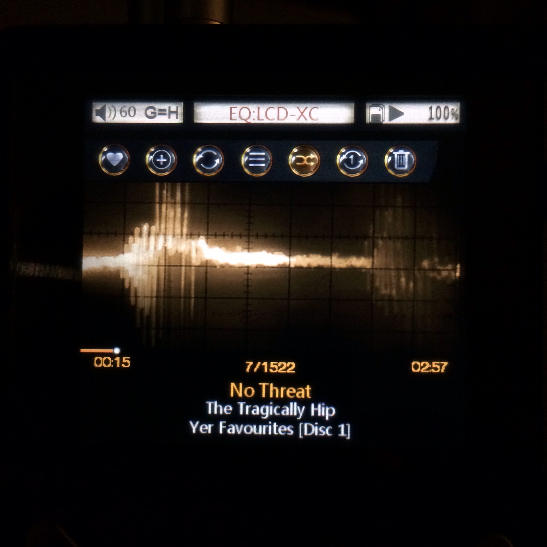
Some background: I usually load only the songs that I like onto an SD card and then simply use the "play all" option to browse the music. The original v2.1 firmware for the X3 works fine for this.
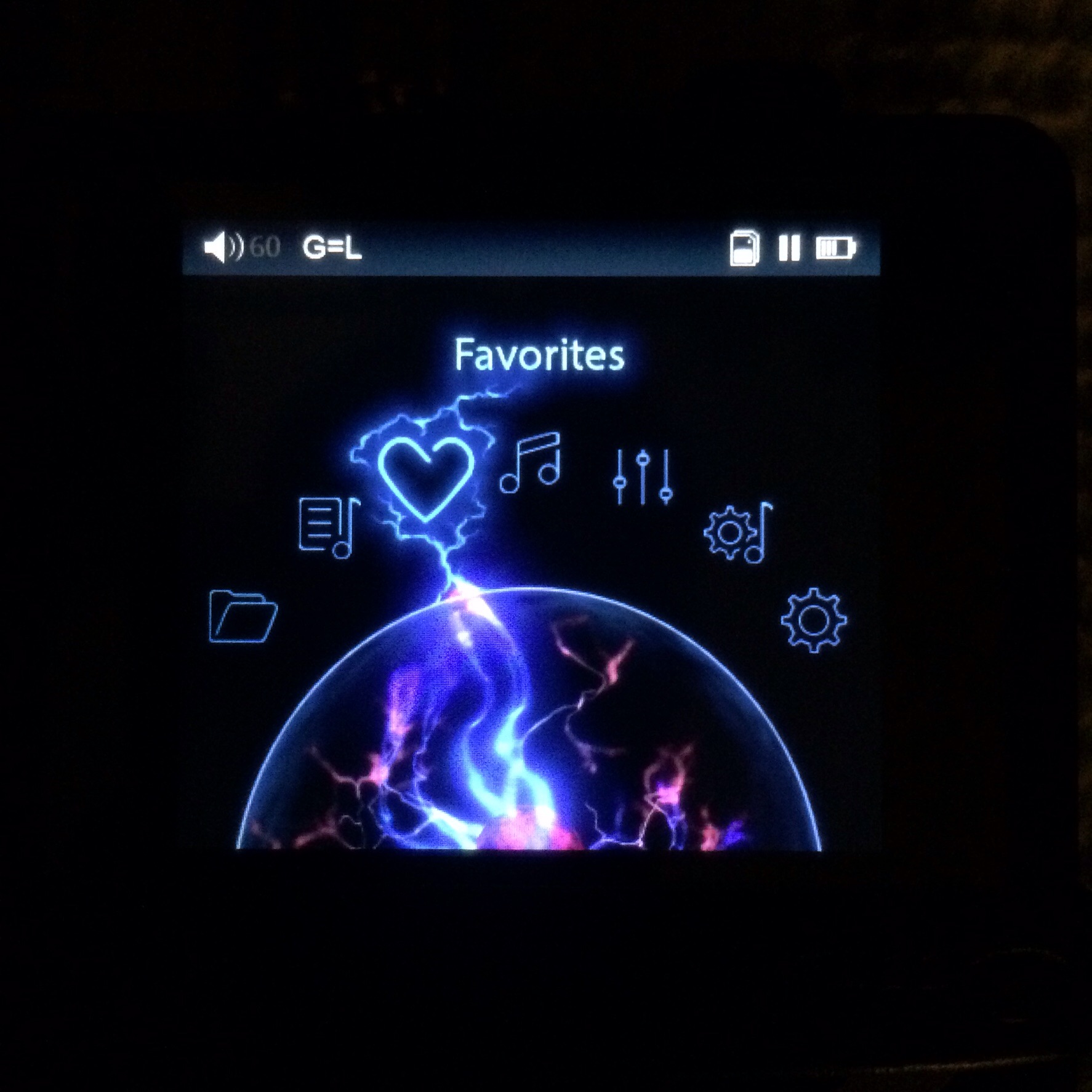
The v3.x firmware works for this as well, but I find that the icons instead of text, while looking slick and smooth, really reduce the overview of the GUI. I can see the icons and with time I would probably learn what they'd stand for and wouldn't need to look at the top line of the screen to see what each icon actually means, but it seems to me that such large icons are intended for touchscreens and it seems not to work so well without a touch screen. Think Windows 8 on a desktop PC - it just adds extra clicks and obfuscation.
Also, I'd have prefered it if the radial menu (for setting gain, deleting a file, setting playback mode, etc. during playback) was static and the cursor moved, so that I'd only have to memorise the desired locations of the cursor without having to try and figure out which icon is supposed to depict what. Again, I think the simple textline interface was clearer and more easy to work with.
But all of these interface niggles I could have worked with if only the "play all" playlist would actually update to the location of the currently playing song if I press back/return when the screen is on the now playing song. Instead, it just stayed at the location at which it was when I last browsed through it. Which is pretty annoying, but would have been less so if there was an option for faster scrolling. As it was, I just reverted to the v2.1 firmware.
Anyway, TL;DR: I'm not that fond of the icon-based GUI and the lack of updating the playlist location in the playlist to the current song is a deal breaker for me. So can anyone assuage me that the GUI is handled better in the X5 (or any FiiO DAP since the X5, really)?