The Fiio X5 Thread
Apr 15, 2014 at 9:12 AM Post #7,036 of 19,652
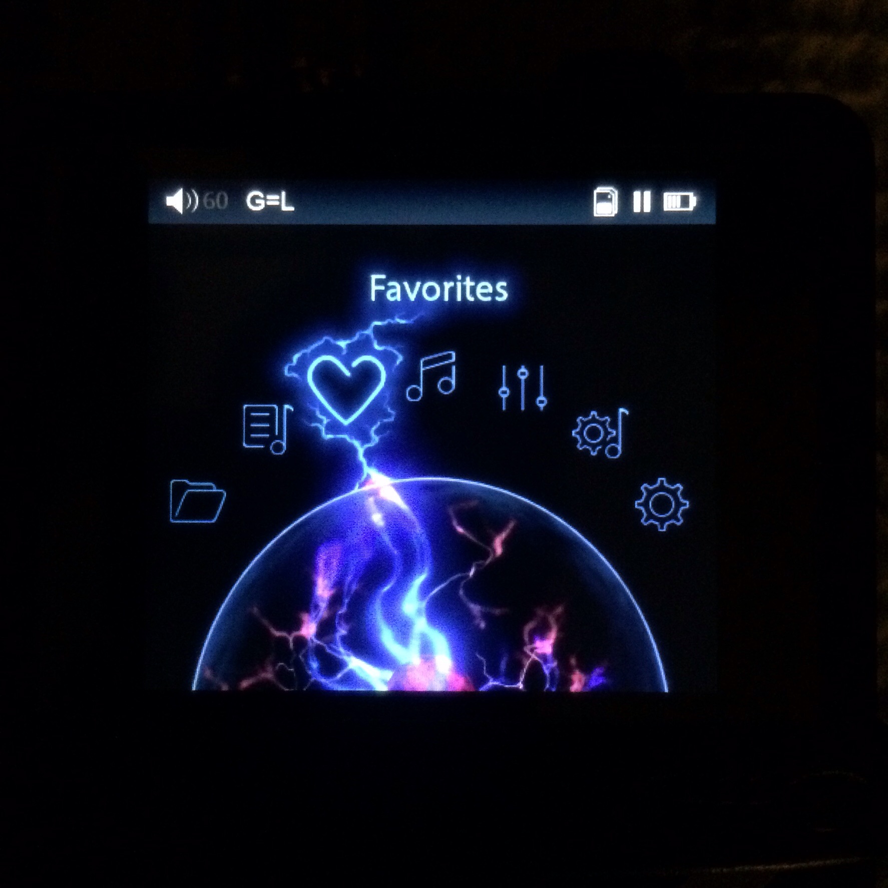
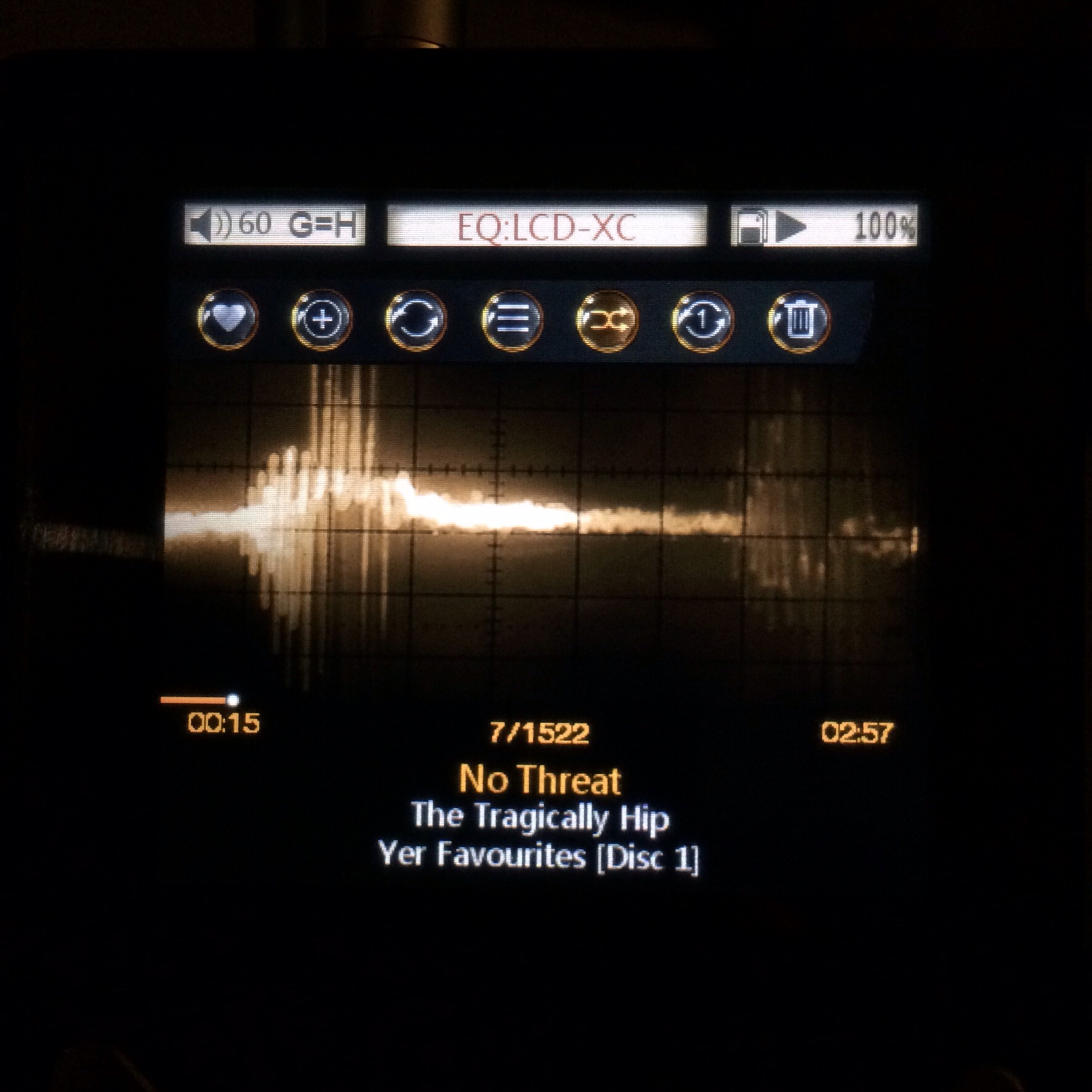
  Please don't do this FiiO! The album art currently looks fantastic and the lower part is covered by song info anyway.

 
...But in some cases, it cuts off something important.
 
What if they make the top bar partially transparent, like the song info window at the bottom currently is -- at least while a song is playing -- and use the whole screen for album art?
 
Apr 15, 2014 at 9:15 AM Post #7,037 of 19,652
Wait, is album art only getting cut off if it's not an exact square? Or are they all getting cut off?
 
My one complaint regarding album art (barely) is that a lot of text won't show up on top of it depending on the artwork... any chance we could do white text with a black border for song titles and artist names that show up on top of album art? Or even a transparent black box behind the text?
 
Apr 15, 2014 at 9:18 AM Post #7,038 of 19,652
  Wait, is album art only getting cut off if it's not an exact square? Or are they all getting cut off?
 
My one complaint regarding album art (barely) is that a lot of text won't show up on top of it depending on the artwork... any chance we could do white text with a black border for song titles and artist names that show up on top of album art? Or even a transparent black box behind the text?

 
It's the square ones that are cut off. The screen is a perfect square, and the display aligns the top edge of the image with the bottom edge of the status bar, so a strip the height of the status bar is cut off from the image at the bottom, unless it's a rectangular image (which some of mine are, but not most of them: square is the standard with album art).
 
Apr 15, 2014 at 9:21 AM Post #7,039 of 19,652
   
It's the square ones that are cut off. The screen is a perfect square, and the display aligns the top edge of the image with the bottom edge of the status bar, so a strip the height of the status bar is cut off from the image at the bottom, unless it's a rectangular image (which some of mine are, but not most of them: square is the standard with album art).

Ah ok, damn, I was thinking it was the opposite (in which case I would be like, just make it square y'all) - but yeah bummer.
Would it be weird to have an option for album art "fit to full screen" or "show full album art"?
 
Too many options and things can get crazy, but I do wish certain things were customizable (like the functions of the buttons! I would love to make the top left button for "back" instead of top right for example) - I think this is a cultural thing, though, no? Top right makes more sense for a back button in China, or am I wrong there?
 
Apr 15, 2014 at 9:30 AM Post #7,040 of 19,652
twister had an idea, i just sticked silicon cover to e12 with double-sided tape and now it's possible to easy remove e12 when needed; made ic myself. and you need thin tape,
thick kind doesn't stick to silicon well.


Completely OT, but I love those headphones...are they the modded DT48 in your signature? :)
 
Apr 15, 2014 at 10:05 AM Post #7,041 of 19,652
The screen is not square, it is 400x360 (source: FiiO website).
The only way to show a standard artwork in its entirety is to have borders. (edit: I'm not suggesting this. It would look bad. But maybe as an option for the dissenters)
I agree that making the top bar also transparent is a good idea.
 
"My one complaint regarding album art (barely) is that a lot of text won't show up on top of it depending on the artwork... any chance we could do white text with a black border for song titles and artist names that show up on top of album art? Or even a transparent black box behind the text?"
 
There is already a darkened transparent box behind the text (at least in v1.23 beta). I don't think it's possible for the text to be obstructed by the art, even on e.g. the white album. Because of the darkened box it's not possible for the artwork to still be white in that position.
 
Apr 15, 2014 at 10:07 AM Post #7,042 of 19,652
  The screen is not square, it is 400x360 (source: FiiO website).
The only way to show a standard artwork in its entirety is to have borders. (edit: I'm not suggesting this. It would look bad. But maybe as an option for the dissenters)
I agree that making the top bar also transparent is a good idea.
 
"My one complaint regarding album art (barely) is that a lot of text won't show up on top of it depending on the artwork... any chance we could do white text with a black border for song titles and artist names that show up on top of album art? Or even a transparent black box behind the text?"
 
There is already a darkened transparent box behind the text (at least in v1.23 beta). I don't think it's possible for the text to be obstructed by the art, even on e.g. the white album. Because of the darkened box it's not possible for the artwork to still be white in that position.

Ah ok cool. I admit I still am in the beginning stages of using my X5 - I just noticed orange text on top of on of my albums before and I couldn't read it - I am also using 1.20, though
 
Apr 15, 2014 at 10:13 AM Post #7,043 of 19,652
The text that shows the bitrate/format at the start of a track might easily be obstructed, might that have been it? That doesn't have a darkened box like the info at the bottom.
 
I don't think I have any orange album art outside of the Orange Box soundtrack. Maybe that's why orange was chosen?
 
Apr 15, 2014 at 10:17 AM Post #7,044 of 19,652
  The text that shows the bitrate/format at the start of a track might easily be obstructed, might that have been it? That doesn't have a darkened box like the info at the bottom.
 
I don't think I have any orange album art outside of the Orange Box soundtrack. Maybe that's why orange was chosen?

Yup I think you're right in that it was the bitrate/format at the beginning. I didn't have my X5 on me to double check. Totally not a big deal at all and probably will rarely be obscured
 
Apr 15, 2014 at 10:21 AM Post #7,045 of 19,652
  The screen is not square, it is 400x360 (source: FiiO website).
The only way to show a standard artwork in its entirety is to have borders. (edit: I'm not suggesting this. It would look bad. But maybe as an option for the dissenters)
I agree that making the top bar also transparent is a good idea.
 
"My one complaint regarding album art (barely) is that a lot of text won't show up on top of it depending on the artwork... any chance we could do white text with a black border for song titles and artist names that show up on top of album art? Or even a transparent black box behind the text?"
 
There is already a darkened transparent box behind the text (at least in v1.23 beta). I don't think it's possible for the text to be obstructed by the art, even on e.g. the white album. Because of the darkened box it's not possible for the artwork to still be white in that position.

 
I'm fine with making it a toggleable option. Like I said, it's naught but a minor complaint. I just have some album art for which it can be jarring: band names cut in half, &c. On Abbey Road, the band's feet are cut off. It's just a shame to have so much image info go to waste and have some iconic album images get cropped fairly badly.
 
Apr 15, 2014 at 10:33 AM Post #7,046 of 19,652
Completely OT, but I love those headphones...are they the modded DT48 in your signature?
smily_headphones1.gif


orthodynamics, that is made from scratch, just headband remade from old vintages. i see no reason to put dt48 in wood, headphones are very good (and unique), just made real good damped earpads and placed melamine to cancel reflections on the back of the driver. and real leather on the headband, just to make it nice.
 
Apr 15, 2014 at 10:34 AM Post #7,047 of 19,652
Yeah, options might be good. I'd really like an option for the display to be like GoneMad Music Player (darkened 2x-zoomed album art used as the screen background; full album art at normal brightness displayed separately from info) - while we're wishing :)
 
Looks like this (no idea what this music is though)

 
Apr 15, 2014 at 10:36 AM Post #7,048 of 19,652
I just did a quick search for "backwards" in this thread and didn't get anything. Is there a way to reverse the control wheel? If you have a circle on the screen, which is controlled by spinning a circle, UI 101 says that the on screen circle should rotate the same direction that you're rotating the wheel. But it doesn't, it spins in the opposite direction. 
 
Quirkyness aside, it's a well built device. I've got the test unit at my desk right now. The hardware definitely seems very solid, and this is one that's been passed through a lot of hands.
 
Apr 15, 2014 at 10:43 AM Post #7,049 of 19,652
It rotates the same way (look at the wheel on the left), which makes the options go past the other way.
So rotate it clockwise to go to the option which is visibly clockwise of your current one.
If it were linear you'd want to press 'right' to go to the option to your right - this is identical.
I suspect far more people would complain if it were reversed.
 
Apr 15, 2014 at 10:54 AM Post #7,050 of 19,652
  It rotates the same way (look at the wheel on the left), which makes the options go past the other way.
So rotate it clockwise to go to the option which is visibly clockwise of your current one.
If it were linear you'd want to press 'right' to go to the option to your right - this is identical.
I suspect far more people would complain if it were reversed.

 
The wheel on the left goes the same way, but the items move the opposite. I get what you're saying, but it's not linear, it's a circle. It's certainly not the end of the world, but I would expect that if I'm controlling a wheel with a wheel, they'd spin the same way. Just a quick observation. 
 

Users who are viewing this thread

Back
Top