


swbf2cheater
Headphoneus Supremus
- Joined
- Aug 14, 2009
- Posts
- 5,044
- Likes
- 121
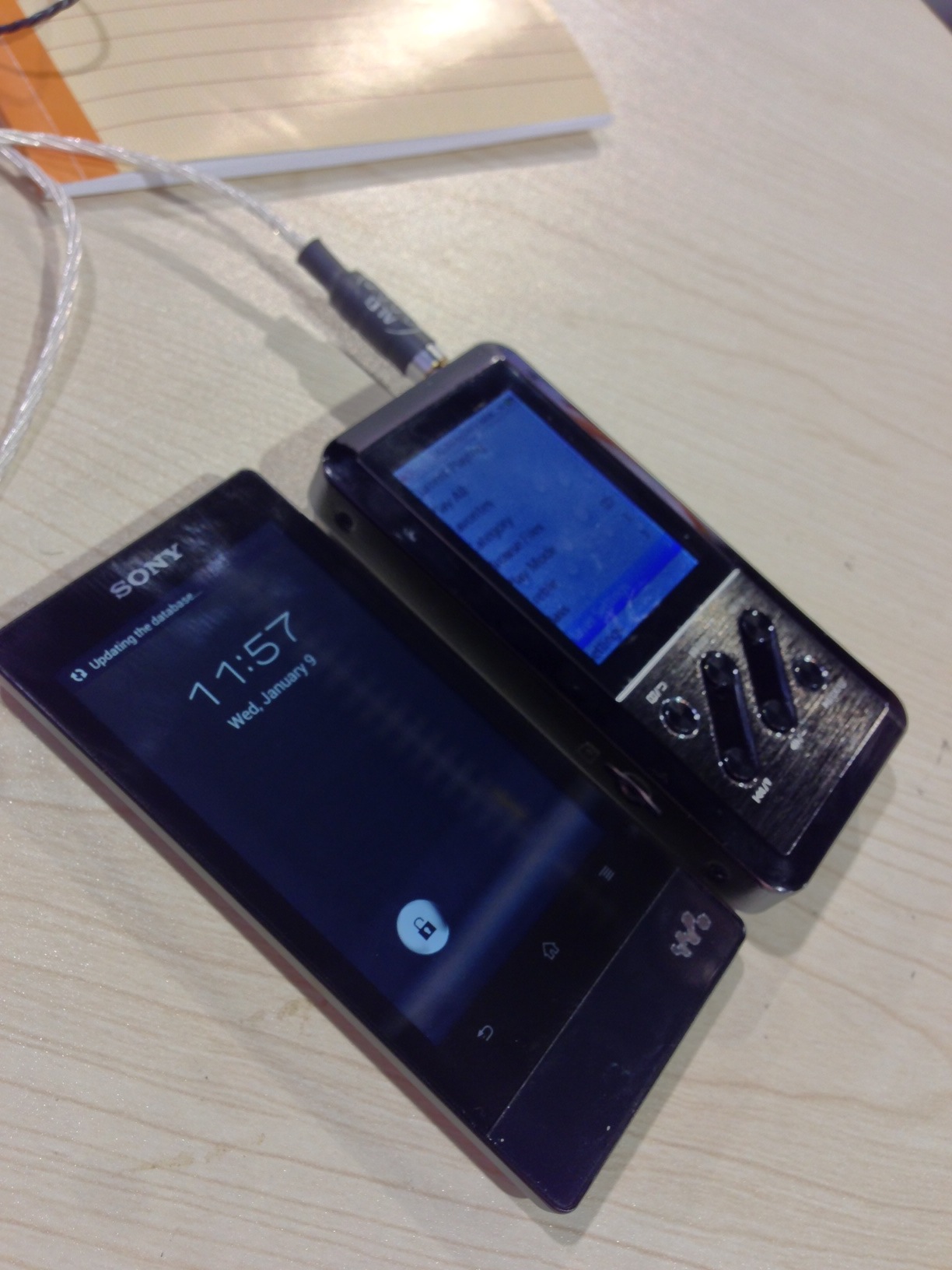
How about this? The Fiio logo lights up and the center buttons are offset a bit instead of perfectly in line with the others, keep the blue backlight theme since the E11 power on light is blue


