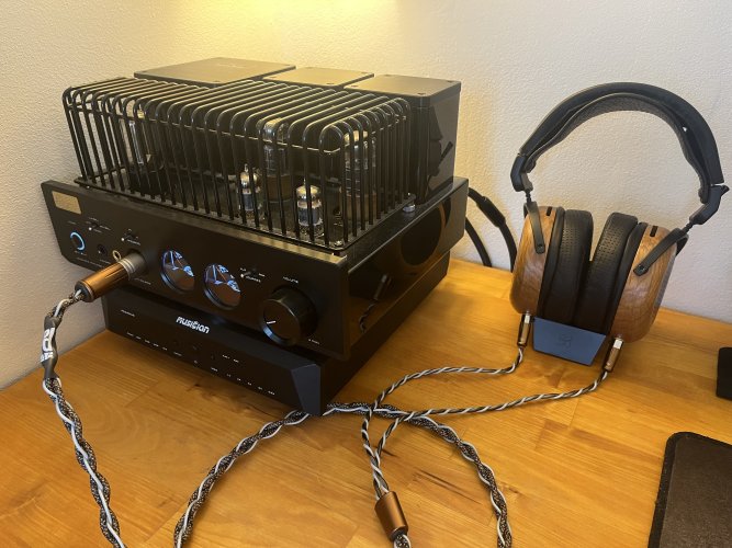
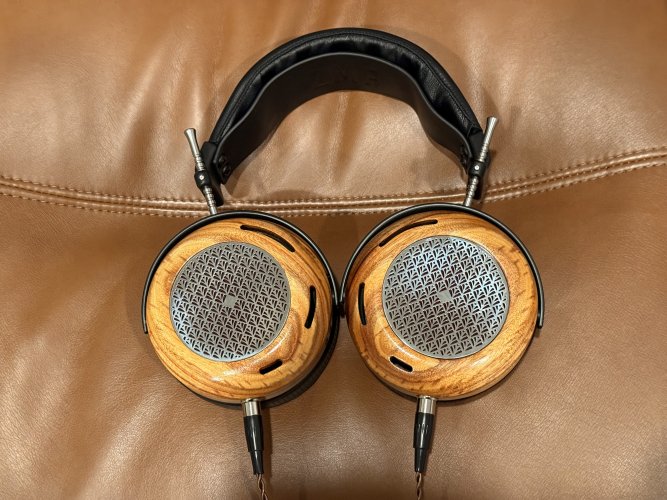
Maybe you're right. Or maybe we're all "in on the joke" here (veterans of this and other ZMF threads) and like to mess around. Either way, no insult or attitude intended.
I should explain why I feel the Caldera screen is totally good for a top of the line headphone. I've been interested in architectural & furniture design for years...the patterns used in screens have often been inspired by those things.
This is the screen design of the original Meze Empyrean. I regard this as the most advanced screen design of all headphones I've seen. This complex design is inspired by several early 20th century European furniture styles:

And the image below pictures the succession of ZMF screens in the open-back dynamic headphones designed over the past 4-6 years. I could be wrong, but I believe the sequence of launches was Aeolus / Auteur / Verite Open / Atrium / Caldera. Notice a few points:
- the Aeolus screen is relatively simple. It's my least favorite ZMF screen, though the sound of this headphone itself is quite amazing;
- the smaller diameter Auteur screen, by contrast, is more ambitious, with tight curves in multiple directions. I see gothic style here, also some art nouveau style
- then the VO screen is downright modern & futuristic
- then the Atrium is the most complex and evolved design to this point, somewhat larger and very handsome IMO
- and finally, the Caldera screen is the most complex of all, composed of many tiny, repeating figures. the repetition is the whole point, creating a visual field that IMO is most interesting. it's also not 100% uniform--note the solid center figure.
Note: the graphical nature of each screen is most visible in SS/silver, though I couldn't find each one is that color.

Call me blind and crazy, but I think these screens became more evolved, interesting, and graphically complex with each new headphone. ZMF has been in the design big leagues from day-1 due to the unmatched wood types, shapes and finishes used; and IMO the latest screens are right up there, as well.


