An exercise in graph manipulation
There seems to be a worrying trend of audiophiles taking manufacturer's graphs as the absolute truth and dismissing everything else that looks dissimilar as inaccurate. While it may be true that manufacturers are typically the ones with access to highly accurate, industry-standard, multi-kilobuck measurement gear, it is also in their own interests to ensure that whatever data they publish is as "pleasing" to the consumer as possible. While the raw data itself may not be directly modified, there are still many ways to "trick" the reader.
In a way while this may be an educational post, this is also protection against myself in case anyone tries to compare my graphs with the manufacturer's. Just because the measurements are different doesn't mean they're wrong.
There are some ways to make a graph aesthetically pleasing without
actually fudging the raw data.
- Scaling: a lower range acts as a "microscope" and amplifies the peaks and dips of a system. On the flipside, a higher range masks them and can visually "flatten" the imbalances of any given curve.
- Smoothing: self explanatory. Ideally you would use smoothing to mask noise and artifacts in a measurement, though it can also be used to reduce peaks and dips.
- Changes to procedure: not following industry-standard procedure can result in graphs that look more visually appealing.
- Non-standard/uncommon source gear: more in reference to the output impedance of the interface used.
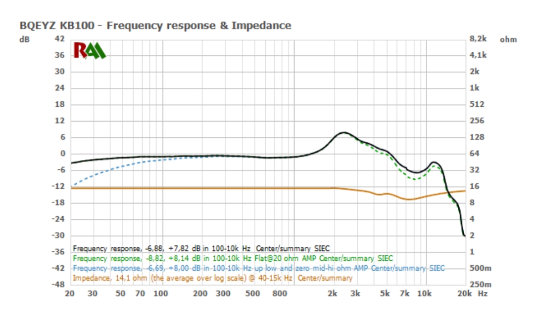
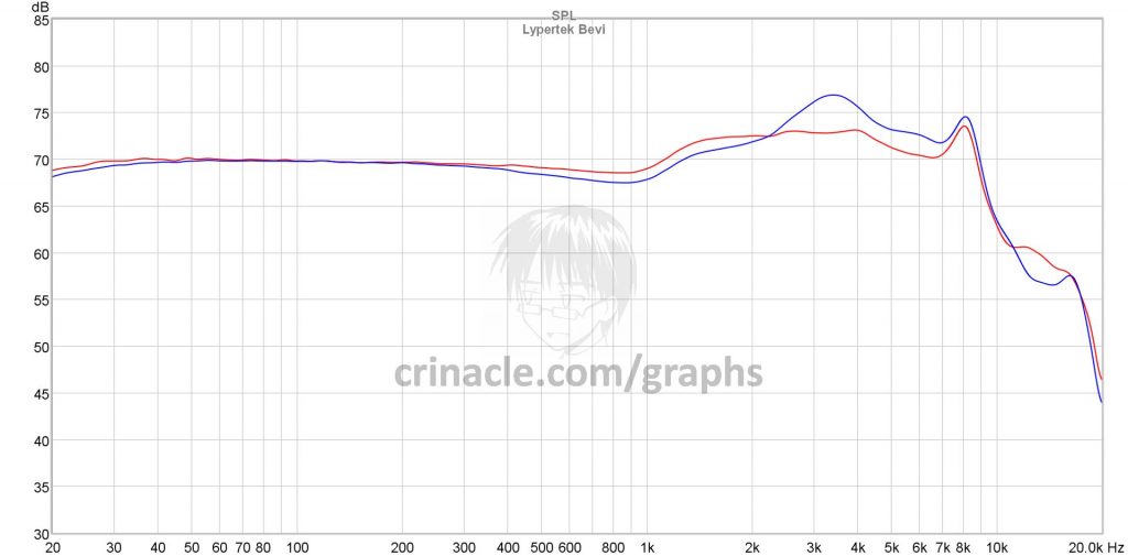
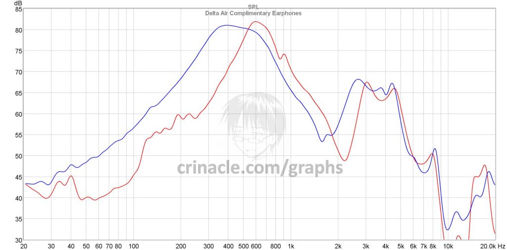
Taking the BGVP DM6 as an example since they seem to be a popular IEM these days (and also because I have one with me right now). Below is what I found on the official store, assumed to be performed on a standard IEC60318-4 system (and posted various times around the forum to show how "flat" it is):

And here is mine based off my own rig (also IEC60318-4) and procedures that I follow with every measurement I perform:
 Smoothed at 1/12 octave
So why is my graph different from the manufacturer's? Is my setup wrong, or is their setup wrong? The reality is that both of our data can be "truthful" and yet be displayed differently; I can get a near-identical graph to what the manufacturer provided if I simply reverse-engineer their settings and procedures (most of which they have thankfully provided). What I've determined is the following:
- Scaling: Blow up the y-axis to 100dB as opposed to my usual of 55dB.
- Smoothing: 1/6 octave smoothing as opposed to my usual of 1/12 (or raw, depending)
- Procedure: Remove the external ear simulator from the IEC coupler and measure at reference plane instead (using the procedure highlighted in section 6.2 of IEC60318-4, usually meant for custom earphones only)
- Output impedance: attach a 20ohm resistor in series to the earphone in an attempt to match the 33ohm output impedance of the interface used by the manufacturer (which is crazy high, most DAPs and amplifiers are below 5ohms)
The final result matches the manufacturer's graph almost to a T:

To reiterate my point again, just because two graphs are different doesn't necessarily mean that one
has to be wrong while the other
has to be right. Just like with reviews and impressions, don't just take data from a single source; seek out as many as you can before forming an opinion.