^^^ Seriously good shot and processing. Her expression and the picture as a whole is quite mesmerising.
Thanks for the compliment, though I my personal feeling is that while the shoot turned out decently, I know a good number of individuals can get the same type of shot just as well, so I have a lot of work to do.
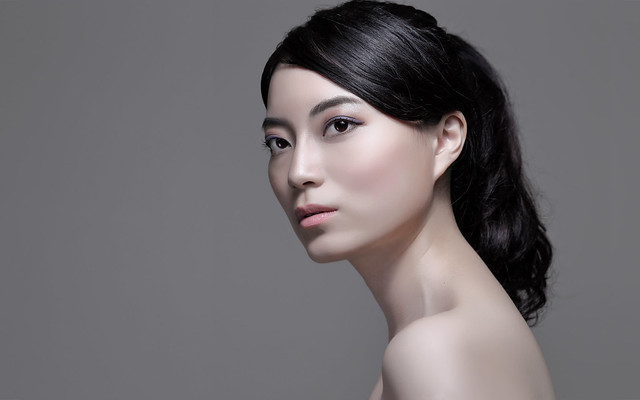
Sorry being a jerk but I find the overall image too soft and almost cgi or airbrushed looking in the face. I do like your model and the composition though
Why apologize? Criticism is good. I don't mind. It's good to know what other people are thinking.
I do have a few things to note, however: the "soft", slightly fake look is done on purpose. I wanted a porcelain quality to her skin, and while her skin was already quite pale, I actually pulled back on the saturation of the reds and yellows even more. However, I did still retain all the detail --- I don't have the full resolution image online, but all her pores still exist and are easily visible compared to the raw image. The lighting also affects the way the shot is perceived. I modified my existing octabank with a small center "core" of light that is in between a soft and hard light, but that light will quickly fall off to very soft edges, so there's a huge and very soft shadow transition area. Thus, the shadows formed on her eyes and nose, while not completely hard, are harder than the shadow formed under her jawline (softened with a silver bounce), and much harder than the shadows on her shoulders. That's why her shoulders look a little "milky" and soft compared to the far more specular feel of the T-zone, which is lit by the harder center core of the light. I find this light quality to be very unique (but it's not really superior), and even I was thrown for a loop when I saw the raw image. The lighting looks significantly different from that of a classic beauty dish or softbox. You look at the shoulders and wouldn't believe it's not lit with a softbox, but look at the center of the face, and it looks like it was lit with a bare reflector with a tiny layer of diffusion.
The end goal here isn't to shoot a realistic image. The concept itself was inspired by a couple of different things:
Tilda Swinton's campaign for NARS, and a
beauty editorial that featured in Elle Vietnam. The final image, of course, looks like neither of them, but the color palette chosen is similar, with a similar level of skin texture. I actually considered doing the classic, bare-faced style (not really bare-faced; they're all wearing tons of makeup in those cosmetics campaigns) of beauty shot (that translates well to the kind of "HD" look that I assume you're expecting), but I decided to stick with this concept. Maybe I'll try the more orthodox look next time.
Doing a better job tying down the hair and having someone with the right retouching skills to clean up the hair will help substantially in selling that "sculpture" look. Right now, the hair looks loose and casual, inconsistent in style with the rest of the image. So I can understand why you find the image "off". The message isn't consistent, and I know that's something that's lacking in the shot. When working with a first-time MUA and model, however, I only try to make the best of it. I also make a couple of technical mistakes here; the shot was underexposed by about 1/2 a stop, and it was difficult to tell by just looking at the screen and histogram (there's too much middle grey to determine whether the skin exposure is good). My tethering was basically broken, so I couldn't preview values on a big screen. I did notice the underexposure after manually exporting it into the computer, but I couldn't get the right kind of pose and expression in subsequent shots that did have proper lighting, so the moral of the story is: get a light meter.
Long story short, I made a number of mistakes during the shoot, mistakes that I know I can correct in the future. However, I did still get a few shots out of the session that I thought were presentable and that properly represented what my original concept was.
Recent creative shoot, something different.
I like this one. The dress is cut off by just that tiny bit at the top; if there were a little bit more space on top, I think it'd be ideal. You can dodge out the wrinkles in the seamless paper if that's what you want.
Anything of her actually dancing? Or is she merely masquerading as a ballerina?