Hearyourself.com custom IEM discussion thread
Nov 23, 2008 at 8:30 PM Post #826 of 1,734
Hi fellows. I just went ahead to get my impressions done for the order of a pair of C-3s. But I'm a noob when it comes to custom graphics. I've 2 qns:

1. Is it more than possible to place the 2 logos below on opposing side of my monitors?:

SI2.jpg

GL1.jpg


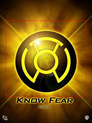
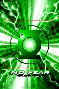
Can the words be squeezed in as well? If really impossible, what abt the portion bordered up in red?

2. What color should I choose for the main monitor body itself, i.e. 2 colors, to match the yellow and green background of the logos? Not very good with graphic design, hence seeking opinions...but preferring translucent colors so that I can see the innards of e monitors...but I'm open to all types of suggestions.

3. So just to confirm, for the "full" customization, I've to specify 4 colors, 2 for each monitor body, 2 for each "flat" faceplate surface, and 2 logos for each side right?

Hope to gather feedback from the ground here. Custom noob here(it's my first). Thanx very much, in advance.

P.S. I hope the 2 logos dun turn out to be bad taste for the general public, i.e. ugly; my 1st choice, autobots and decepticons logos, have been used by someone in my local community...so drats abt that.
 
Nov 23, 2008 at 9:00 PM Post #827 of 1,734
Try the UE custom cable. The muddinesss goes away and it improves the highs

Quote:

Originally Posted by Stikk /img/forum/go_quote.gif
Hey boys and girls!

So I'm baaaack! Haha. I've been MIA for a few weeks, 2 weeks of exams and a surprise holiday from my gorgeous girlfriend mean this is the first minute I have had to drop in and say hi! Anyway, I have had my C3s for a little while now, like over a week, and I really really like them, at this point. They are a LITTLE muddy, if I have to complain about something, but to be honest, I am too busy enjoying them to complain about them
smily_headphones1.gif


As for the fit, I noticed a few of you saying that you had problems with your left ears.. My left fits perfectly, it's the right one that I have problems with. When I get it seated right, it's fine, but it takes a bit of fiddling and doesnt feel quite as good as the left. Not enough to send them back tho, I don't think, and the SQ doesnt change if I press on the right one.. In fact, it feels like it gets worse.. Anyway, I will post some pics soon but mine look a lot like LK's, same colour and same cable.. Haven't thought about a cable upgrade yet but that's the next step but prolly won't bother for at least a couple of weeks.


Nov 23, 2008 at 9:14 PM Post #828 of 1,734
Your two logo choices are by far the most elaborate I've seen so far. I think that a medium translucent caramel similar to the background of the top pic would go well with both logos.

If you have a nice photo printer and some clear label sheets you may be able to print them off and send the logos with your impressions and have HY embed the decals into the outer layer of the faceplates. or just get them in the caramel coor, stick the decals on yourself and seal with a clear laquer finish. It would probably be best to have the monitos so you can properly size the decals for the faceplates.
 
Nov 24, 2008 at 3:47 AM Post #829 of 1,734
Quote:

Originally Posted by boomy3555 /img/forum/go_quote.gif
Your two logo choices are by far the most elaborate I've seen so far. I think that a medium translucent caramel similar to the background of the top pic would go well with both logos.

If you have a nice photo printer and some clear label sheets you may be able to print them off and send the logos with your impressions and have HY embed the decals into the outer layer of the faceplates. or just get them in the caramel coor, stick the decals on yourself and seal with a clear laquer finish. It would probably be best to have the monitos so you can properly size the decals for the faceplates.


I'll very much prefer to have HY print them onto the faceplae for me.

So the yellow uneven background of the 1st picture is called "caramel"?

I tot circular logos r simple enough?
 
Nov 24, 2008 at 4:55 AM Post #833 of 1,734
It's just a matter of mixing the dye before adding to the liquid acrylic prior to putting into the UV hardener.

It depends on who mixes it. My color came out almost exactly the way I wanted it but Gatto's turned out a little more marroon than the purple she wanted. so it's a hit and miss kind of thing. My son's were balck and white swirl so it was pretty easy for that. The custom Star Wars artwork amounted to gluing clonetrooper helmets to the faceplates
 
Nov 24, 2008 at 4:59 AM Post #834 of 1,734
Quote:

Originally Posted by boomy3555 /img/forum/go_quote.gif
It's just a matter of mixing the dye before adding to the liquid acrylic prior to putting into the UV hardener.

It depends on who mixes it. My color came out almost exactly the way I wanted it but Gatto's turned out a little more marroon than the purple she wanted. so it's a hit and miss kind of thing. My son's were balck and white swirl so it was pretty easy for that. The custom Star Wars artwork amounted to gluing clonetrooper helmets to the faceplates


Actually I wanna make the logo in the yellow with the purple of Gatto's received monitors. Although she mentioned the color isn't what ordered exactly, I tink that deep translucent purple is nice.

And for the logo in the green image I posted, I wan the monitor body to be the aqua green of the triplefi, but translucent.

Anybody can picture these in their mind? Haha...
 
Nov 24, 2008 at 9:14 AM Post #835 of 1,734
Quote:

Originally Posted by Lil' Knight /img/forum/go_quote.gif
That's great, Stikk!
The blue one always looks awesome.

BTW, I wonder how you guys pull out the cable? It sticks really hard to the earpiece that I dare not use force.


mine wasn't that tight. i use a knife.
 
Nov 24, 2008 at 9:20 AM Post #836 of 1,734
I've found it;
one side of my monitor is gonna be in this exact color:
Matt%20Hasselback,%20NFL%20Seattle%20Seahawks%20Image.jpg


Probably the side with the green lantern's logo; I'll probably have to request for a BLACK faceplate so that there's a clear distinction between the green monitor shell and the faceplate...

Now for the other side with the yellow Sinestro logo...probably something orangish--or even red; the search continues...

P.S. fellows, what do u call the above color? Emerald, aqua, or turquoise green?
 
Nov 24, 2008 at 1:15 PM Post #838 of 1,734
I took 1 of e exhibit at the UE ear art gallery and did some rough photoshopping:

See anything u like fellows? Pls do gimme some comments/opinions and feedback no mater how brutally honest
attempt1_S.jpg

attempt4_S.jpg

attempt5_S.jpg

attempt6_S.jpg

attempt7_S.jpg

attempt8_S.jpg

attempt9_S.jpg


Or if they all are "epic fails" do lemme noe too, so I can go one corner and cry...if you dun like the shell's turquoise color, I can probably steal another sample for further editing...
 
Nov 24, 2008 at 2:21 PM Post #839 of 1,734
I have a question and would really appreciate the input of those who have the C3s!

My impressions are already on the way to Andre, however I'm having some doubts.. I've read through 84 pages of this thread (and am now re-reading again to see if I missed out on stuff).

Anyway my question is regarding the bass of the C3s. I've read that the C3s sound much closer to the Shure 530s than the TripleFis. I auditioned the Shure 530s and found the bass lacking. I did not like how it sounded and would go with the triplefi anytime. However can anyone please tell me how the BASS of the C3s compare with these two drivers?

I'm really not concerned about the mids and highs. I'm pretty certain that i'll be contented with whatever it sounds like, so it's only the bass which I'm looking for.

My current rig is an Ipod 6G > SR-71A Amp > SF5Pros.

I'm the kind who feels that the bass makes or breaks a song and an IEM/Custom. I like Punchy/Deep/Quantity bass. I also enjoy a coloured sound and dislike a neutral/flat sounding monitor. I know UE11 would certainly suit me but I'm not willing to pay the hefty price for the increment in SQ.

Thus my post here! I would really appreciate all the input and prompt replies I can get as my impressions are already being shipped!

Thank you so much!

EDIT: After much thinking and reading, I think it's the AIRYNESS of the TriFis that attract me. Any idea if the C3s are airy?
 
Nov 24, 2008 at 10:49 PM Post #840 of 1,734
Quote:

Originally Posted by ralliart12 /img/forum/go_quote.gif
I took 1 of e exhibit at the UE ear art gallery and did some rough photoshopping:

See anything u like fellows? Pls do gimme some comments/opinions and feedback no mater how brutally honest
attempt1_S.jpg

attempt4_S.jpg

attempt5_S.jpg

attempt6_S.jpg

attempt7_S.jpg

attempt8_S.jpg

attempt9_S.jpg


Or if they all are "epic fails" do lemme noe too, so I can go one corner and cry...if you dun like the shell's turquoise color, I can probably steal another sample for further editing...


epic awesomeness if you get anyone of those on your phones
the 4th ones look good. I am a fan of the newer green lantern logo. what do you think of the recent lantern sagas?
 

Users who are viewing this thread

Back
Top