


elnero
Headphoneus Supremus
Quote:
I'm sorry but in my opinion that's only marginally better and I think it still suffers from many of the same problems as the original while creating some new ones.
Because the top 2/3 is much darker it gives it weight which is pushing down on the lighter bottom 1/3. Also, because of the divider and placement of the company logo and slogan as a base for the pic of the girl to sit on, as well as the contrast of the top 2/3 with the white background of the bottom section, the upper 2/3 and bottom 1/3 come across more like separate entities. The company logo and product name are both in this top section which only adds to this feeling of separate entities, as a result the HiFi-M8 name look like it's referring to the girl. In my opinion the girl is still the overall focus and she still has absolutely nothing to do with what's being sold. If there's the need to put an attractive girl in the ad at least have her somehow related to the product. The "USB DAC, Reimagined" text placement also gets a bit lost and hard to read.
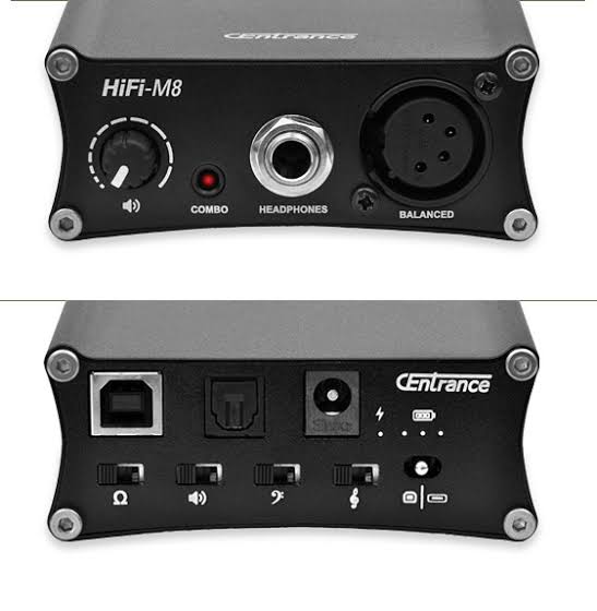
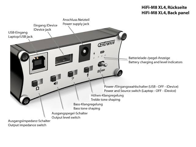
For me, the section showing the HiFi-M8 looks like an afterthought that was pulled from a manual, there's no flavor, there's been far nicer pictures posted that could be used to show off the product. I think if the top section had a glamor shot of the HiFi-M8 or an attractive girl using the HiFi-M8 this idea of showing the front and back could still be used somehow to show off the connections but as the only pics of the product in the ad I don't think it does the job of selling the product very well.
Okay, my 2 cents on the ad: no need to go back to the drawing board. I like the ad, just make a simple change.
I took the liberty of doing a mockup for improving it. I hope that's ok.
I like it better like this (with the model on top):
This:
vs. the original:
There are various reasons for this but mainly with it the original way, the eye moves down to the girl and stops there. My way, the eye still moves down and stops at the products, which is what you want.
You see her, you read "Portable.Nirvana", you see the products. That's really the sequence you want.
Personally, I have no problem with the model at all.
I'm sorry but in my opinion that's only marginally better and I think it still suffers from many of the same problems as the original while creating some new ones.
Because the top 2/3 is much darker it gives it weight which is pushing down on the lighter bottom 1/3. Also, because of the divider and placement of the company logo and slogan as a base for the pic of the girl to sit on, as well as the contrast of the top 2/3 with the white background of the bottom section, the upper 2/3 and bottom 1/3 come across more like separate entities. The company logo and product name are both in this top section which only adds to this feeling of separate entities, as a result the HiFi-M8 name look like it's referring to the girl. In my opinion the girl is still the overall focus and she still has absolutely nothing to do with what's being sold. If there's the need to put an attractive girl in the ad at least have her somehow related to the product. The "USB DAC, Reimagined" text placement also gets a bit lost and hard to read.
For me, the section showing the HiFi-M8 looks like an afterthought that was pulled from a manual, there's no flavor, there's been far nicer pictures posted that could be used to show off the product. I think if the top section had a glamor shot of the HiFi-M8 or an attractive girl using the HiFi-M8 this idea of showing the front and back could still be used somehow to show off the connections but as the only pics of the product in the ad I don't think it does the job of selling the product very well.


