So a couple of days of using this now.
While I absolutely love the simplicity of the dot arrangement across the top, I did have to stop and think about what they meant earlier today. Green dot on the top left meant G=H. Green dot on the top right meant track was playing, but then on pause, a full pause icon would appear as opposed to an amber dot. Multiple little dots on the right were battery indicator. How little they were meant it was hard to conclude how much juice was left. As juice was running out, they would go amber on the left first rather than the right, which to me seems reverse of what I would expect. Then interestingly, when the player gets to a low battery level, the green/amber battery dots revert back to a complete low battery icon.
I'm not suggesting we should revert to a complicated top section by any means but I think someone who is unfamiliar with the player needs something more obvious to interpret up top. I don't know how you would achieve this, I have nothing to suggest myself.
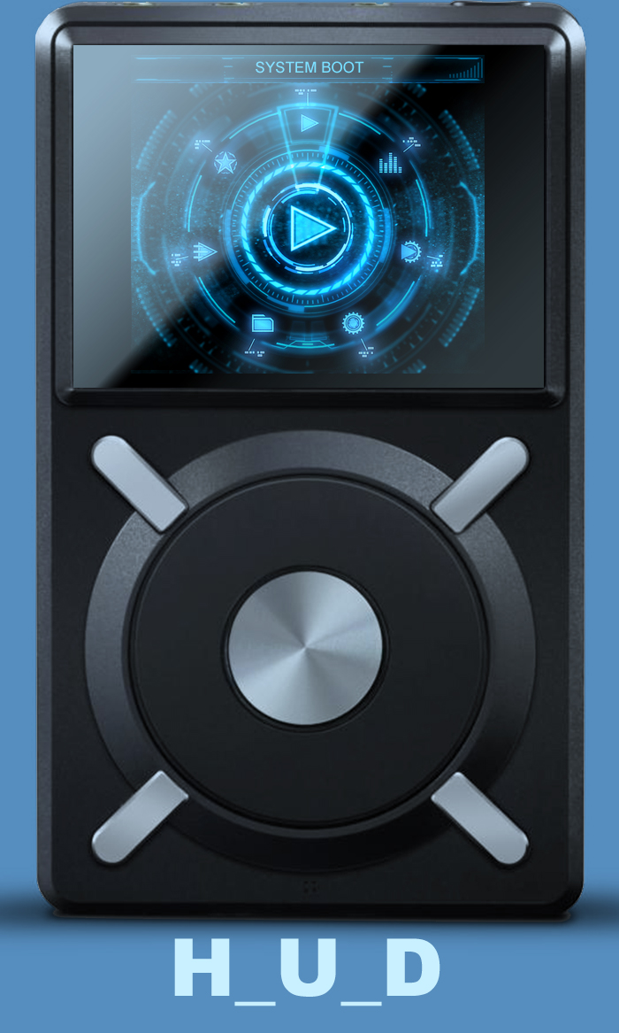
Top dots aside, for some reason, the Now Playing screen where there is no artwork seems to use an image which feels too modern relative to the rest of the images used. I expected something more vintage. And the fact it's an LP meant you had one LP on top of another when you decided to adjust the volume of the device.
Maybe my critique is unwarranted. Takes nothing away from the fact I am loving the theme and currently have it as my daily driver!
")