The fonts selected aren't the most legible it looks like F110 or Fll0. I would approach this design differently as none of those designs help for brand recognition to someone who is unfamiliar with the company. That being said, apply changes to number 4 or keep your current word mark logo.
I vote to stop with the logo change - current logo looks great- just makes some new products people want and need & affordable $ - the logo is unimportant - my vote keep current logo
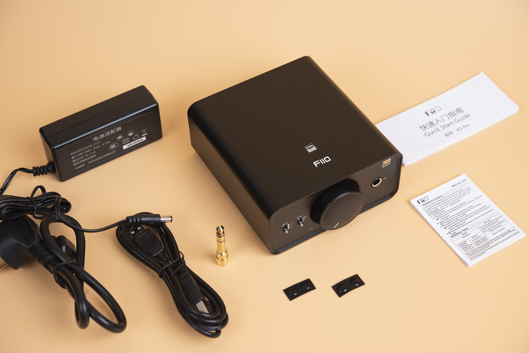
We found that our brand name FiiO is easy to be written wrong as fiio or Fiio. With developments of our brand ,changes of our products positioning and target users, now we are considering to change FiiO to be FIIO. Our team has designed several new LOGO patterns.
We would like to get your suggestion of which logo pattern is suitable for us now. Kindly vote it for us !
Again...I said this in a comment earlier...I love you guys and have owned lots of your gear (from music players, amps, IEMs and more) , but these logos aren't good. Just keep the original one, or just have fellow Head-fiers submit designs to help your cause.
These logos are not worthy of your brand and are a bit amateurish and dont have the right professional look to them. I do logos for companies right now and these look like something someone, without a background not in art or graphic design, would assemble hastily on Microsoft Word who is in love with 1980-1990s era fonts, on the cheap.
These designs arent ones that communicate appropriately where your company is going and who you are presently, within the market. You guys have a good reputation per se, and these logos would set you back on how you want to be perceived.
If you're going to do anything, then follow the industry leader, Astell & Kern, and copy how they go about their logo and imaging design.
Here's a wacky idea... hire a professional design firm whose work is well-regarded (that you admire, too), and pay them a fair price to design a new identity that can be deployed effectively across the entire media landscape... from digital to print to packaging. And if you don't want to pay a professional design firm, maybe it would be just as well to have a nephew who likes to draw 'n fiddle with type 'n stuff do it.
In my honesty opinion it's always a bad idea to change things only to change things (or because they think they have to be cooler for young people, which makes it actually questionable in the best case). But it seems like companys and industry will never understand that.
We found that our brand name FiiO is easy to be written wrong
I'm sure you didn't mean it like that but the flipside of this kind of arguement is always like you think that your customers are to dumb to write it right.
Well the existing logo is good enough imho. We can relate to it as a brand.
If you must change it, you think these changes seem interesting to you? Just an opinion.
In the end, it's your brand and you know what you really want to convey through it.
But maybe, keep the ii's.
Seriously. "Born to music" is better but still cringe. Half of these Chinese companies' writings sound off off the tongue, yet they seem to refuse to accept grammatical advice.
I remember 5 years ago, spending half a day trying to explain to an internet/tech company in China that their company name "Global Power" sounded like the name of a literal power grid company, and they probably want to change to (the equally bad) "Global Force" to get the message across. To this day they still proudly rocks "Global Power".
This site uses cookies to help personalise content, tailor your experience and to keep you logged in if you register.
By continuing to use this site, you are consenting to our use of cookies.