Vote the new FiiO LOGO patterns you like!

We would like to get your suggestion of which logo pattern is suitable for us now.

  • FiiO New Logo No.1

    Votes: 47 9.6%
  • FiiO New Logo No.2

    Votes: 10 2.0%
  • FiiO New Logo No.3

    Votes: 61 12.4%
  • FiiO New Logo No.4

    Votes: 22 4.5%
  • FiiO New Logo No.5

    Votes: 350 71.4%

  • Total voters
    490
May 31, 2021 at 8:18 AM Post #76 of 113
We found that our brand name FiiO is easy to be written wrong as fiio or Fiio. With developments of our brand ,changes of our products positioning and target users, now we are considering to change FiiO to be FIIO. Our team has designed several new LOGO patterns.
We would like to get your suggestion of which logo pattern is suitable for us now. Kindly vote it for us !
1.jpg2.jpg3.jpg40.jpg5.jpg
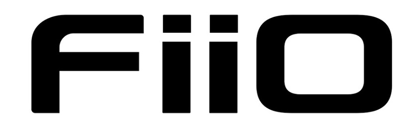
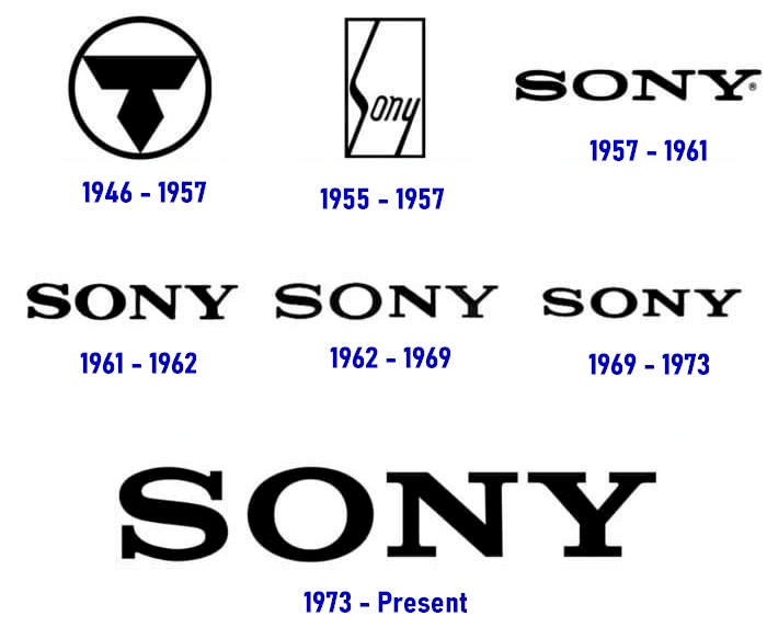
5 is by far my favourite. But even so, there are way better options in my opinion. Try to go for a less "cyber" approach and use a more elegant, possibly cursive font
 
May 31, 2021 at 9:09 AM Post #77 of 113
#5 is the best. The rest look like "FUD" = "Fear, Uncertainty, Doubt".
 
May 31, 2021 at 9:53 AM Post #79 of 113
Voted for Number 3. Why? Just because it matches the aggressive look of your new products such as FD5, M11 Plus.
 
May 31, 2021 at 12:37 PM Post #81 of 113
That's an overwhelming vote for 5 from me.
 
May 31, 2021 at 2:01 PM Post #82 of 113
We found that our brand name FiiO is easy to be written wrong as fiio or Fiio. With developments of our brand ,changes of our products positioning and target users, now we are considering to change FiiO to be FIIO. Our team has designed several new LOGO patterns.
We would like to get your suggestion of which logo pattern is suitable for us now. Kindly vote it for us !
1.jpg2.jpg3.jpg40.jpg5.jpg
seems like #5 winning by a long mile...
 
May 31, 2021 at 2:40 PM Post #84 of 113
I'll abstain from voting. These all look like amateurish ripoffs of famous designs: Fila, F1, Ford F-150, etc., but they don't have anything to do with FiiO.
I agree with whoever suggested getting a designer that's familiar with Western fonts and languages. There's just so much going wrong that's immediately obvious to anyone familiar with the alphabet. A Head-Fi design competition would be a lot of fun and would garner a lot of hype for the brand, too.

I hope FiiO actually reads the comments here instead of just looking at the results of the vote. I think a lot of people are voting for the least bad option, though most don't actually like any of them.
 
May 31, 2021 at 3:00 PM Post #85 of 113
So Fiio is no longer born for happy? Just music? Sad!
 
May 31, 2021 at 5:37 PM Post #86 of 113
First 3 look like FIID. #5 looks like it has a pause button in the middle, I imagine fiio it's about playing music, not pausing music. So I voted 4, which looks the best anyways.
 
May 31, 2021 at 7:49 PM Post #90 of 113
I voted no. 4, because it has all character squared instead of “cut the corner” on other designs.
edit:you can use my word as your new logo slogan:we don’t cut the corners beginning with our name…:relaxed:
 
Last edited:

Users who are viewing this thread

Back
Top