


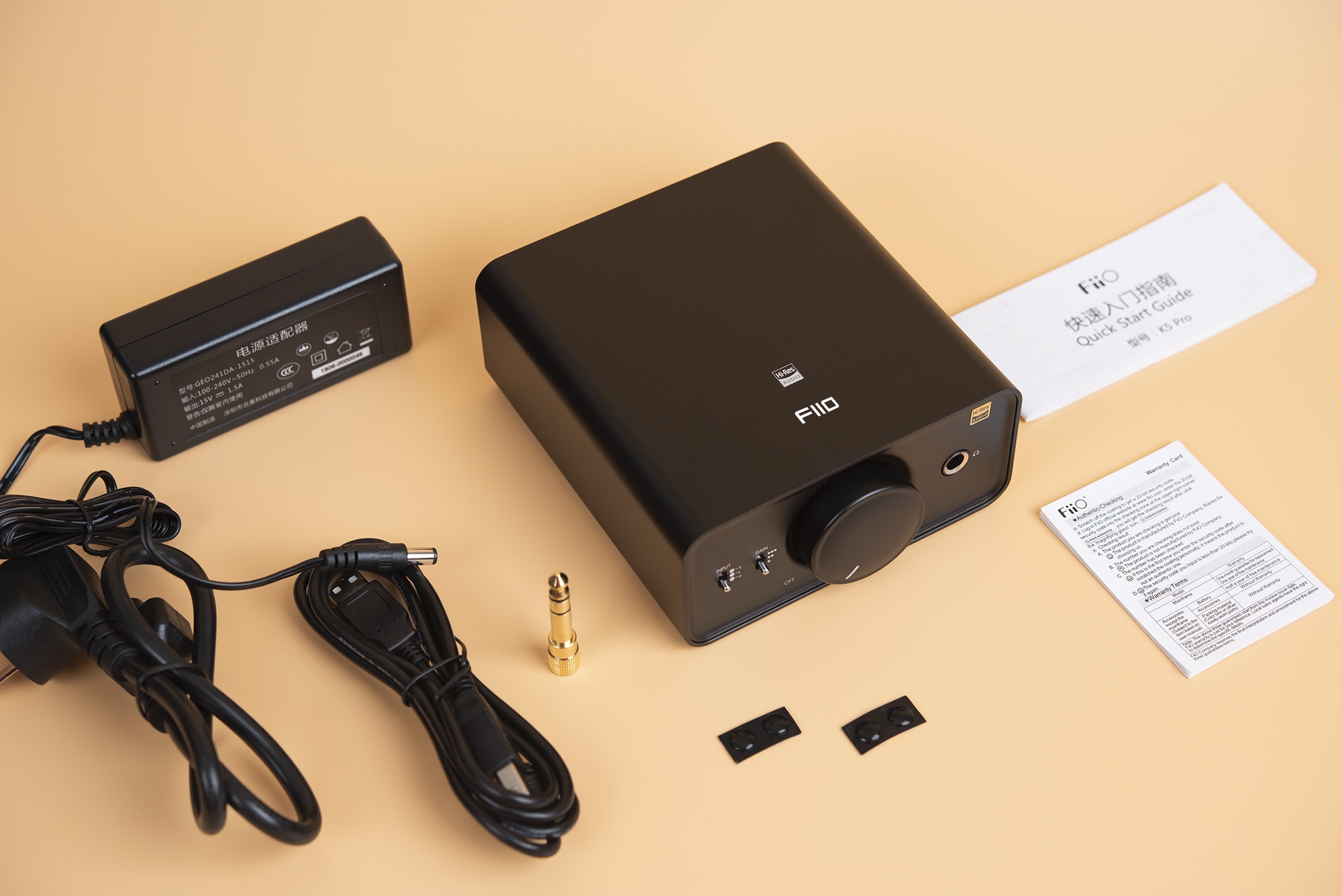


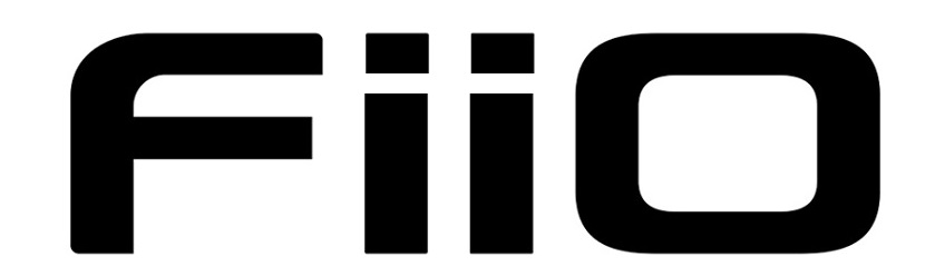

We found that our brand name FiiO is easy to be written wrong as fiio or Fiio. With developments of our brand ,changes of our products positioning and target users, now we are considering to change FiiO to be FIIO. Our team has designed several new LOGO patterns.
We would like to get your suggestion of which logo pattern is suitable for us now. Kindly vote it for us !


We would like to get your suggestion of which logo pattern is suitable for us now. Kindly vote it for us !
Last edited:

|
Stay updated on FiiO at their sponsor profile on Head-Fi.


|


