New Head-Fi Update
Status
Not open for further replies.
Apr 26, 2017 at 6:30 PM Post #62 of 1,792
Jeez, guys. There's certainly room for improvement, but it's not the end of the world. I'm sure they'll get everything worked out as long as we post our feedback in a reasonable, actionable format.

I for one would like to see an easy link to the "watch" aka subscription page up in the corner with the PM notification, like before.
 
Apr 26, 2017 at 6:31 PM Post #63 of 1,792
You can manually start a conversation. Nothing found on users page for direct contact, though.

See MA has it covered.

? I have a bunch of private messages already started, I guess there might be a button to start another
 
Apr 26, 2017 at 6:34 PM Post #64 of 1,792
Screen Shot 2017-04-26 at 4.33.02 PM.png
 
Apr 26, 2017 at 6:36 PM Post #65 of 1,792
Guys, exactly the same thing happened when Head-Fi switched to the Huddler platform 7 years ago. Everyone thought the sky had fallen because a bunch of functionality was missing or had changed. Over time, that was fixed and improved.
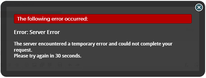
On first glance it looks attractive, however, this was not a good rollout, a train wreck is more like it. A website should be intuitive and easy to navigate. This rollout has bugs galore. I understand that you will fix things as you have no choice but to get it right. The QA effort seems to have fallen flat. The first experience is negative, "Your account locked out" should never have happened. If you required a password reset for the new rollout, there should have been a clear message.
Perhaps the best thing to do is admit the problems, rollback to the old software, get it straight before unleashing it again. It does have a nice new fresh look, but it needs be right. Best wishes and good luck, I know this must have been stressful.
 
Last edited:
Apr 26, 2017 at 6:37 PM Post #66 of 1,792
The first time I tried to log-in, it gave me some error saying my account had been locked due to login attempts - even though it was the first time I tried to log-in and I know for a fact that I was using the correct password. On the 2nd attempt, it let me log-in fine, so I guess my account wasn't "locked" after-all.

The biggest thing that stands out for me as bad about the new design is the way everything is scrunched into the center. I have like 6-inches of empty wasted grey space on both sides of my monitor. It feels like I'm stuck viewing the mobile version of the page, designed for a phone instead of a computer monitor. If this design was a bike, it would be a little-tikes.
 
Last edited:
Apr 26, 2017 at 6:37 PM Post #67 of 1,792
I wouldn't have minded an update to the site, but my god, this is a disaster. Huge margins (wasted space) and large ads clutter the page, functionality is missing and the most egregious change has to be the design. The old site had a consistent identity and design language; when i saw that shade of blue I thought of Head-Fi. This design is so uninspired and generic, it reminds me of a default Wordpress or Blogger theme. Why was this drastic change not communicated to users beforehand...
 
Apr 26, 2017 at 6:43 PM Post #68 of 1,792
jesus christ this is pretty bad. They could have kept the same layout but changed the colors or something. This one does look really nice but the layout is terrible. Couldnt even tell that I was logged in.
 
Apr 26, 2017 at 6:44 PM Post #69 of 1,792
I do like the start conversation button, that's really cool. I did get logged out and locked out for like 20 mins... had to click "stay logged in" and here I am
 
Apr 26, 2017 at 6:45 PM Post #70 of 1,792
whoever made your new site , he killed your mojo guys

this is a DISASTER
 
Apr 26, 2017 at 6:46 PM Post #72 of 1,792
Onward with the list! (I will put any future gripes in bullet list form to make them more visible.)

  • User names are now all lower case. (It's supposed to say Music Alchemist, not music alchemist! Grr. For those with subtlety in their user names, well...for example, StanD now just says stand.)
  • I can't figure out how to tag users now. The @ method does not work.
  • Everyone's gender and birthday are by default displayed now. You have to go into your settings to remove them if you didn't want those shared publicly.
  • Previous avatars are gone.
 
Apr 26, 2017 at 6:47 PM Post #73 of 1,792
what is going on with the FS threads ?

how can i bump my FS threads ?

how can i choose if i want to see ads by the date of LAST BUMP ?

where are the pics of the items for sale ?

oh my god , this feels like a layout made by a saboteur of head-fi......
 
Status
Not open for further replies.

Users who are viewing this thread

Back
Top