


x RELIC x
Headphoneus Supremus
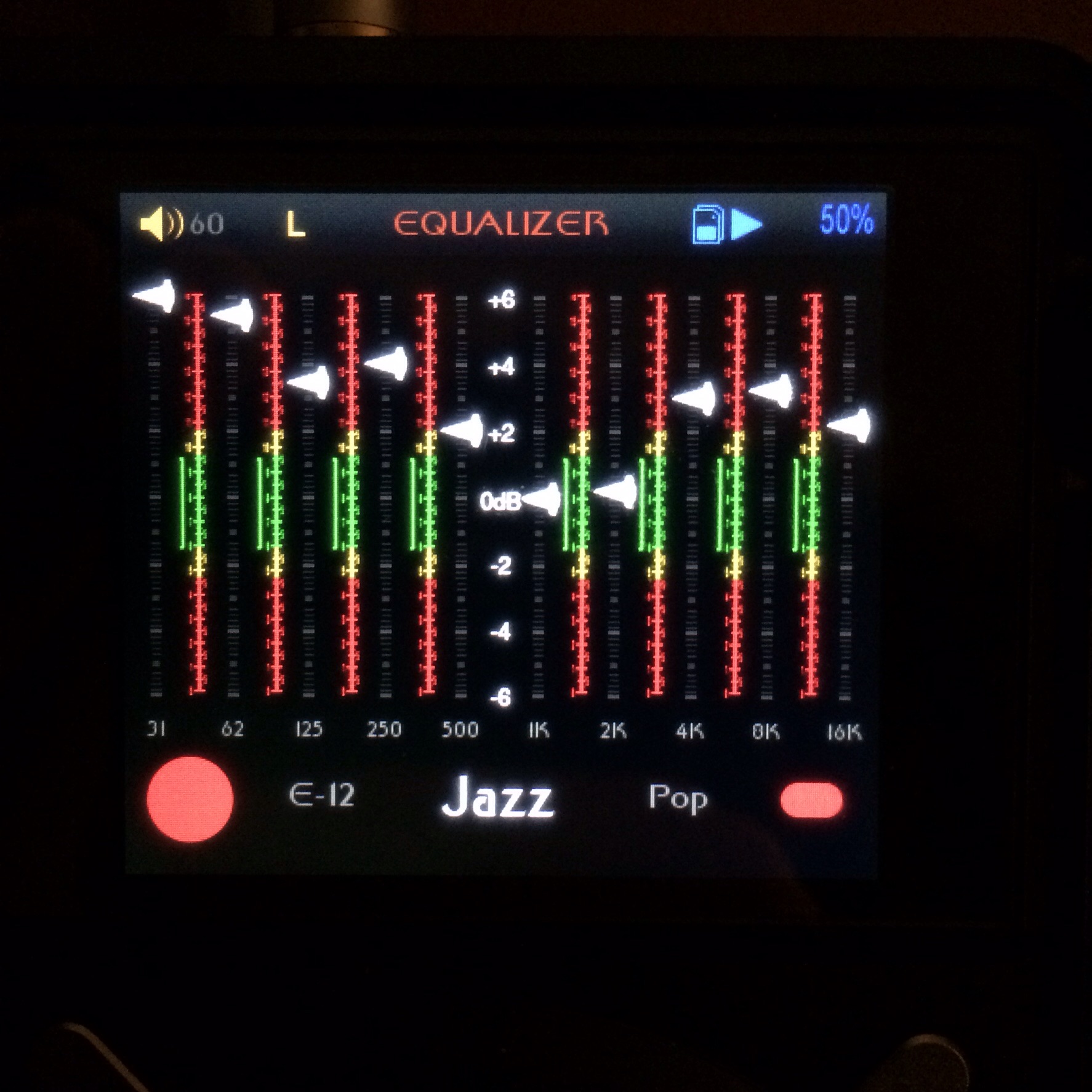
AsianInvasion, I like a lot of the elements of the Harmony 3 theme but I can't make heads or tails of the battery indicator. Also, and this may just be me, but I'm missing the feedback of the EQ information in the now playing screen. Also, it's near imposible to read the highlit text in the fast picking screen. If you darkened the bg for that screen it would help immensely. Just a couple observations.
