


scorpion90
New Head-Fier
- Joined
- Dec 26, 2014
- Posts
- 18
- Likes
- 17
I was trying to download Hi-Vinyl from app.box.com but now that it is available from www.dropbox.com, I can download it. For some reason it doesn't serve the file from app.box.com.
I was trying to download Hi-Vinyl from app.box.com but now that it is available from www.dropbox.com, I can download it. For some reason it doesn't serve the file from app.box.com.


I finished it.
https://www.dropbox.com/s/sagvfgeuhxe60nc/x5.fw?dl=0
this can actually show what i meant by elegant and such, it is fully working... i feel nice to have finished it..


I finished it.
https://www.dropbox.com/s/sagvfgeuhxe60nc/x5.fw?dl=0
this can actually show what i meant by elegant and such, it is fully working... i feel nice to have finished it..
Is this based on TheoS53's Modern Material theme with a tweaked Modern Simplicity main menu? I haven't loaded that yet so I'm curious to know what you've tweaked.
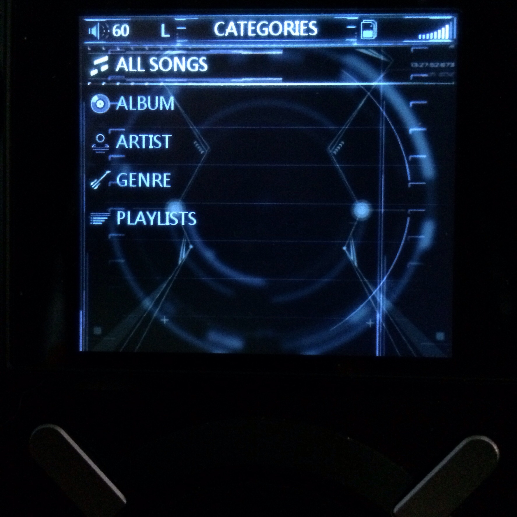
Has a stylized iPod classic feel in the menus and the toggle switches are clean and very easy to read. This along with the launcher (main screen) makes for a nice theme.
Pro-tips:
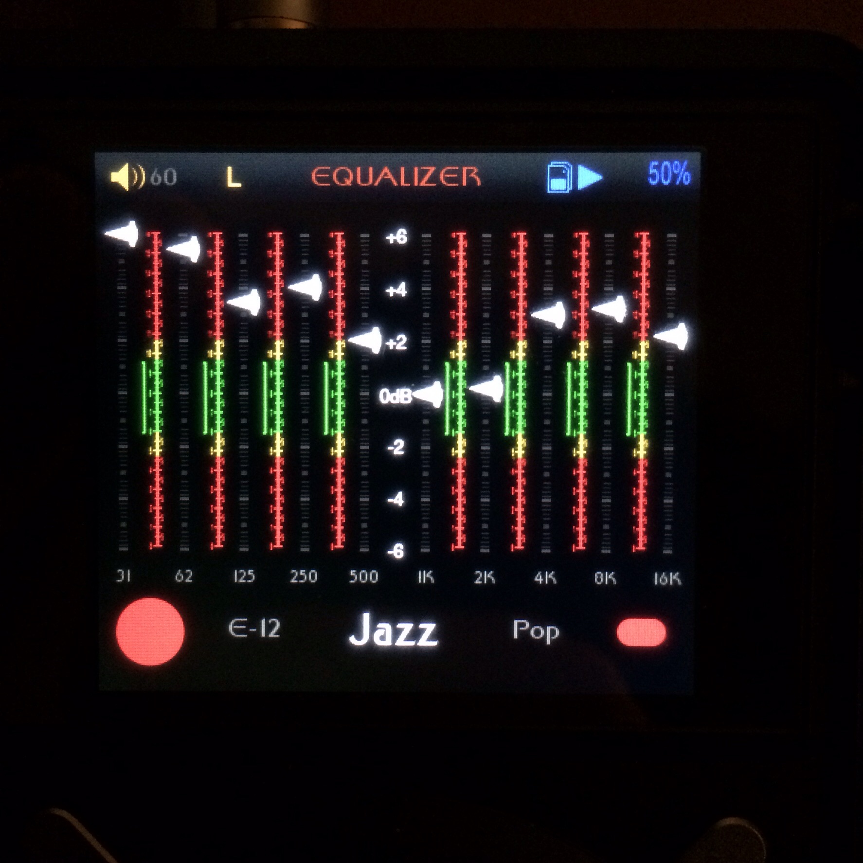
- You can change the text for all the menus to be UPPER CASE and it's even easier to read. look in the str folder and open the .ini files.
- You can look at the config.ini breakdown I posted(link on the first page) to change the color of all the text in the theme except for the fast picking highlight text. I say this because the color you have for the unselected text is dark grey which is very hard to read with the grey selection bars in the theme (specifically the EQ names not selected). More separation in the text color or menu bar would be desirable in this theme.
to change the text color the easiest thing to do is open the config.ini file and find the grey which is the first enrty that looks like this:
<list_item_color>0x6C6C6C</list_item_color>
If you change it to 0xb8b8b8 you'll get a lighter grey. These are web colors so you can find a color editor that shows them in the color picking portion of the program. I use PS CS6 so it's all listed there when choosing a color.
- You can brighten the icons in the topbar for better readability by editing the images in the topbar folder.
These suggestions are extremely easy to do now that you have your feet wet. It's up to you of course whether you want to do it or not.
See, wasn't that hard was it? You can create you're own theme images as long as you follow the constraints of the fw like resolution, image file name, and position for the most part. Now I have a very clear understanding of what you like.
Where is TheoS53?
He is a definite asset to this thread!
Originally Posted by x RELIC x /img/forum/go_quote.gif
- You can change the text for all the menus to be UPPER CASE and it's even easier to read. look in the str folder and open the .ini files.
This would be useful to me - I can see how it's possible to change it for everything except the track names - is that possible too, & if so where's the command line?
You suggestions are most welcome, i am pretty sure that there is space for improovement, and i want to do it as soon as possible.
i am not able to fiind within any of the .ini files the options to change colors of fonts. i would really need to change the colors for:
-not playing song but visible in fast picking, it is way too dark, i tried, but i cannot understand how to change that color;
-background writing in EQ and colors of numbers in eq
i tried to fiind the exact line you were talking about, but it does not seem to be there.
The changing text to upper case would not be my first priority, as i am trying to make it look not only easy to read, but also very elegant, i would, on the other hand want to change the font iteslf, but i have no ideea how.
the topbar colors change is totally considered, but i am trying to figure out how to do it, without making it look less elegant;
Thanks a lot for all the help!
i hope that this project, i will name it skeptic, would be for more than me, but i am entirely happy if i am the only one using it, because it is so much fun to be able to edit what you use exactly how you want.
If anyone who trys it finds anything that doesn't quite work, please let me know!
Coming soon...
")
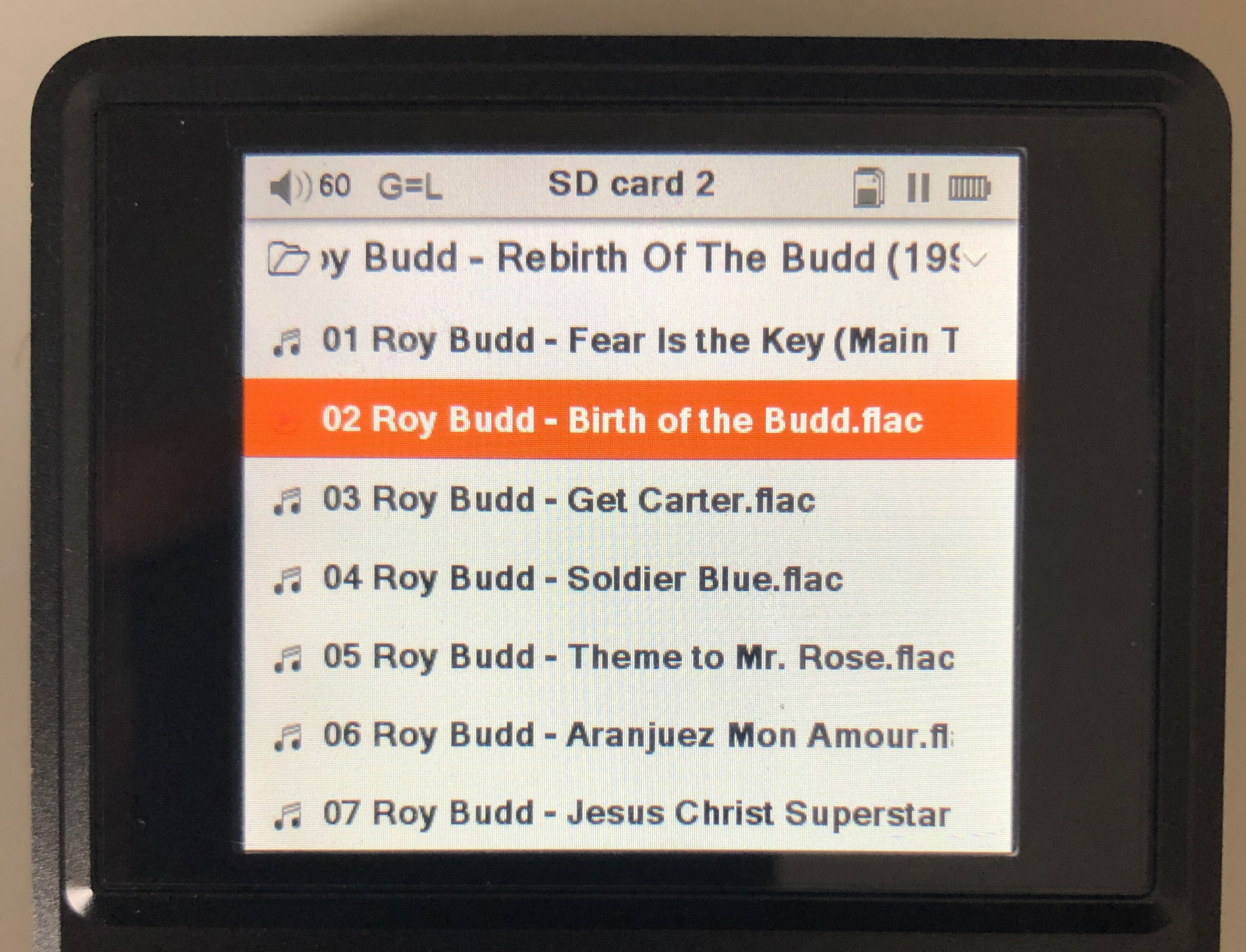
Not everyone will be laying out their cards the way you have them labelled. I spotted this before loading the theme as my OTG makes me change the labels to Card 1 and Card 2. Something irritates me about "mSD Card" or "TF card" - I don't know why...
Yeah, thought that might be a problem for some - I have my cards set up as alphabetical folders with A-L on one & M-Z on the other (hence what you see). The "msD & TF" thing really irritates me too,
I think if I'm to pursue text-based themes (which is what interests me) I'll have to stick with more generic treatment of some things for the versions I post here... Occurred to me that my not using American English might annoy some too.
Pleased to hear your input anyway - do say if there're other things. I particularly want someone to comment on the shortcut & playlist functions as I'm not sure some of the labels I've used are correct - I've never understood what the short context menu does exactly!
