


x RELIC x
Headphoneus Supremus
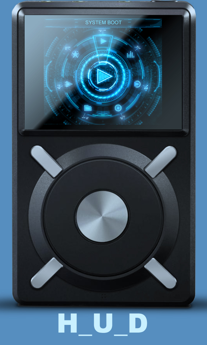
HUD update......... So far......... A lot more tweaking needed but it's coming along.

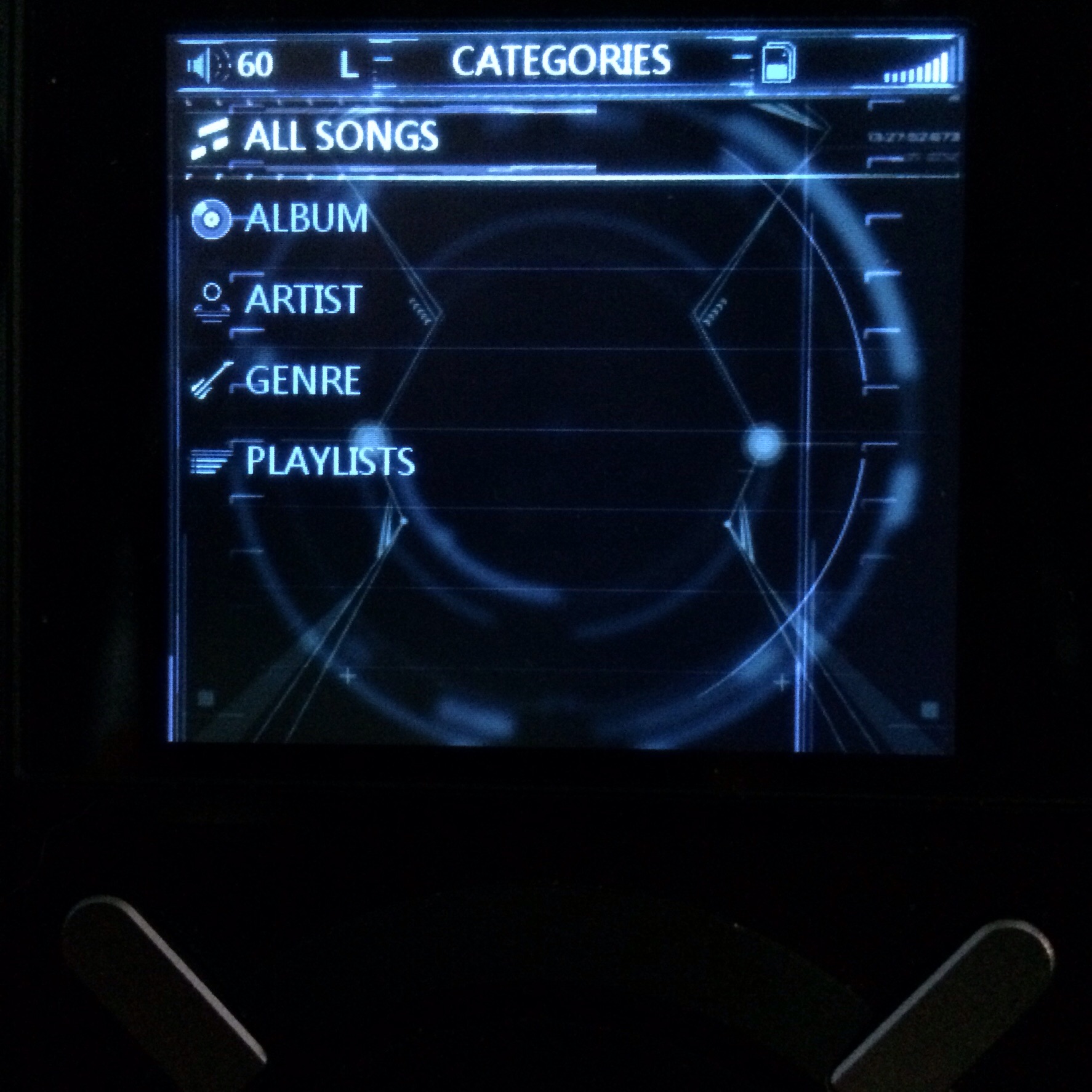
Launcher.

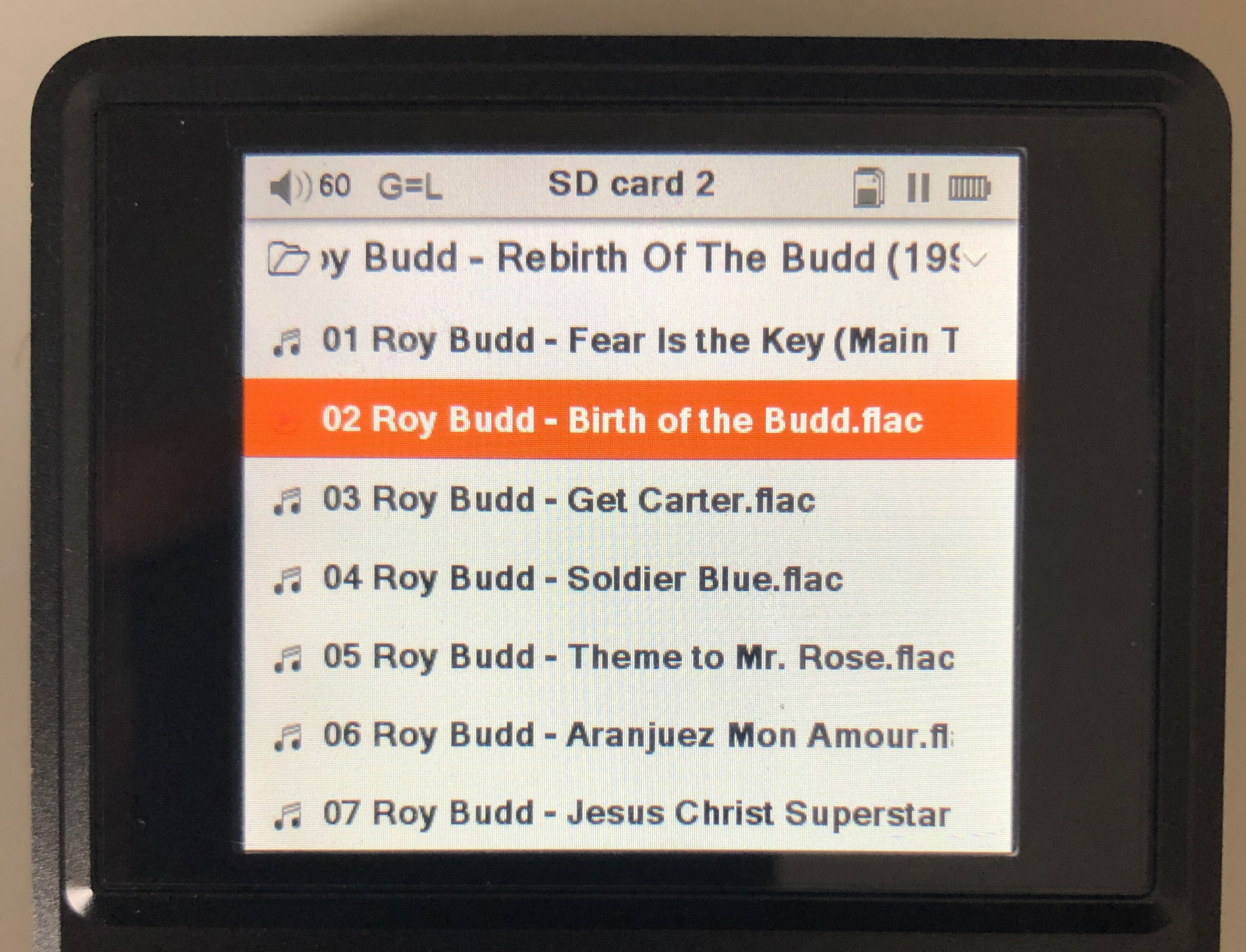
Fast picking.
Have some out of town family visiting for the weekend so I'll need to get back to it next week. Happy Easter.
Launcher.
Fast picking.
Have some out of town family visiting for the weekend so I'll need to get back to it next week. Happy Easter.


")
