


I'm sorry, I don't understand what you're asking.
can I take your picture battery for my theme, so as not to draw again?
I'm sorry, I don't understand what you're asking.
I'm sorry, I don't understand what you're asking.
Just installed on my X5. Beautiful as always!

New theme complete!
Elegance - Firmware 2.4
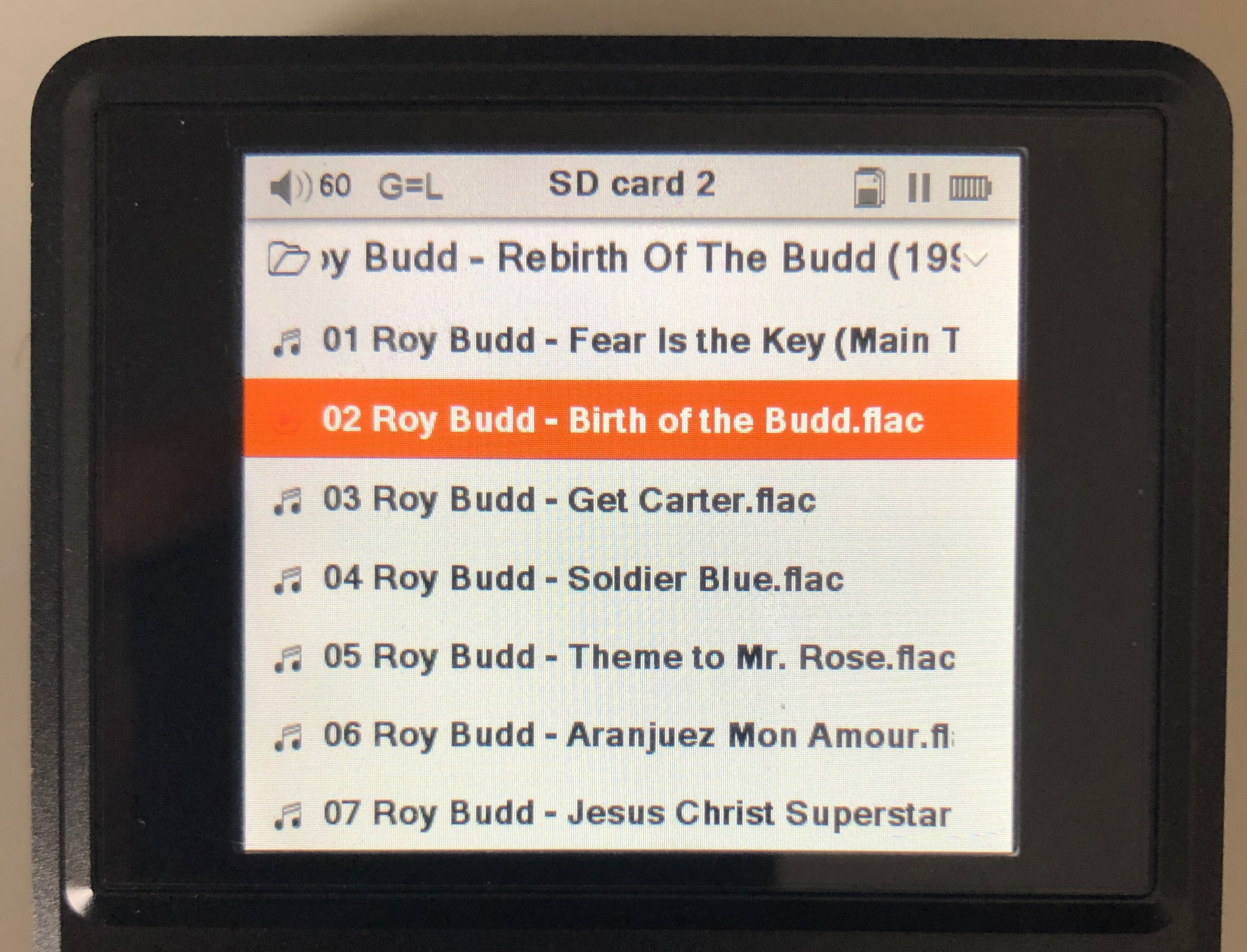
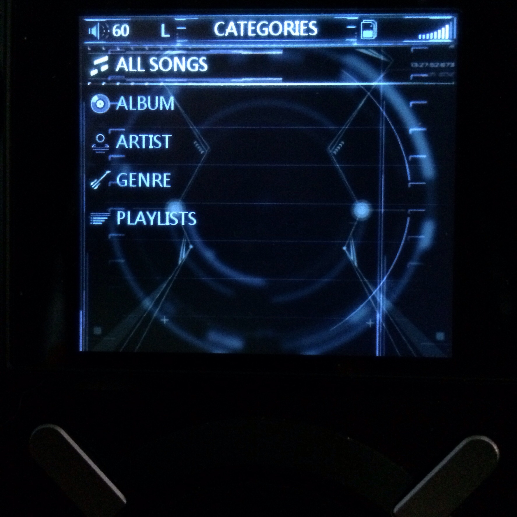
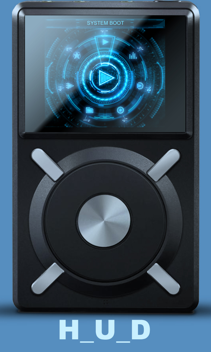
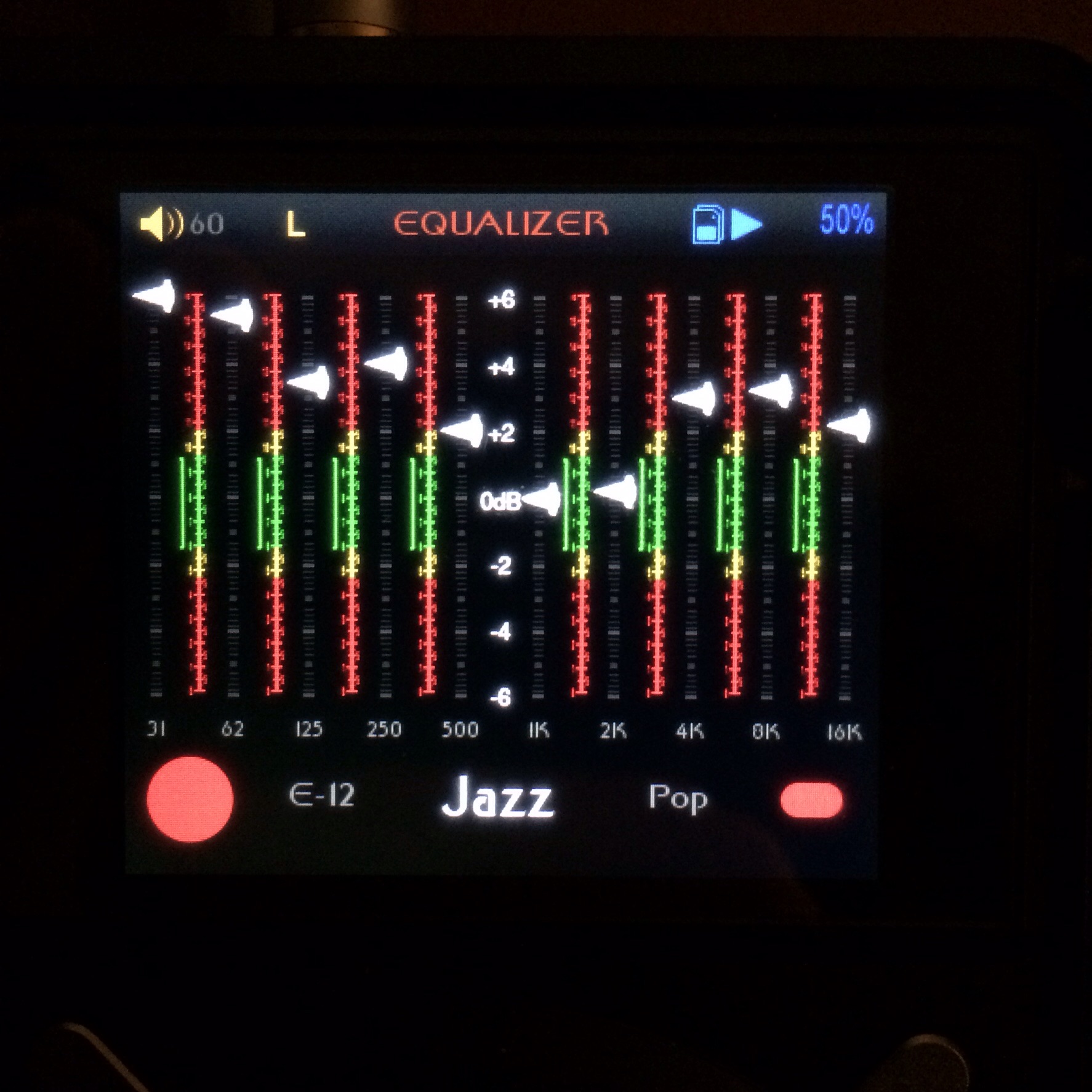
Some of the UI elements in the firmware:
https://drive.google.com/open?id=0B9fkQZFkWYHQakxQbnZtMjlHNkE&authuser=0
Firmware Info
- Name: Elegance
- Version: 2.4
- Languages: All that work in stock
P.S. Feel free to modify any of my themes
Firmware theme update file>>>> https://www.dropbox.com/s/cm9crr1vb55w41v/x5.fw?dl=0
Users familiar with archive casual surfers are not and i don't know if my dropbox reflects the updated one but link in this post does.
Enjoy
_________________________________________________________________________________________________________
Using the link above I get a 404 error
"file moved or deleted".
Just thought I would let you know.
We discussed the lack of feedback here even before Hi-Fi was posted. Over 300 downloads and so little feedback could be explained in a number of ways - high volumes of non-members - not wishing to appear negative - just trying out everything there is etc. Maybe some people just agree with what's already been said and don't want to add a +1 post. I think, if you appreciate what someone has done, the least you can do is hit the thumbs up icon.
I tried the theme and gave you some feedback. A theme without a launcher is not going to be for me. Relying on FiiO's unchangeable text colour for navigation is going to alienate anyone with poor eyesight as in general spectacles and over ear headphones do not go well. A set of large icons which remain distinguishable in somewhat blurred vision will always win out.
I know folks attached to the icons will look elsewhere. Like I said. Soft pastels and stuff like theo and asian do are beautiful but feel too itune'ish to me so the different strokes for different folks thing.
The lack of being able to change that top bar into a clear/transparent and change the color of the text is a rock that is blocking me from taking my next step. If that thing has to be there in order to give up the icons I gotta eat it but it would be nice to make it clear and gold.
There is a user .ini that is blank whick leads me to wonder but putting in instructions to auto hide the top bar whaen there is no wheel action for 5 seconds seems undoable. It aso annoys that the X1 seems to have some mod abilities that the X5 lacks.
EDIT
I may actually make a version with
5 of these crossing horizontally and each scroll would flick a switch like the Mc moves the VU meter. I might try that as an alternate for folks needing a better visual. I'm fine and prefer no icons but changing to switches instead of icons is a cool challenge
It doesn't seem possible to get rid of the top bar, but the text can be overwritten by, say.. a battery icon...
The user.ini is where all your personal presets go that you lose on a firmware update.
The switch idea is perfectly doable by replacing all the .pngs in the launcher folder in just the same way that others have modded launchers.
An icon is still more powerful visually, than text and a light.
Edit: The icons don't have to be cartoonish. Why not use full frame photos to produce a launcher? This would blend well with the Hi-Fi theme.

If I find a set of goldish sunlit hi-fi pics I'll finish this theme with full screens and I'll be happy since it wont be icons and others will have a huge screen worth of knowing where they are at. Image gigantus...

Right NOW!!
Like I said earlier I LOVE THIS THEME. At first I thought the green-ish color would be too much, but given the intended brand emulation it works exceedingly well. Also helps with readability.
I went wild with the menu text and used CAPS for everything like the brand that shall not be named. I think it really works.
I also changed the names of the equalizer presets to just read 'EQ-#' which is much more generic. There's no USB screen issues and I'm quite happy with the startup and shutdown animations (nothing special but they suit the theme).
There are two versions in case someone doesn't like the McFiiOtosh label, but I feel it represents the intended brand as you see the logo on all their gear, front and center.
McFiiOtosh link
The original is with the logo and the alt is without.
Edit: I left the missing album art out on purpose as I feel it's much more in line with the simple design of the theme.
")
