


ZeroInfinity
New Head-Fier
The question was not relevant to the topic, removed.
Last edited:
I have the SR25 mk1. I just recently installed Qobuz and works fine by me. It was working perfectly on wifi and I have just tried downloading a track and everything works fine. I have installed version 6.5.1.0I bought an SR25 last August after reading this thread. I’ve loved it ever since. However, I’ve had a weird issue with the latest AK-approved version of the Qobuz app. I can import albums, delete albums, favorite albums and artists, etc. But I can’t for the life of me get music to actually play! I’ve tried hitting play through every option on the app. Nothing seems to work. Is anyone else having this problem with Qobuz? If so, how did you resolve it?
I have the SR25 mk1. I just recently installed Qobuz and works fine by me. It was working perfectly on wifi and I have just tried downloading a track and everything works fine. I have installed version 6.5.1.0
 (but I was pissed off at the time) lol, listen, a good solution to this that preserves the function whilst solving this problem is that you need to offer an option to disable these (the three buttons on the left side) in the interface. I genuinely never switch songs by pressing them and no one I know does either, which means that while there are definitely people who do so no need to comment that you do, there are evidently plenty of people who don't which is why am asking for the option to choose.
I can only answer #4. Yes, there is currently no way to lock the side buttons. The volume wheel, yes you can lock. Here's an answer from Jason, one of the Astell&Kern reps on this thread:Having had the player for another few weeks now, I do to be honest find the UI and interface pretty lackluster. There are so many small annoying things about how the player behaves in the interface I honestly expected more for the price class. This is not about the sound or playback which I agree with a majority of the owners of the player is absolutely excellent, it's about working in the actual interface.
For example (and if I have missed something about the player and it is my fault and there is actually already a better solution, let me know and if so I apologise beforehand) here are the first 5 things that come to mind that annoy me and I expected better:
1) connecting the player to a PC, I try to add files in the explorer: the folder/file view cannot be changed. It is set to "Large Icons" but I mean I have hundreds of albums to work with here, I want to view it as a list, this is very annoying and makes it complicated to parse and structure what you have on there and what you don't. This is probably, like other problems (such as loading the last.fm app) coupled with how locked the OS is, which is bad. You can temporarily change the look of the current folder you are in which doesn't help as asap you leave it for another folder it is reset, it cannot save the folder view.
2) On the player I browse by folder, this has pretty poor support. For starters there is no setting for starting the player at a default folder, which would be my music collection. This might seem like a detail that doesn't bother you and it doesn't the first 10 or 20 times you start the player, but then it starts to bug you. I have to start it up, it has some random song on, I press the back thing, get to some general list of stuff, then press folder, then get a list of supposed hard drives I guess? I have one sd card in it, so I have to click that thing, then I get to a folder view of.. all the folders on the player, not the music folder, all the folders.. no one knows why. Here there is an option to bookmark folders so they end up on top, but now I am already one click away from my music folder so it serves zero purpose. This bookmark function should be -on the now playing screen-. That's where the player starts. That's where I am when I am listening to things. This is sort of what the < button does, but it takes you through the above loop. Again, not too a big deal the first 20 times, then it starts to bug you. This is a music player, I start it I should be one (or ideally zero) click/s away from my music collection, not a bunch of clicks through different menus. I also tried removing all the preset folders (EqLists, AlbumArt etc) to just have my music collection here, in order to reduce the amount of clicking by one step, but on restart the OS remakes the folders (which I understand is a good thing fundamentally, I was trying for a sneaky workaround).
3) there are skip forward/backward buttons that double as search buttons if you hold them on the now playing screen. There is also a touch screen search bar, you might have not noticed because it is the progress bar which is maybe.. idno.. 5 pixels thick and sit under the album art icon, this you can actually touch and drag. This is a great function to have, a dynamic touch screen search bar, but it's so thin it's difficult to manage when you're out and about and not sitting at a desk inside.
4) the mechanical buttons on the side of this player bugs the living hell out of me. They stick out of the player and I accidentally click them in my pocket if I have tight jeans now and then, say when I stand up or sit down or bump into a hold on the underground or w/e.. now what do these buttons do? the skip to the next song. Which sometimes is the next song on the album (i.e. the next file in the folder) which isn't the end of the world, but it sometimes for reasons I haven't figured out, switches to the next song on the player in alphabetical order, as if the playlist it has made is the entire collection of mine. This has led to me half blowing my ears out completely out of nowhere as my low volume (maybe 88dB) chill background ambient song completely unannounced switched song (as I moved seats on the bus) to Cannibal Corpse vocalist Corpsegrinder yelling obscenities in my ear at probably twice the volume (maybe 95 db or louder) to 200bpm blast beats, which is a funny story now
5) the < button keeps moving around as if you press it it does it's thing but if you hold it you drag it around. You need to offer an option in the settings to lock this button in place. Plenty of times while I'm out walking and changing something (track/volume w/e) I come back to it later and that button has moved somewhere.
so tl:dr; better support for people who listen by folder including the folder view in windows, reduce all the pointless browsing since it is a music player with one purpose, give the option to bookmark a folder from the now listening menu, give the option to disable the buttons on the left side of the player and to lock the < button on the now playing (and some browsing) screens, and increase the size of the touch screen search bar.
All of these things are fundamentally good concepts but need tweaking. Again, other aspects of the player such as the audio quality and build quality are, again, stellar - excellent work there.

You make some excellent points about the UI/usability of the SR25 that no doubt leave room for improvement.Having had the player for another few weeks now, I do to be honest find the UI and interface pretty lackluster. There are so many small annoying things about how the player behaves in the interface I honestly expected more for the price class. This is not about the sound or playback which I agree with a majority of the owners of the player is absolutely excellent, it's about working in the actual interface.
For example (and if I have missed something about the player and it is my fault and there is actually already a better solution, let me know and if so I apologise beforehand) here are the first 5 things that come to mind that annoy me and I expected better:
1) connecting the player to a PC, I try to add files in the explorer: the folder/file view cannot be changed. It is set to "Large Icons" but I mean I have hundreds of albums to work with here, I want to view it as a list, this is very annoying and makes it complicated to parse and structure what you have on there and what you don't. This is probably, like other problems (such as loading the last.fm app) coupled with how locked the OS is, which is bad. You can temporarily change the look of the current folder you are in which doesn't help as asap you leave it for another folder it is reset, it cannot save the folder view.
2) On the player I browse by folder, this has pretty poor support. For starters there is no setting for starting the player at a default folder, which would be my music collection. This might seem like a detail that doesn't bother you and it doesn't the first 10 or 20 times you start the player, but then it starts to bug you. I have to start it up, it has some random song on, I press the back thing, get to some general list of stuff, then press folder, then get a list of supposed hard drives I guess? I have one sd card in it, so I have to click that thing, then I get to a folder view of.. all the folders on the player, not the music folder, all the folders.. no one knows why. Here there is an option to bookmark folders so they end up on top, but now I am already one click away from my music folder so it serves zero purpose. This bookmark function should be -on the now playing screen-. That's where the player starts. That's where I am when I am listening to things. This is sort of what the < button does, but it takes you through the above loop. Again, not too a big deal the first 20 times, then it starts to bug you. This is a music player, I start it I should be one (or ideally zero) click/s away from my music collection, not a bunch of clicks through different menus. I also tried removing all the preset folders (EqLists, AlbumArt etc) to just have my music collection here, in order to reduce the amount of clicking by one step, but on restart the OS remakes the folders (which I understand is a good thing fundamentally, I was trying for a sneaky workaround).
3) there are skip forward/backward buttons that double as search buttons if you hold them on the now playing screen. There is also a touch screen search bar, you might have not noticed because it is the progress bar which is maybe.. idno.. 5 pixels thick and sit under the album art icon, this you can actually touch and drag. This is a great function to have, a dynamic touch screen search bar, but it's so thin it's difficult to manage when you're out and about and not sitting at a desk inside.
4) the mechanical buttons on the side of this player bugs the living hell out of me. They stick out of the player and I accidentally click them in my pocket if I have tight jeans now and then, say when I stand up or sit down or bump into a hold on the underground or w/e.. now what do these buttons do? the skip to the next song. Which sometimes is the next song on the album (i.e. the next file in the folder) which isn't the end of the world, but it sometimes for reasons I haven't figured out, switches to the next song on the player in alphabetical order, as if the playlist it has made is the entire collection of mine. This has led to me half blowing my ears out completely out of nowhere as my low volume (maybe 88dB) chill background ambient song completely unannounced switched song (as I moved seats on the bus) to Cannibal Corpse vocalist Corpsegrinder yelling obscenities in my ear at probably twice the volume (maybe 95 db or louder) to 200bpm blast beats, which is a funny story now
5) the < button keeps moving around as if you press it it does it's thing but if you hold it you drag it around. You need to offer an option in the settings to lock this button in place. Plenty of times while I'm out walking and changing something (track/volume w/e) I come back to it later and that button has moved somewhere.
so tl:dr; better support for people who listen by folder including the folder view in windows, reduce all the pointless browsing since it is a music player with one purpose, give the option to bookmark a folder from the now listening menu, give the option to disable the buttons on the left side of the player and to lock the < button on the now playing (and some browsing) screens, and increase the size of the touch screen search bar.
All of these things are fundamentally good concepts but need tweaking. Again, other aspects of the player such as the audio quality and build quality are, again, stellar - excellent work there.
I'm using the latest version (6.5.1.0) and it works fine.Is Qobuz version 6.4.1.3 working properly for everyone else? I still cannot get it to play music properly. All other functions of the app work fine. I might revert back to an earlier version if there’s no fix. Does anyone know offhand what was the previous AK-approved version of the Qobuz Android app?

|
Stay updated on Astell&Kern at their sponsor profile on Head-Fi.


|
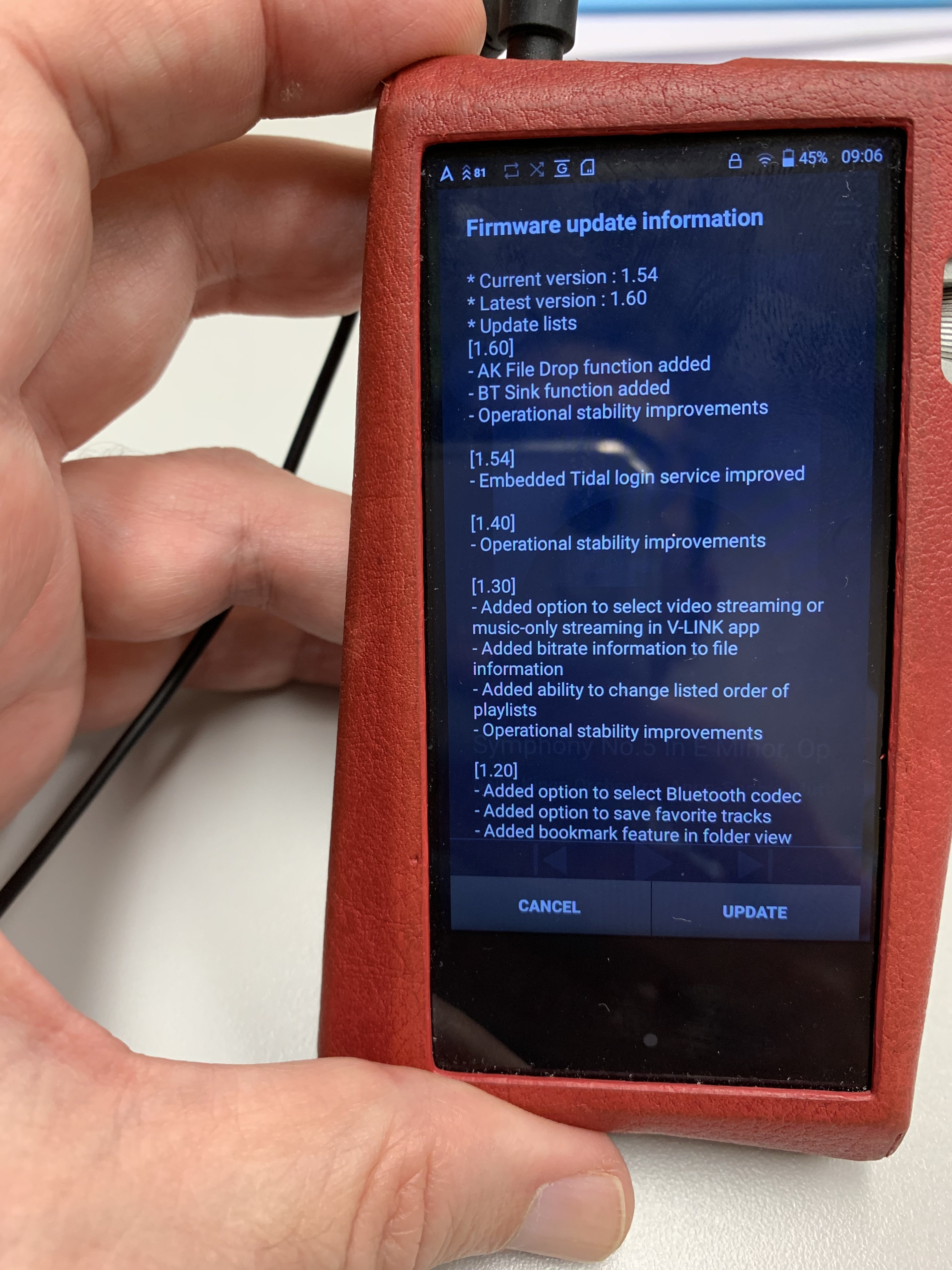
Nice, thx for the update.FYI, new firmware update coming March 28 for the SR25.
New features:
- BT Sink - Bluetooth send/receive, BT DAC mode
- AK File Drop - wireless FTP file transfer
Fixes:
- Wi-Fi stability fixes for wifi dropout issues while streaming
- Fix for connection issues when using a Mac with M1 chipset
Nice surprise, Jason")
Terrific! Thanks for the info, JasonNYC.FYI, new firmware update coming March 28 for the SR25.
New features:
- BT Sink - Bluetooth send/receive, BT DAC mode
- AK File Drop - wireless FTP file transfer
Fixes:
- Wi-Fi stability fixes for wifi dropout issues while streaming
- Fix for connection issues when using a Mac with M1 chipset


