


My feedback for the next update
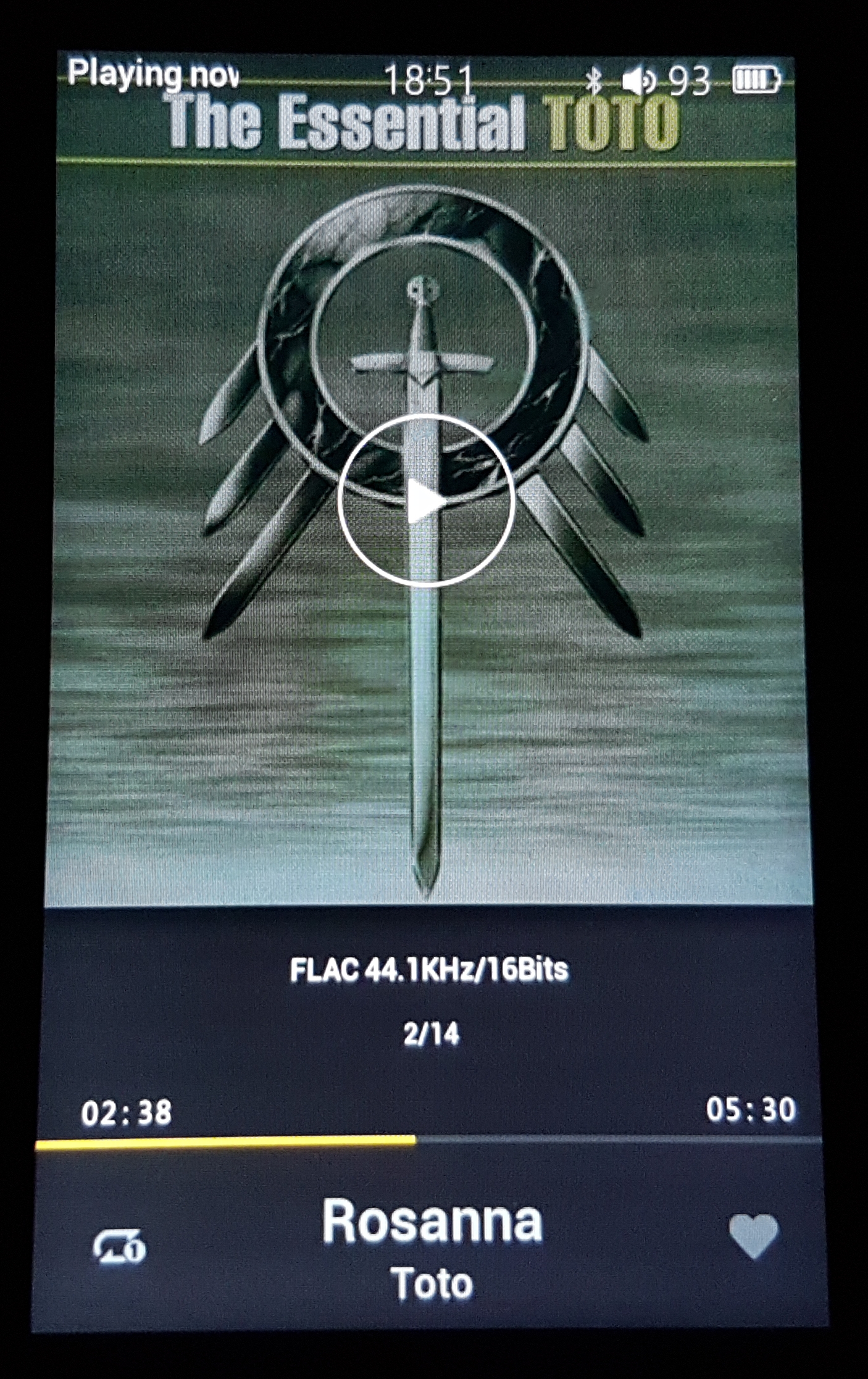
1. Different Themes - solid darker colours would be nice, it's hard to read the fonts next to bright areas.
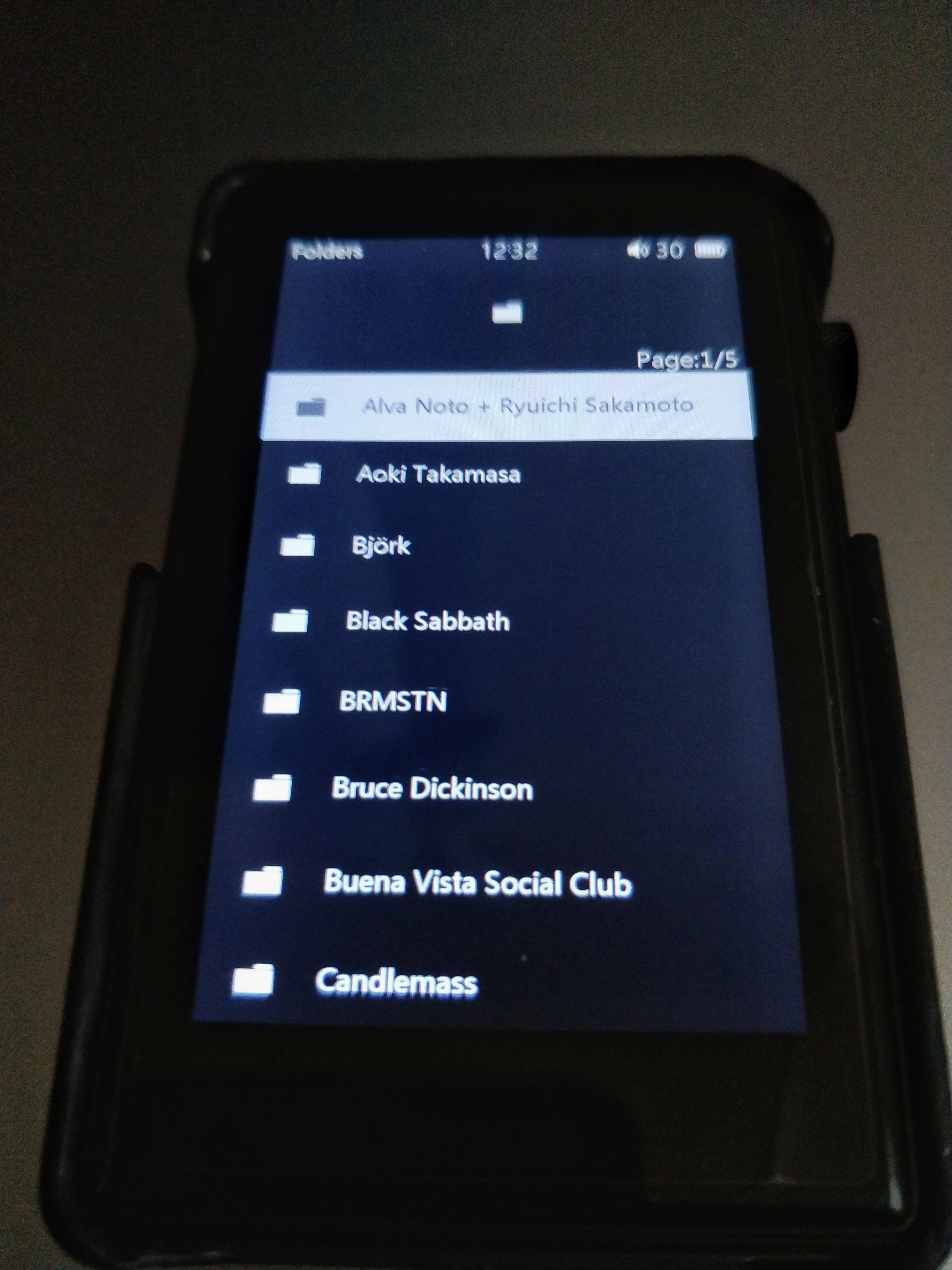
2. Fonts - specificly at the a bottom, the track titles and file information (eg. 16/44.1) it's quite thin and small, slightly bigger and bolder would be welcome.
3. Scroll wheel, each click of the wheel should represent a single movement on the screen, It feels too sensitive at times and feel like I'm correcting the movement often.
4. Battery percentage icon.
1. Different Themes - solid darker colours would be nice, it's hard to read the fonts next to bright areas.
2. Fonts - specificly at the a bottom, the track titles and file information (eg. 16/44.1) it's quite thin and small, slightly bigger and bolder would be welcome.
3. Scroll wheel, each click of the wheel should represent a single movement on the screen, It feels too sensitive at times and feel like I'm correcting the movement often.
4. Battery percentage icon.
") 5 is better than 2. Also I don't know if it's possible but it would be really awesome if the player could revert to headphone out by just plugging headphones in. Or some kind of warning when it's on LO mode so I don't blow my eardrums out.
5 is better than 2. Also I don't know if it's possible but it would be really awesome if the player could revert to headphone out by just plugging headphones in. Or some kind of warning when it's on LO mode so I don't blow my eardrums out.


