


flobear
New Head-Fier
- Joined
- Aug 9, 2013
- Posts
- 6
- Likes
- 0
Quote:
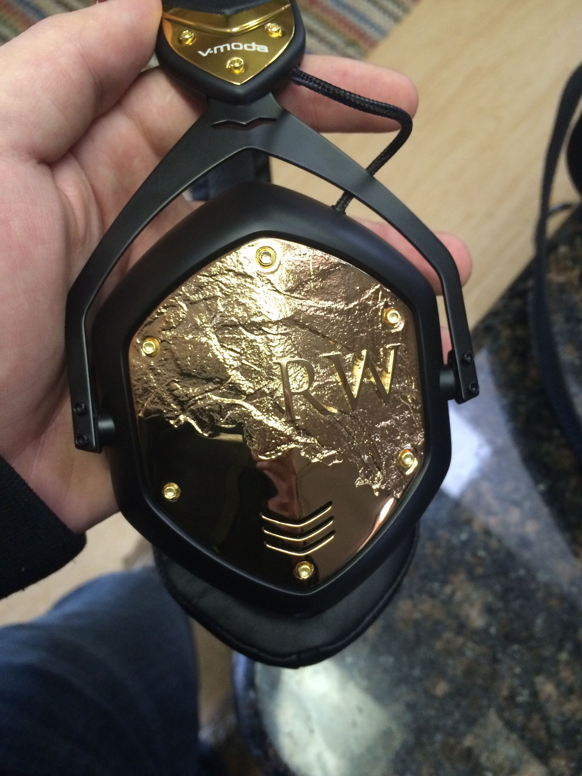
I would suggest matching the font sizes that you used for your name and the latin, and increase the spacing between the individual letters so it's more evenly spread out. I don't know if this matters to you, but one thing I noticed while looking through this thread and the V-Moda FB page, people tend to maximize the size of the logo, which ends up being a top-heavy design (because of the vents and green safety line). Personally, I would make the busts about 70-80% smaller, and move them as low as possible without intruding on the type.
Sorry if I'm nitpicking lol
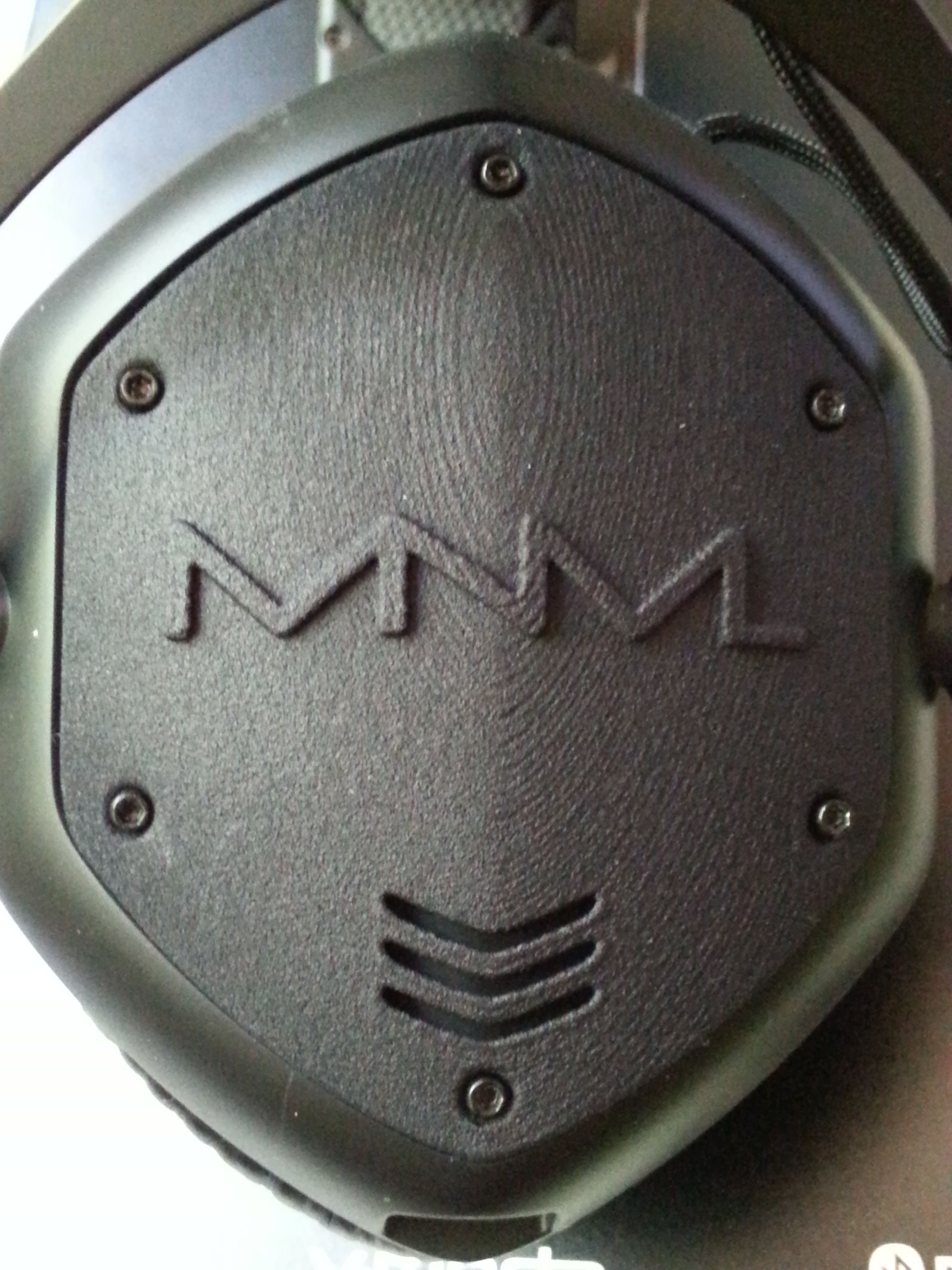
That. Or you could combine your two designs by stitching together the two images side by side and uploading it as a single image.

I would suggest matching the font sizes that you used for your name and the latin, and increase the spacing between the individual letters so it's more evenly spread out. I don't know if this matters to you, but one thing I noticed while looking through this thread and the V-Moda FB page, people tend to maximize the size of the logo, which ends up being a top-heavy design (because of the vents and green safety line). Personally, I would make the busts about 70-80% smaller, and move them as low as possible without intruding on the type.
Sorry if I'm nitpicking lol
")
