mistarobotics
100+ Head-Fier
- Joined
- Jun 5, 2012
- Posts
- 128
- Likes
- 11
These are how my Legend of Zelda shields look on the M-100s.
How do you guys think this would turn out? Also, i set the DPI to 300 but it put the image size at around 5.5MB( larger than the 3mb maximum on the site) I dropped it 250 DPI and it was just under the 3MB mark. Can i e-mail the higher res version so that they can use that one instead?
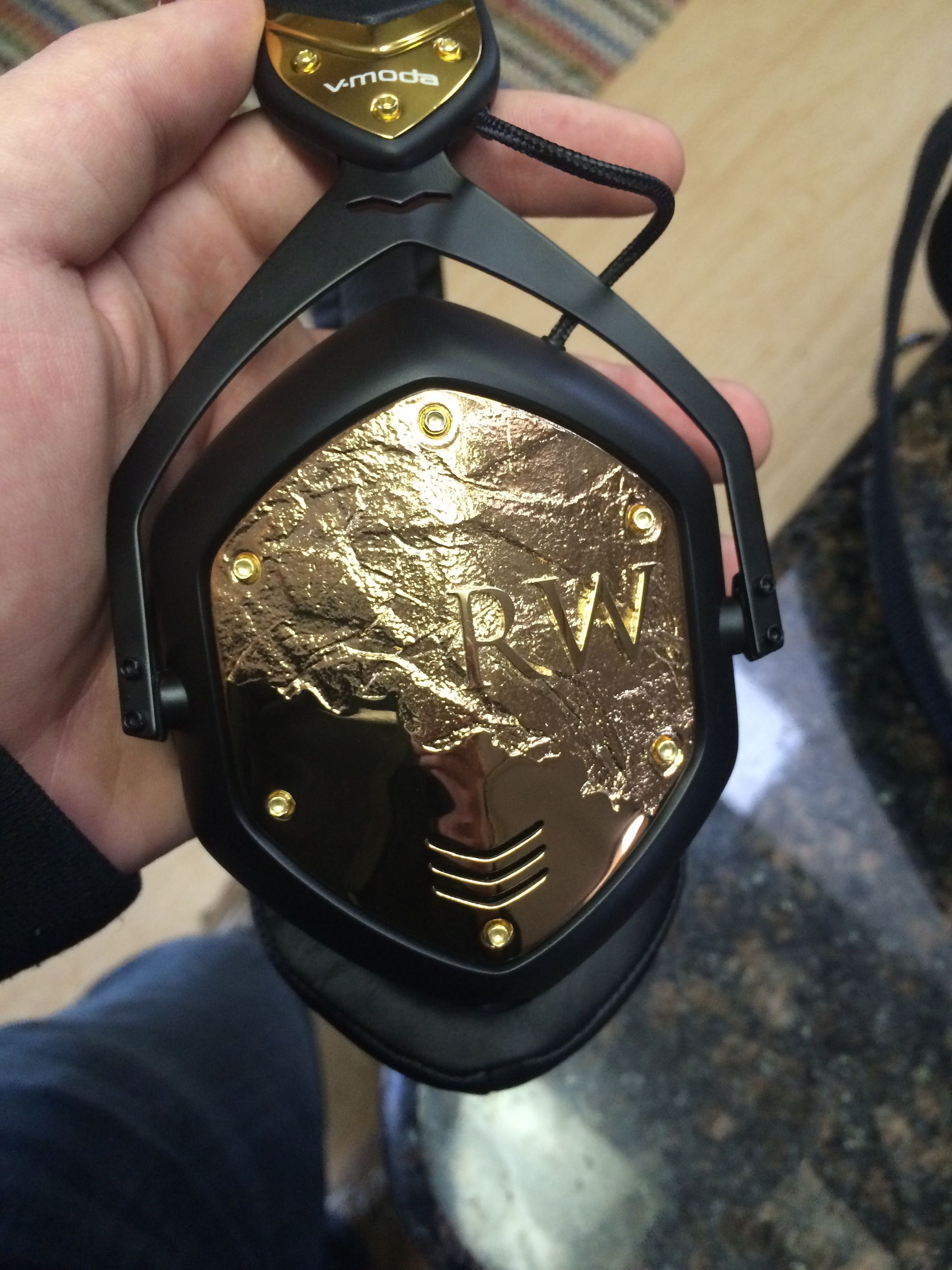
Personal opinion alert!!! I feel like designs with small-sized words with lots of letters embedded within a line would be hard to see unless you are holding them in your hand. Whether that matters to you, I don't know, but I would suggest that if you send them that design to explicitly say that you want it to be as large as possible or exactly how you positioned it within the shield frame. I've heard some people saying that their designs were shrunken a bit and with a design containing so many small letters, you would want to make it as big as possible. For example miceblue's shield design contained some Chinese characters within a heart, and honestly, I thought they were just squiggly lines until I saw a close-up shot.
Also, I think you should try to disconnect the "#GU" from the outside circle for a cleaner look.
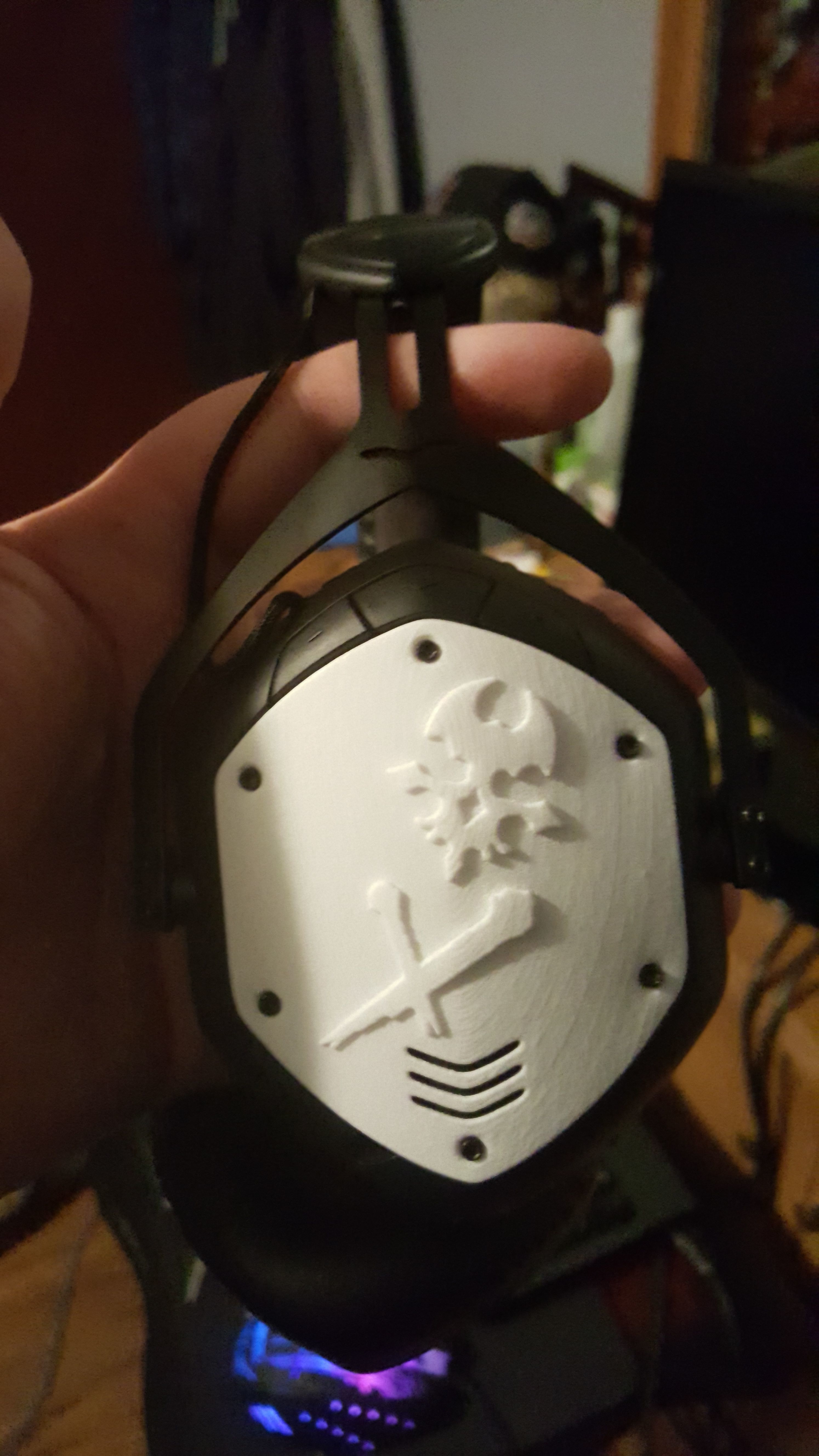
Finally, remember that they laser white onto whatever shield color you pick. I'm assuming that the black lines in your designs is what you want them to laser, so that would make the color scheme inverse if you pick black shields.
These are just personal opinions and suggestions, so please don't get mad have fun designing your design
I'm not mad at all. In fact, i appreciate your criticisms. I want these to look great so i do appreciate your help. Do you think that maybe putting a little more space in between each letter and make the words come more around the circle you help out? If nothing else, i could get my friend that made it remove the words entirely and just go with the "#GU" after disconnecting it from the inner circle. Leaving the words would be preferable though.
So I'm coming up with my shield design on Paint and there it is: but
I was wondering if this was good enough for VMODA to work with. I don't know what it means when they ask me to upload the image at 300 dots per inch even after wikipedia-ing it. Wanna help a brother out?
lol are you chinese/taiwanese/asian? just curious why did you choose to write Saturn in chinese?
Saturn is my favorite planet and it contained more of the aesthetic I was looking for versus the astro. symbol.