V-MODA Shield Design Discussion
Aug 8, 2012 at 7:06 PM Post #76 of 1,269
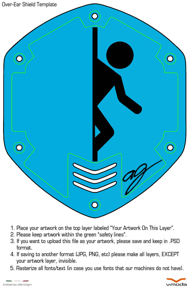
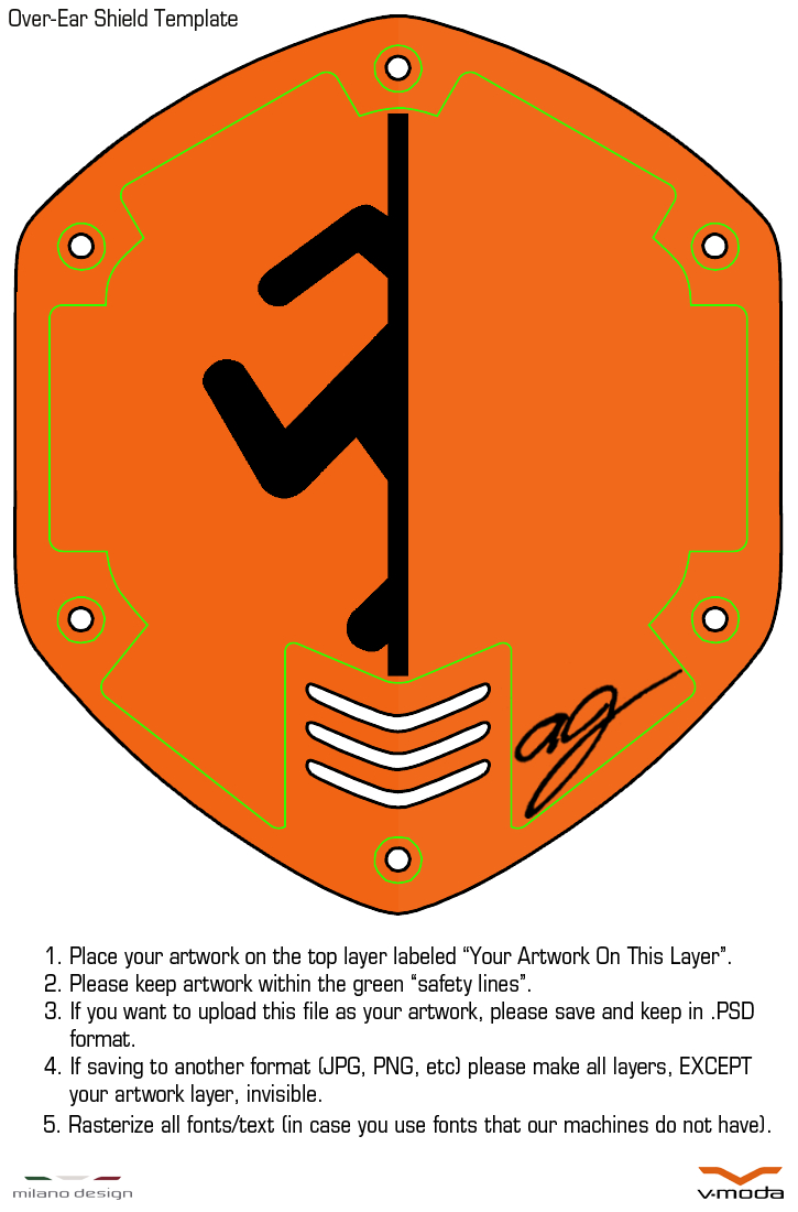
To help all those new ones rushing on their new designs, here's my guide: 
 
 
  • Go here to download the Adobe Illustrator CS6 trial.
  • Once it is downloaded/installed, open the image you want to edit in it.
  1. This means going to the file, right clicking..
  2. ... selecting "Open with"...
  3. ... and choosing to open with Adobe Illustrator CS6.
  • Next, click on the image once you have opened it in the program.
  • On the top you should see a button called "Image Trace"..
  1. Press this button, and it should automatically convert it to a vector-based, B&W image..
  2. ... next, just to the left of where the "image trace" button was, click on the small, square list icon...
  3. ... Make sure to open the advanced settings, and change them, up or down, until your image looks right..
  4. HINT: Changing the "Paths" value will mean that the vector will try to copy the original image more tightly.
  5. HINT: Changing the "Corners" value will make any edges and corners appear sharper, rather than rounded.
  6. HINT: Changing the "Noise" value will alter how much of the image is ignored. If you have a small line that you don't want in your logo, make the value larger, so it only includes thicker lines.
  7. HINT: To help with making sure its perfect, change the zoom-in percentage on the bottom left to 150% or higher, so you can see all the details.  
  • Lastly, once everything is ready, save it as an AI file, and when it asks if you want to "include PDF" or something, say yes.
 
 
Aug 8, 2012 at 7:07 PM Post #77 of 1,269
Quote:
Ok... so I'm officially confused.
 
Does the custom image have to be made in Photoshop? (I have no idea what I'm doing with it)  The white background of my image is actually white... not clear/blank.  Will this cause an issue?  Should I worry about DPI?
 
The image I intend to use is below.  The one with black text will be submitted as required, the white text is how I intend it to appear on the matte black shields.
 

[/snip images]

 
No, the image can be made in other programs too, but only .EPS, .TIFF, .AI, .PSD, .BMP, .PNG or .JPEG formats are accepted.
 
No, it's supposed to be white (black and white images only).
 
Yes, the DPI is required to be 300 PPI/DPI or above in order for the image to look nice from the engraving machine.
 
Aug 8, 2012 at 7:19 PM Post #78 of 1,269
Quote:
Originally Posted by BRSxIgnition /img/forum/go_quote.gif
 
 
  1. ... next, just to the left of where the "image trace" button was, click on the small, square list icon...
  2. ... Make sure to open the advanced settings, and change them, up or down, until your image looks right..
  3. HINT: Changing the "Paths" value will mean that the vector will try to copy the original image more tightly.
  4. HINT: Changing the "Corners" value will make any edges and corners appear sharper, rather than rounded.
  5. HINT: Changing the "Noise" value will alter how much of the image is ignored. If you have a small line that you don't want in your logo, make the value larger, so it only includes thicker lines.
 
NEXT
 
  • Open the AI file you saved in Illustrator earlier..
  • If you don't need to change anything else, save it as a JPG, the resolution should be over 1080p, and the dpi/ppi should also be extremely high. 

 
I don't see these options with the trial version on Mac OS X.


As I mentioned earlier, Val stated:
Quote:
Vector images can sometimes become distorted in photoshop, and that as long as you send in the AI file to us, the image will come out fine and clean in the engraving process.

In other words, if you create something in Illustrator and make it into a vector, then import it into Photoshop, the image will be distorted/not accurate.
 
Based on this, and my previous experiences/frustrations, one should make serious logo changes in Photoshop, GIMP, etc. first, then if you wish to create the line drawing in Illustrator, do that second.
 
Aug 8, 2012 at 7:26 PM Post #79 of 1,269
Quote:
 
No, the image can be made in other programs too, but only .EPS, .TIFF, .AI, .PSD, .BMP, .PNG or .JPEG formats are accepted.
 
No, it's supposed to be white (black and white images only).
 
Yes, the DPI is required to be 300 PPI/DPI or above in order for the image to look nice from the engraving machine.

 
Thanks for your help!  I found how to adjust DPI in Preview (yes... I made mine from scratch in Preview... feel free to laugh) and did so accordingly.  Mine is all straight lines so I'm not sure if it would actually matter, but there you go.  If the white background doesn't matter and I have it saved in both PNG and JPEG formats I'm assuming I'm good to go...?
 
Aug 8, 2012 at 7:32 PM Post #80 of 1,269
Quote:
 
Thanks for your help!  I found how to adjust DPI in Preview (yes... I made mine from scratch in Preview... feel free to laugh) and did so accordingly.  Mine is all straight lines so I'm not sure if it would actually matter, but there you go.  If the white background doesn't matter and I have it saved in both PNG and JPEG formats I'm assuming I'm good to go...?


Wow, Preview? That's impressive. :xf_eek:
 
Yup it looks like you're good to go.
 
Aug 8, 2012 at 7:46 PM Post #81 of 1,269
Quote:
Wow, Preview? That's impressive. :xf_eek:
 
Yup it looks like you're good to go.

 
Yep, Preview.  I knew I just wanted to do my name, but didn't want to stick with some pre-made font.  I started with an "F" in Word, took a screenshot, imported into Preview, cropped, and then copied-pasted to victory.  I honestly thought it was a pretty ridiculous way to go about it, but everything was coming together so I stuck with it.
 
Thanks again for your help... and for not completely shattering my ego. 
smily_headphones1.gif

 
Aug 8, 2012 at 8:11 PM Post #82 of 1,269
Quote:
As I mentioned earlier, Val stated:
In other words, if you create something in Illustrator and make it into a vector, then import it into Photoshop, the image will be distorted/not accurate.
 
Based on this, and my previous experiences/frustrations, one should make serious logo changes in Photoshop, GIMP, etc. first, then if you wish to create the line drawing in Illustrator, do that second.

Sorry - fixed guide now. I didn't know.
 
Aug 8, 2012 at 10:40 PM Post #83 of 1,269
Just completely finished mine, this is how it should look with the gunmetal background (Text and stuff in white)
 
Just worried I may have made it a bit too complex, and may not look as good irl :s
 
and how do i check DPI on a PSD?
 
Aug 8, 2012 at 11:16 PM Post #84 of 1,269
Quote:
Just completely finished mine, this is how it should look with the gunmetal background (Text and stuff in white)
 
Just worried I may have made it a bit too complex, and may not look as good irl :s
 
and how do i check DPI on a PSD?
 
[/snip image]

 
I think you can Save As, and the dialog box will display the PPI/DPI.
 
Aug 11, 2012 at 5:51 PM Post #88 of 1,269


First image was traced manually in Photoshop from a Modular Eight Sided Origami Star picture.
 
Second one I had decided to take a 3D approach of the first image after seeing that 3D Linsanity Basketball shield design on Facebook so i tilted the image in illustrator and did some extra work on it.
 
Third one I found from a tatto website, but i edited it a bit.
 
Fourth one, I'm a fan of this game series and before hand i was looking to make an X out of sword slash effects, but i couldn't really find any good ones so i chose this after finding the image and applying a black gradient on it with some Auto-Sharpening after since it did look just a tad blurry beforehand.
 
Fifth one, Another shuriken image i found that had already been taken in a tilted perspective so i just traced it manually and did the same stuff i did with the second image after it had been tilted in illustrator.
 
Last but not least, the Sixth One, the fifth image (Without the gradient layer) made me think of a demon wing and an angel wing so i looked up for an image like this one and had it traced through Adobe Illustrator (The only one since i didn't like the results of a few other images i tried tracing in Illustrator). I did read that its probably distorted from being imported into Photoshop, but i still wanted to try and show it and it doesn't really look that bad anyway in my opinion. The only thing is would there be a problem trying to make all the feathers on the angel wing side?
 
Aside from that what are your opinions on each?
 
Edit: Just made a little adjustment to image #3 where the bottom right piece from the center of the image was a little choppy, but its fixed now.
 
Edit #2: Fixed all remaining errors i found to image #3.
 
Aug 11, 2012 at 6:12 PM Post #89 of 1,269
Quote:


First image was traced manually in Photoshop from a Modular Eight Sided Origami Star picture.
 
Second one I had decided to take a 3D approach of the first image after seeing that 3D Linsanity Basketball shield design on Facebook so i tilted the image in illustrator and did some extra work on it.
 
Third one I found from a tatto website, but i edited it a bit.
 
Fourth one, I'm a fan of this game series and before hand i was looking to make an X out of sword slash effects, but i couldn't really find any good ones so i chose this after finding the image and applying a black gradient on it with some Auto-Sharpening after since it did look just a tad blurry beforehand.
 
Fifth one, Another shuriken image i found that had already been taken in a tilted perspective so i just traced it manually and did the same stuff i did with the second image after it had been tilted in illustrator.
 
Last but not least, the Sixth One, the fifth image (Without the gradient layer) made me think of a demon wing and an angel wing so i looked up for an image like this one and had it traced through Adobe Illustrator (The only one since i didn't like the results of a few other images i tried tracing in Illustrator). I did read that its probably distorted from being imported into Photoshop, but i still wanted to try and show it and it doesn't really look that bad anyway in my opinion. The only thing is would there be a problem trying to make all the feathers on the angel wing side?
 
Aside from that what are your opinions on each?

 
The angel wing feathers should be fine I think:
The details on this design are pretty fine.


I personally really like #3 the most, the keyblades second most, and the angel/devil wings third most.
 
Aug 14, 2012 at 11:53 AM Post #90 of 1,269
I'm a huge hockey fan with absolutely no artistic skills and here's how I went about designing my shields (avatar pic has them in it).
 
Last year, Artem Anisimov of the NY Rangers caused a minor fracas in a game with a goal celebration when he dropped to one knee and used his stick to simulate a sniper aiming at the goaltender.  It started a mini brawl on the ice and was featured on HBO's 24/7 program when he apologized to teammates in-between periods of the game.
 
Call it immaturity or what you will, but I thought it was an awesome, almost video-gamey way to celebrate a goal.  I found an image of the celebration and went to fiverr.com where I paid someone $5 to turn it into a silhouette for me.
 
I submitted the silhouette to V-Moda and chose the matte black shields for my original Crossfade LP's.  The shields and wings arrived yesterday and they look amazing.  I'm thrilled with how they came out and my design was done with a few minutes of web surfing and five bucks!  :)
 

Users who are viewing this thread

Back
Top