Why stick with Apple's design? Well I do know the click wheel is really nice to use, but can't you guys think of any other designs? Don't get me wrong though. I just don't want other people seeing Fiio as another chinese knockoff of some sort.
Why stick with Apple's design? Well I do know the click wheel is really nice to use, but can't you guys think of any other designs? Don't get me wrong though. I just don't want other people seeing Fiio as another chinese knockoff of some sort.
Why stick with Apple's design? Well I do know the click wheel is really nice to use, but can't you guys think of any other designs? Don't get me wrong though. I just don't want other people seeing Fiio as another chinese knockoff of some sort.
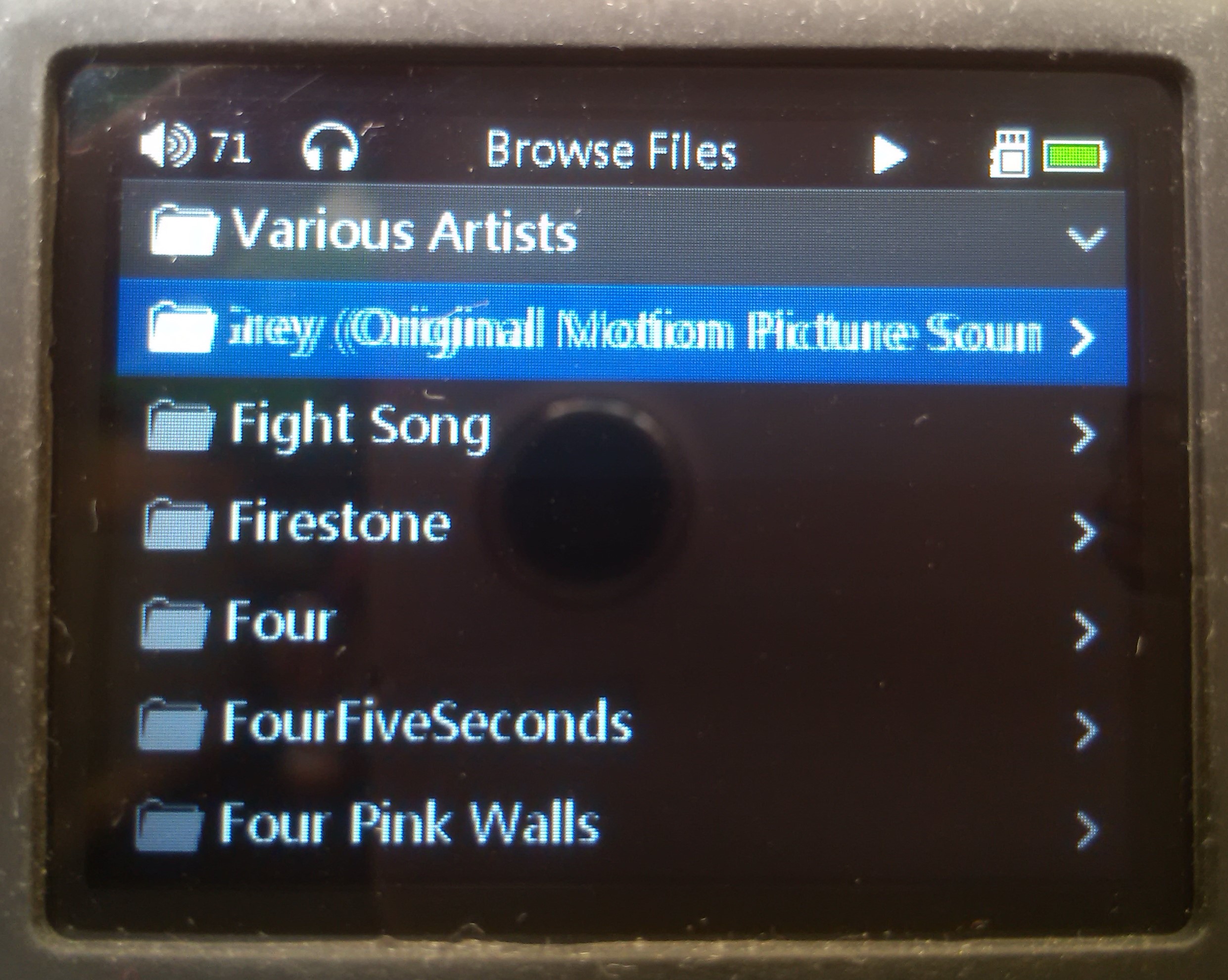
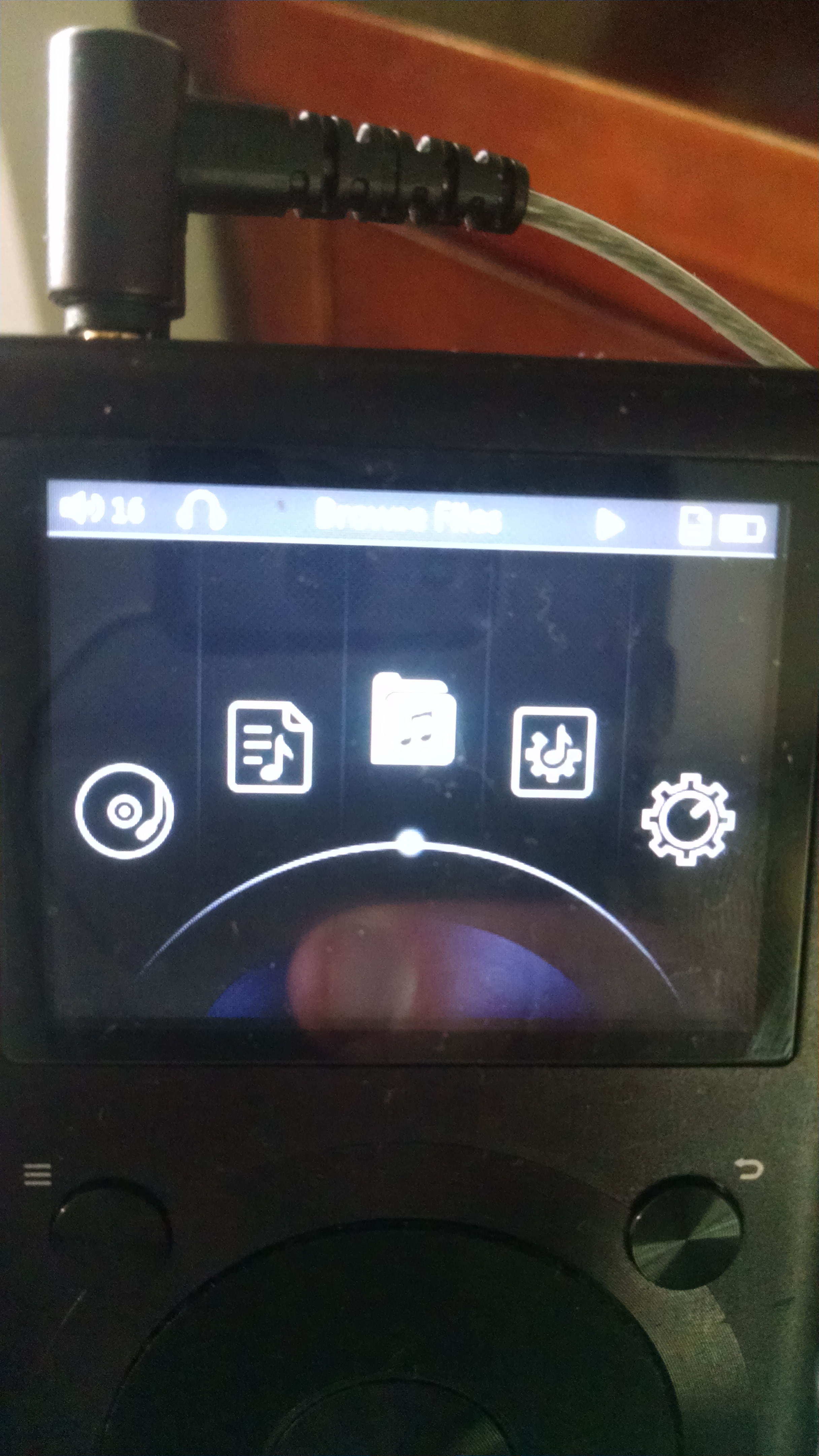
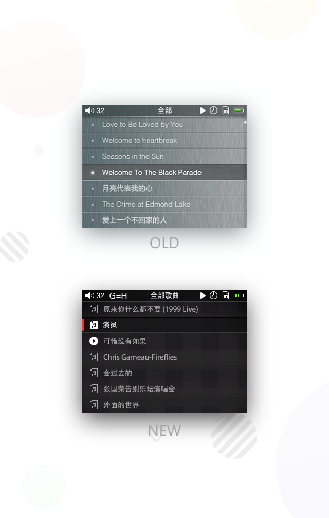
Let's put " what people think" aside. Can you think of any other keys other than click wheel for navigation purpose? Please don't think about touchscreen. The X1 is a budget friendly DAP with high resolution SQ (keep in mind, this DAP will focus on SQ) so no fancy unnecessary features please!
Enough for IEMs since most of them are low impedance. For anything more than that, you should pair it with a more powerful external amp for more power.
It's designed for IEMs; I'll use my ASG-1 as an example. In a quiet environment, it needs less than 5/100 on Windows volume control from my Acer laptop, and this one can get the HD600 loud enough at 65/100 (just sounds too bassy and dark, bass decay noticeably less polished, etc, but tolerable). On my SGS3 I only use about 1/5 of the volume bar (louder and the sounds get darker, with some roughness in the mid-treble) and roughly the same setting on the iPad2 but sometimes I kick it up a bit since it doesn't distort the same way.
The ASG-1 however is 32ohms,121db @ 1mW, so that's very efficient - plus it's a single driver with no crossover anywhere. 16-ohm, multiple-driver IEMs however might present a complex load but they promise low impedance, so that's a good start. Of course, the rest of the circuit matters too, and we'll just have to see if they pull this off. I haven't heard of the Clip having issues with all such IEMs (some, of course), so a DAP with more power and designed specifically to play high-res - not just the digital section but with due consideration to the sort of earphones listeners of such material are likely to use it with - isn't likely to be something to worry about unless they got blinders and focused too much on the role of the low impedance output.
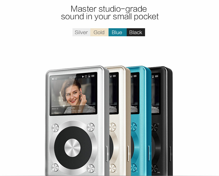
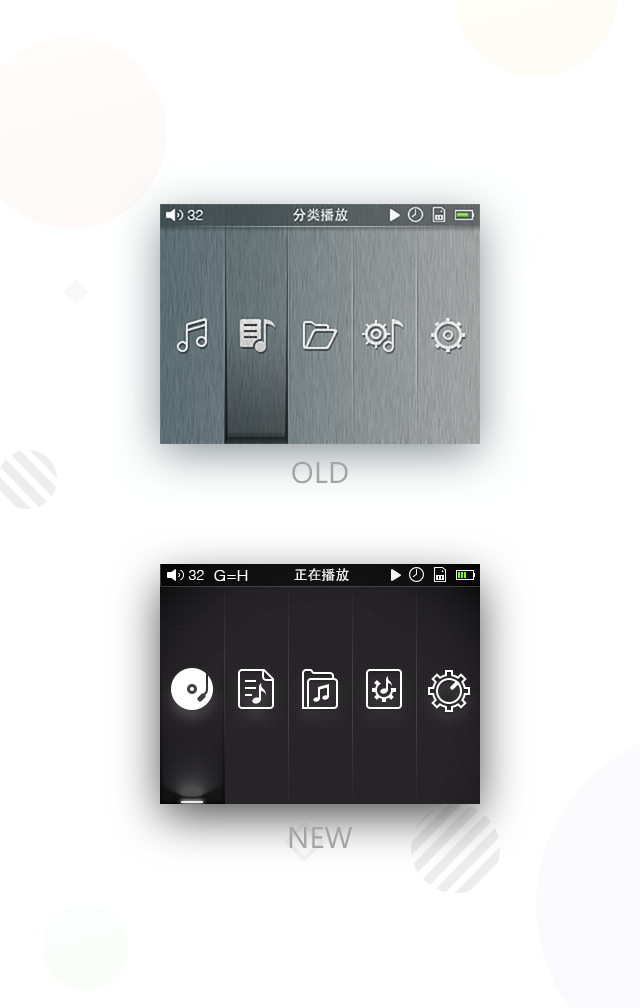
B or C's deign, but C's color scheme. I prefer B's tall screen. I think when it comes to design that uses wheel, you best bet is stick with Nano4's design. Note that this is the design that Apple finally arrived at after 3 iteration (remember that Nano3 used a short and fat form factor and Apple ditched it? They must found the sales and customer feedback to be unfavorable. So design A is right out of the window)
With the color scheme, try not to be flashy! Look at the the trend over the years, from Sony's extremely flashy and complicated design to Apple's emphasis on simple and elegant which now dominate the portable devices. You may observe the reaction to HiFiman's HM700's appearance and the design philosophy behind it!
Now with the button layout I notice you used a "X" shape, maybe to coincide with the name X1. It's not something people won't get used to at all. But again my opinion is that you are taking a huge risk by being only slightly counter-intuitive. If you don't have something better, stick with the best out there - Nano4 and Sansa's tried and true button layout. These big companies especially Apple who basically monopolized the market through the sheer design/usability of Ipod Classic knows what's at stake and the best way to do it. I call "X" counter intuitive because humans are used to think in "+" way, think about up down left right, north south east west, the cross we use to aim a gun...
B or C's deign, but C's color scheme. I prefer B's tall screen. I think when it comes to design that use wheel, you best bet is stick with Nano4's design. Note that this is the design that Apple finally arrived at after 3 iteration (remember that Nano3 used a short and fat form factor and Apple ditched it? They must found the sales and customer feedback to be unfavorable. So design B is right out of the window)
With the color scheme, try not to be flashy! Look at the the trend over the years, from Sony's extremely flashy and completed design to Apple's emphasis on simple and elegant which now dominate the portable devices. You may observe the reaction to HiFiman's HM700's appearance and the design philosophy behind it!
Now with the button layout I notice you used a "X" shape, maybe to coincide with the name X1. It's not something people won't get used to at all. But again my opinion is that you are taking a huge risk by being only slightly counter-intuitive. If you don't have something better, stick with the best out there, Nano4 and Sansa's tried and true button layout. These big company especially Apple who basically monopolized the market through the sheer design/usability of Ipod Classic knows what's at stake and the best way to do it. I call "X" counter intuitive because humans are used to think in "+" way, think about north south east west, the cross we use to aim a gun...
This site uses cookies to help personalise content, tailor your experience and to keep you logged in if you register.
By continuing to use this site, you are consenting to our use of cookies.


")

