Pen-Fi (FPs, RBs, BPs, etc...) [56k Warning]
Feb 26, 2014 at 8:12 PM Post #2,461 of 2,804
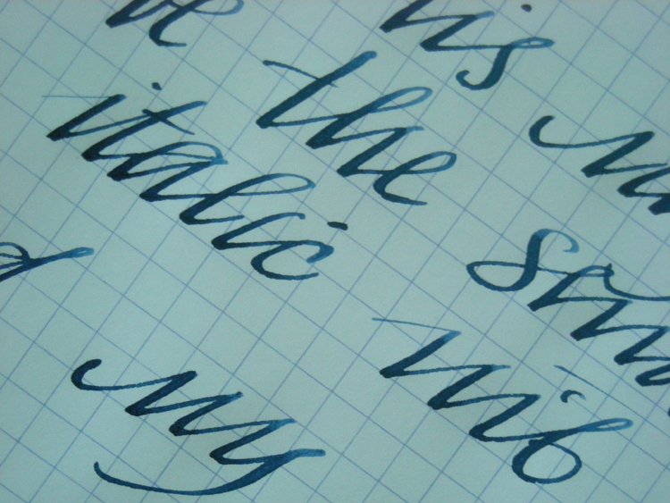
  I think you are right about that the step needs to be in a good distance from the grip section. You just need to know how high do you normally hold your pens and you'll have an idea if it would bother you or not.
For me the first issue is aesthetics with most pens with a big step. The Metro is still a nice one though.
 
I mean, like these custom pens:
The proportions are just a bit off, and the step is not for making it more streamline or anything...I'm not really fond of these.
They can be comfortable though.

 
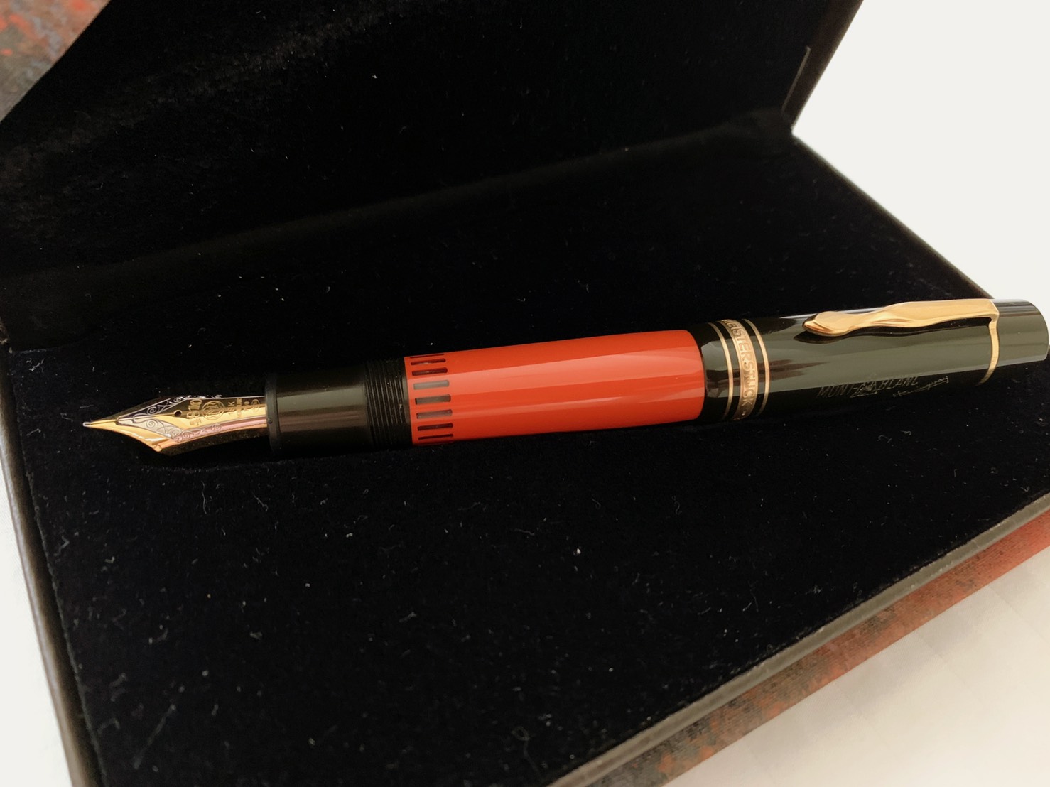
Well, this one above ^^ has a long grip section but its too narrow... the entire design is out of proportion as you say.
 
I'd prefer something along these lines:


Its all made in one piece, and is using a Pelikan nib unit. That's the best part about custom pens. There's an endless choice of materials, overall design, and you can add your own modifications. In the end the pen would be unique to your needs.
 
(The image is not mine).
 
Feb 27, 2014 at 10:04 AM Post #2,462 of 2,804
The proportions, I think, definitely have the most to do with it.  A good excuse to take some pens out!
 
Here are a few pens I have at work that have the little "step" that we're talking about:


In order from left to right, Lamy 2k (just because it's here, although it doesn't have a "step"), Parker 75, Sheaffer Triumph 444, Lamy Studio, and Lamy CP1.  I tried to line up the "steps" as close as possible, to use as a reference.  And below, a close-up picture of their steps (same order and a nice excuse to test the new "macro" lens on my iphone):


You can see that the CP1's step is much closer to the tip of the nib and this is the only one of the 5 that bothers me (even though the actual steps are similar in height).  My thumb rests right on top of it when I'm holding it normally.  The triumph actually has ears and a step, but no problem holding it comfortably.
 
Mar 18, 2014 at 6:45 AM Post #2,463 of 2,804


Been using it for about a year now, loving it even more.
 
Apr 8, 2014 at 3:53 AM Post #2,465 of 2,804
I'm looking forward to bringing some Rhodia Ice Graph tablets home soon. Long used the traditional Orange cover but in the last few years been enjoying the Black covers. I'm curious about the dirt impact on the White, though...
 
rhodia-ice-1024x1024.jpg

 
http://rhodiadrive.com/2014/04/03/rhodia-ice/
 
Apr 8, 2014 at 6:58 AM Post #2,466 of 2,804
I need to find A5 dotpads. So wanted to try them out.
 
Apr 8, 2014 at 8:28 AM Post #2,467 of 2,804
  I'm looking forward to bringing some Rhodia Ice Graph tablets home soon. Long used the traditional Orange cover but in the last few years been enjoying the Black covers. I'm curious about the dirt impact on the White, though...
 
[...]

Ooo, those are pretty! Though I agree with you about the dirt, and they're not the sort of thing I go Rhodia for (top spiral, dot grid).
 
Apr 8, 2014 at 3:08 PM Post #2,468 of 2,804
smiley_thumb.gif
 When available I'm gonna run with 'em, see how they work out. Should look really nice inside my portfolio to compliment the Black covered notepad. 
 
May 21, 2014 at 10:17 AM Post #2,470 of 2,804
Are there any relatively inexpensive nib options for a Lamy Safari pen that I can use for calligraphy-like writing?

i.e. a nib to write something similar to this:
sorowka_closeup.jpg

 
Yes there are, and really easy to switch out too.  Lamy sells italic nibs in 1.1, 1.5, and 1.9mm widths.  They cost around $13 from Goulet, but other places may be cheaper.
 
Goulet also has some videos showing you how to swap out nibs on the Lamy pens.
 
May 25, 2014 at 4:30 AM Post #2,471 of 2,804
I got a Lamy Safari Fine the other day - my first FP. I'm loving it, but I find that, especially on certain paper, it flows too fast and bleeds a touch/ends up with too much ink on the paper. Is this correctable by different ink? Or do I need to get the EF nib? Currently I'm just using the Lamy Blue cartridge it came with.
 
May 27, 2014 at 5:00 AM Post #2,472 of 2,804
  I got a Lamy Safari Fine the other day - my first FP. I'm loving it, but I find that, especially on certain paper, it flows too fast and bleeds a touch/ends up with too much ink on the paper. Is this correctable by different ink? Or do I need to get the EF nib? Currently I'm just using the Lamy Blue cartridge it came with.

 
Personally I think it's easiest to correct by switching paper.
 
You might have to experiment a lot. The choice of paper is never as simple as making a beeline for the finest paper, or those marked as FP-friendly or whatever -- you could end up with reasonably cheap, low end paper that just happen to work out for the pen. I now use several different kinds of paper to cater for all of my pens and pencils.
 
I would try that first before going for the EF nib.
 
May 27, 2014 at 10:25 PM Post #2,473 of 2,804
  Personally I think it's easiest to correct by switching paper.
 
You might have to experiment a lot. The choice of paper is never as simple as making a beeline for the finest paper, or those marked as FP-friendly or whatever -- you could end up with reasonably cheap, low end paper that just happen to work out for the pen. I now use several different kinds of paper to cater for all of my pens and pencils.
 
I would try that first before going for the EF nib.

 
Thanks for your insight. I think you are right - when writing on my notepad, I don't have any troubles. It was only when using scraps of printer paper to scrawl some notes down that I was having problems. I'll use my notebook paper in future.
 
Jun 17, 2014 at 11:46 PM Post #2,474 of 2,804
Are there any relatively inexpensive nib options for a Lamy Safari pen that I can use for calligraphy-like writing?


Yes there are, and really easy to switch out too.  Lamy sells italic nibs in 1.1, 1.5, and 1.9mm widths.  They cost around $13 from Goulet, but other places may be cheaper.

Goulet also has some videos showing you how to swap out nibs on the Lamy pens.

Indeed! There was a 20% sale at a local bookstore and I grabbed a 1.1 mm nib. Maybe 1.5 would have been a bit better, but this will do.


How do you all write a capital "T" in cursive? I'm re-learning my cursive capital letters, but "T" (as well as "F," "S," and "G") has always been a bit tricky for me.

^ The "T" in "Twenty" looks nice on the top row, but it looks terrible in "This" right below it (it looks like "Ghis" or something). The style of "T" to the left of it looks nicer with the smaller font I think.
 
Jun 23, 2014 at 4:41 PM Post #2,475 of 2,804
do any of you own or have you used a Sailor 1911?
 
I'm considering purchasing one but I'm a bit concerned about nib replacement (if it needed it).
 
my understanding is that the nibs either cannot be replaced, or it's difficult and expensive.
 

Users who are viewing this thread

Back
Top