


So here it is......... Analogue II, based off FW 2.4. This one's done me thinks.
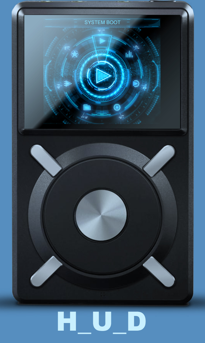
I've tried to touch on everything in the theme including the dots in the fast picking screen. I've even added a missing album art image, it's an analogue oscilloscope waveform. Check out the lock screens.
DOWNLOAD LINK
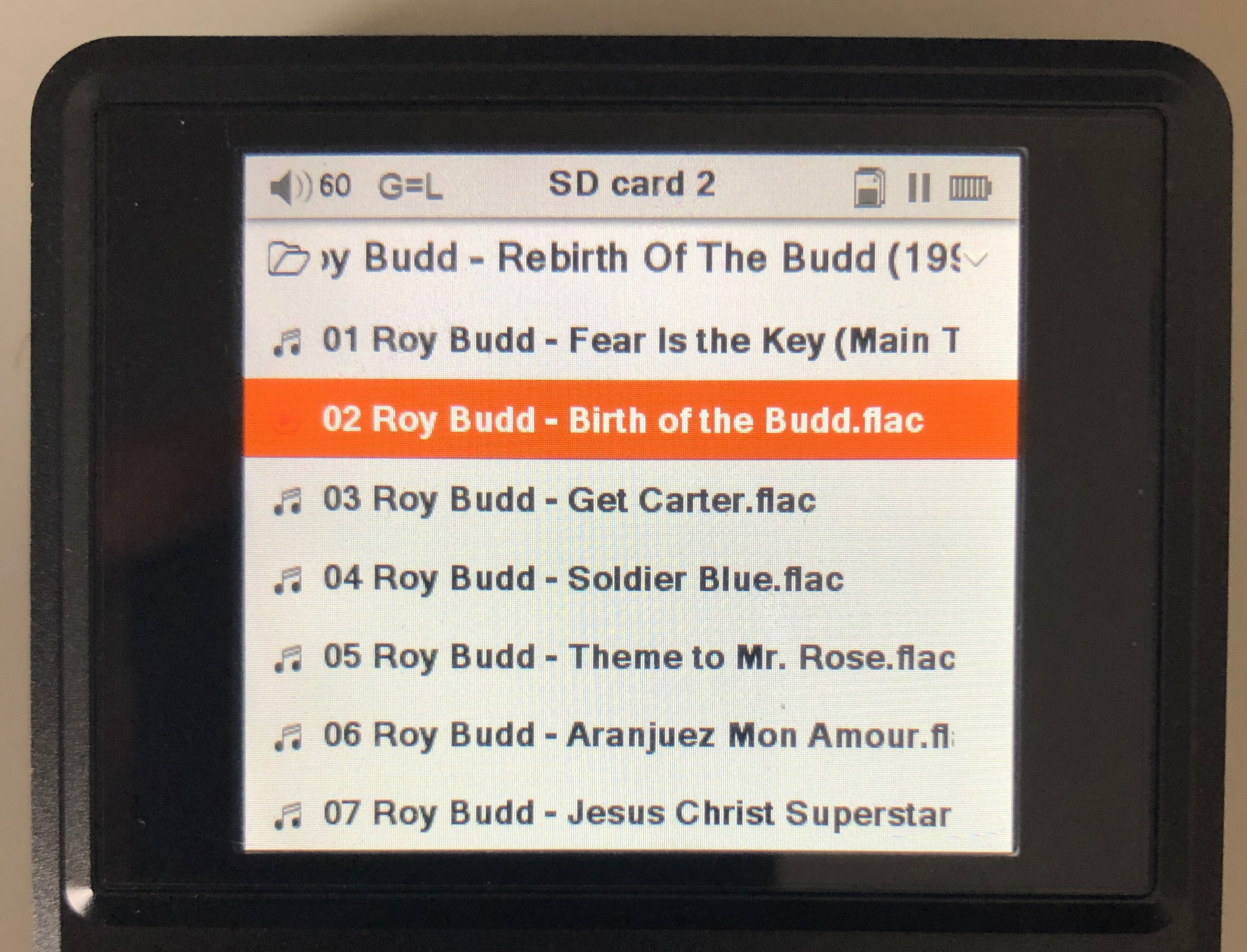
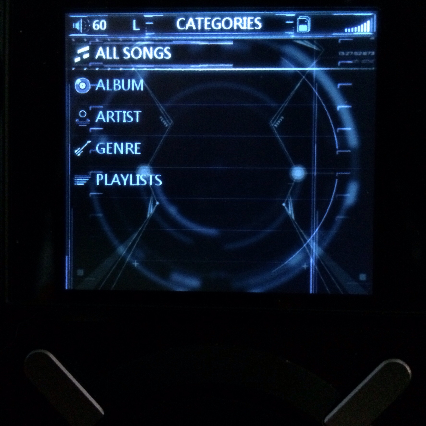
I haven't changed any of the icons but modified the colour of almost every icon from FiiO. I may go back to it and tweak the shortcut bar, when I get more time. My usual caveat of these pictures don't show the subtleties of the theme.
Enjoy!

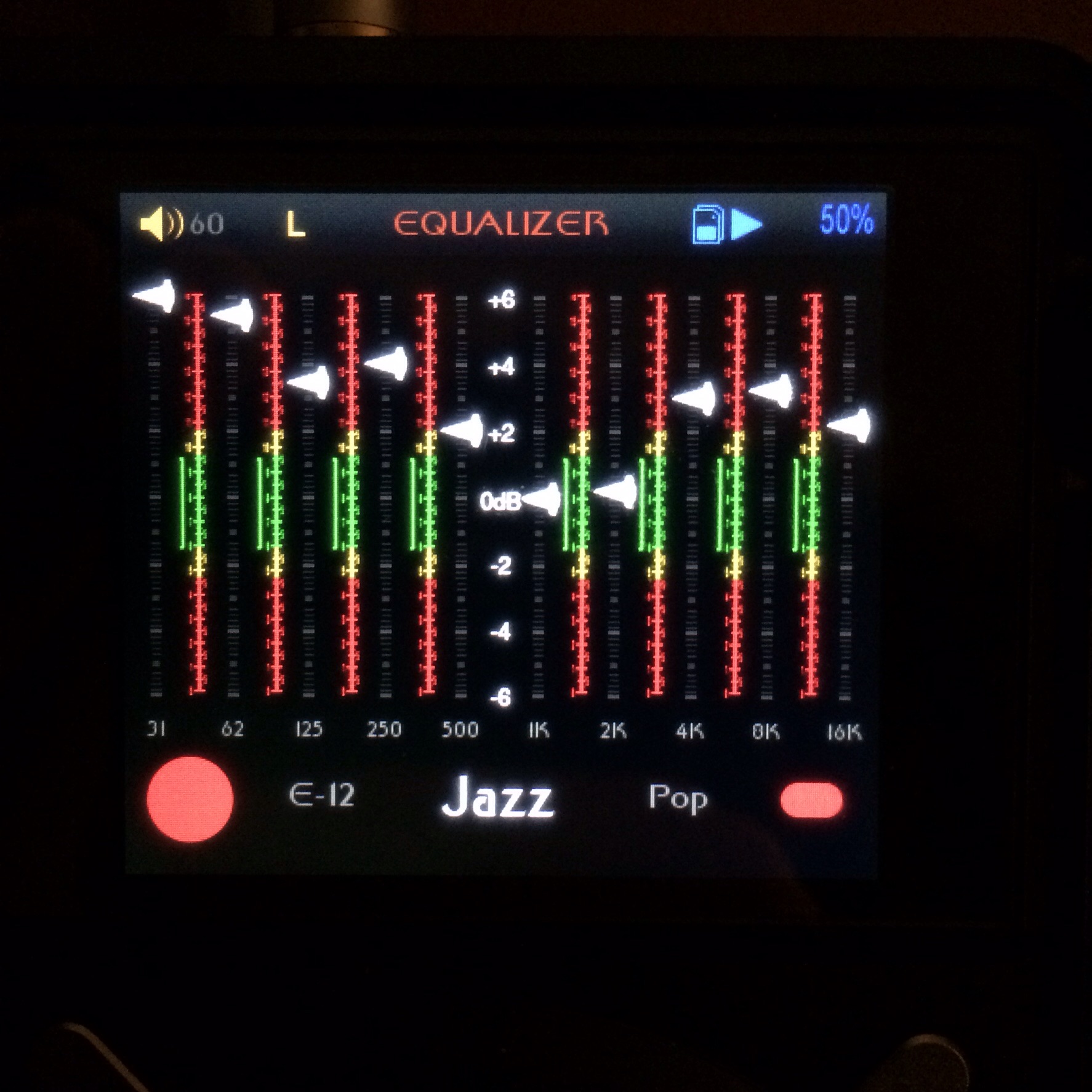
One thing of note is the glow below the slider of the active EQ button can not be masked when you drag it to the bottom. I tried, but again the theme is so simple it does not allow us to change such simple things. Oh well. If enough people say it sucks then I'll lose it.
Awesome work man !!
appreciate your effort here and the exquisite design
")
")

