Fiio X5 - Custom/Modded firmwares
Feb 15, 2015 at 8:00 AM Post #1,366 of 2,614
  I have a strong distaste for busy themes too. But I find this one to be pretty much spot on in the balance between busy and functionality


 Your latest theme shows the viewer in smaller size where they are 3 times in 3 ways at the same time...... Is that not busy?
 
Honest question Theo. I'm new so I don't know what busy is?
 
Feb 15, 2015 at 8:08 AM Post #1,367 of 2,614
 
 Your latest theme shows the viewer in smaller size where they are 3 times in 3 ways at the same time...... Is that not busy?
 
Honest question Theo. I'm new so I don't know what busy is?

A busy theme would mean that the user doesn't have a clear indication of what they have selected, or what has been the previous selection, or the next selection. Elements which serve no real purpose, but draw focus away from what should be the focus point
 
Feb 15, 2015 at 8:53 AM Post #1,369 of 2,614
I have 6 versions of the meter with about 20 pixels of difference between them. Yup, it was tough. Lol!

When we go to edit our footage we have a saying....... 'Slaughter your babies', meaning if it doesnt contribute then get rid of it.


 First thing i saw was the edge and imagined the struggle.
OCD knows OCD. I woulda thought it was 12 versions with 10px diff
biggrin.gif

 
I'm getting the feeling I do a "busy" theme
deadhorse.gif

 
i keep my room clean because I got OCD
Folks say
"Hey that must be hard keeping everything neat and tidy"
No. Waiting until things are messy requires more attention and time than maintaining "clean"
I'm a super lazy dude. Looks the opposite but they clean more than me without realizing it...just net time spent which is how I see the world. Black and white, seconds,minutes,hours,days....and on
 
My theme has no indication except the screen and a text that would be axed if I could do it smoothly. I'm not catering to the simple. I get it though and I don't have any strong distaste for and GUI since I know how much time it takes so I respect the work while preffering my own
 
I also loved the Matrix theme for 1 day then was done. I enjoyed the awesome rain of characters more than listening to music.
 
I wanna know how much battery I got and an EQ that is as exact as possible and do the rest from not infront of my face.
 
Variety.....it's the benefit to the folks downloading these. They got different things to choose from. Seems like winners all around.
 
I slaughtered 7 days worth of babies yesterday and that sucked...they sucked but I made them so....a week of work gone. Oh well
 
Feb 15, 2015 at 10:42 AM Post #1,370 of 2,614

 
Harmony II is complete!
 
 
  1. Improved contrast for better legibility
  2. Easier to use than before
  3. More simple and minimal
  4. Blue-Green color scheme
  5. General refinement of most elements
 
Download folder
 
Two versions: The original, and a version without my logo in the bootanimation.


Release Notes:
  1. Name of the mod/theme: Harmony II/Harmony II Fiio Logo
  2. Version of the firmware: 2.4
  3. Languages: All


Some information:
  1. Feel free to use this theme as a base for other themes
  2. I will take all feedback into consideration
  3. All graphics are made by me or are modifications of the original images by Fiio
  4. With the release of Harmony II, I will no longer be posting official updates to Oxygen themes
 
Feb 15, 2015 at 1:38 PM Post #1,374 of 2,614
Something a bit off topic I wanted to share with you guys. I was getting really annoyed everytime I had to remove the cable that came with my X5 stacking kit (the silver cable) because it wouldn't fit in my Fiio case. So I decided to do a test and see if the silver cable was at all any better than the original copper one

Tests were done using REW V5
I tested both with the bass boost on, and off. 3 tests for each cable, a total of 6 for each cable


Phase:


Even zoomed in at a 0.1dB scale, absolutely no difference
So, from these measurements, it does indeed seem like there is absolutely no difference between the audio reproduction between silver and copper cables (as I had suspected). However, to be fair, this has only been a single test, and only 1 sample of each cable type was used


To be fair the L16 isn't a silver cable, nor is it marketed as such:

The L16 Stereo Audio Cable with 1/8" TRS Connectors from Fiio utilizes PCOCC-A cable from Furukawa Electric

The interconnect cable is 2.2" long (not including the connectors) and provides Oxygen Free Copper (OFC) copper cabling for clean transmition of stereo audio.
 
Feb 15, 2015 at 1:53 PM Post #1,375 of 2,614
 
 
Harmony II is complete!
 
 
  1. Improved contrast for better legibility
  2. Easier to use than before
  3. More simple and minimal
  4. Blue-Green color scheme
  5. General refinement of most elements
 
Download folder
 
Two versions: The original, and a version without my logo in the bootanimation.


Release Notes:
  1. Name of the mod/theme: Harmony II/Harmony II Fiio Logo
  2. Version of the firmware: 2.4
  3. Languages: All


Some information:
  1. Feel free to use this theme as a base for other themes
  2. I will take all feedback into consideration
  3. All graphics are made by me or are modifications of the original images by Fiio
  4. With the release of Harmony II, I will no longer be posting official updates to Oxygen themes

Thanks, this is a very polished and pro looking theme.
 
Feb 15, 2015 at 4:37 PM Post #1,376 of 2,614
^wow that Harmony II had me flashing the firmware again
 
Feb 15, 2015 at 5:12 PM Post #1,377 of 2,614


Harmony II is complete!


  1. Improved contrast for better legibility
  2. Easier to use than before
  3. More simple and minimal
  4. Blue-Green color scheme
  5. General refinement of most elements


Download folder


Two versions: The original, and a version without my logo in the bootanimation.


Release Notes:


  1. Name of the mod/theme: Harmony II/Harmony II Fiio Logo
  2. Version of the firmware: 2.4
  3. Languages: All


Some information:


  1. Feel free to use this theme as a base for other themes
  2. I will take all feedback into consideration
  3. All graphics are made by me or are modifications of the original images by Fiio

  4. With the release of Harmony II, I will no longer be posting official updates to Oxygen themes


Can't wait to try it out!
 
Feb 15, 2015 at 5:12 PM Post #1,378 of 2,614
I'm starting to see a slight pattern with some individuals themes. For example, AsianInvasion seems to start his main menu icons with the 'Categories' menu icon and ends with the 'Browse Folders' icon reading left to right.

Mine will always start with the 'Browse Folders' icon and end with the 'System Settings' icon. I like having the four music playback icons grouped together on the left, with the 'Now Playing' dead center, and the three adjustable sub-menu icons grouped together starting from 'Equalizer' and ending with the 'System Settings' on the right.

I only bring this up because I flashed AsianInvasion's Harmony II and something felt a bit off from what I'm used to (just muscle memory). Again, different flavours. Love it. :)

Nice work on Harmony II. :cool:
 
Feb 15, 2015 at 5:21 PM Post #1,379 of 2,614
Analog tweaks incoming.


I wasn't truly happy with the functionality of the main menu meter and the battery bar. The meter felt too small and the battery bar covered up too much functional information such as displaying what EQ is active while playing a track (was caught by this a couple times). Moved the battery percentage back to its original place.


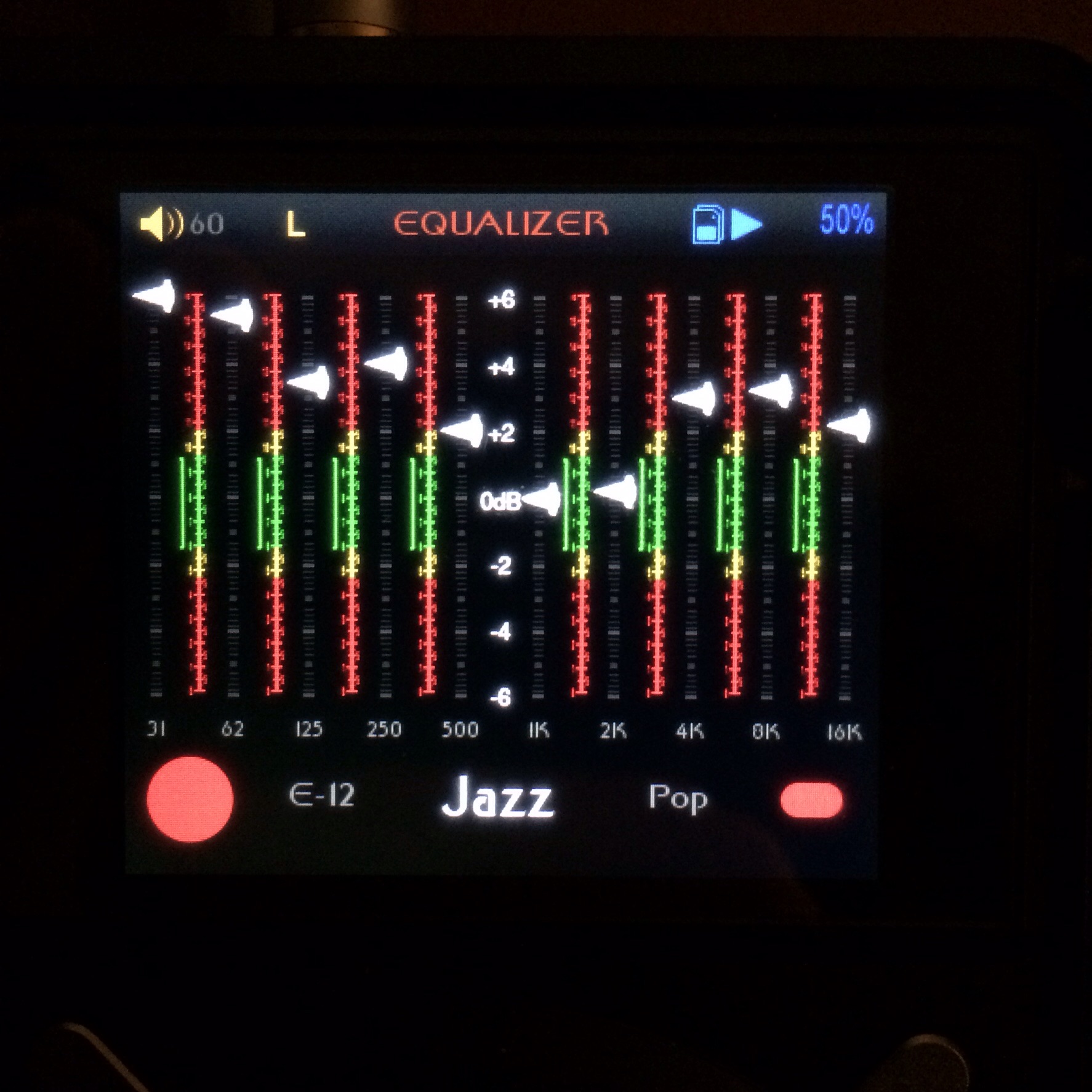
I also did an EQ that I like better than the one I did earlier with just a black BG. Check out the active button. I can not do a glow on the top as well as the bottom of the slider because the FW references the top of the slider image for the position of the slider, so it offsets the slider if I place anything above the slider.


Because I need to use a non-black image for the EQ I also am using a slight texture for other backgrounds. Nothing special but it gives the menus some flavour.


@Hawaiibadboy don't scream at me for not doing a video!!
biggrin.gif


Working on startup and shutdown animations............. I also want to change all of the icons given how nice previous modders icons have turned out, but it's always about time available.............


I agree your revised main menu is making better use of the screen real estate and it looks more symmetrical, something I personally have OCD about. I also think the battery meter being reverted to how it is normally presented is a win because I have been caught out with the meter you previously had. I don't know what it was but I was constantly eno****ering a dead battery when minutes beforehand, it was showing 50% battery life. One other thing I noticed in your original theme was the volume knob looking a bit odd. I don't know whether it was the angle it was being presented or the fact that one side looked more faded than the other. Probably more personal taste than anything. Can't wait to see the completed revised version!
 
Feb 15, 2015 at 5:32 PM Post #1,380 of 2,614
I'm starting to see a slight pattern with some individuals themes. For example, AsianInvasion seems to start his main menu icons with the 'Categories' menu icon and ends with the 'Browse Folders' icon reading left to right.

Mine will always start with the 'Browse Folders' icon and end with the 'System Settings' icon. I like having the four music playback icons grouped together on the left, with the 'Now Playing' dead center, and the three adjustable sub-menu icons grouped together starting from 'Equalizer' and ending with the 'System Settings' on the right.

I only bring this up because I flashed AsianInvasion's Harmony II and something felt a bit off from what I'm used to (just muscle memory). Again, different flavours. Love it.
smily_headphones1.gif


Nice work on Harmony II.
cool.gif

Can you guys in x5-land change the order of the icons, or just stagger the start point? Quite a few folks in x3 world have commented it would be nice to change the order so the most used icons (mostly explorer) are near the top. I tried moving some around, but the scrolling is fixed so the selections jump all over the screen.
 

Users who are viewing this thread

Back
Top