Fiio X5 - Custom/Modded firmwares
Feb 24, 2015 at 11:20 AM Post #1,548 of 2,614
 
Coming soon: Solar 2.0...


...and something new.


Have you considered keeping the highlight central and changing the icons (similar to the original Fiio, but without the half icons)?
This will avoid the jump in highlight from one side of the screen to the other. The impression will be that you are moving the strip of icons rather than moving the pointer. It might be easier on the eye.
 
Feb 24, 2015 at 1:55 PM Post #1,552 of 2,614
  One more version!! THIS IS FREAKIN' IT!!!!!!!!!!!! - and everything works............
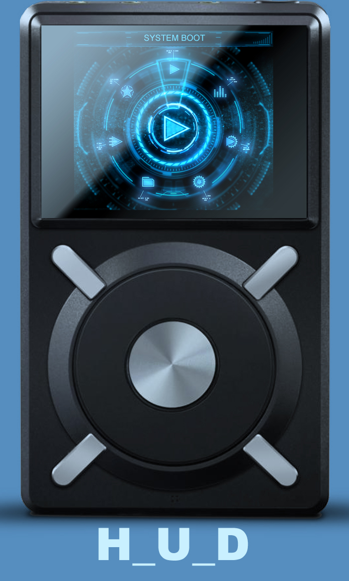
 
 
'Analogue_II_Glass'  
LINK (includes both text % and icon based battery indicators.)
 
Initially I was going for legibility but I felt something was missing after I added the glass icons so I added the glass over the main meter. 
 
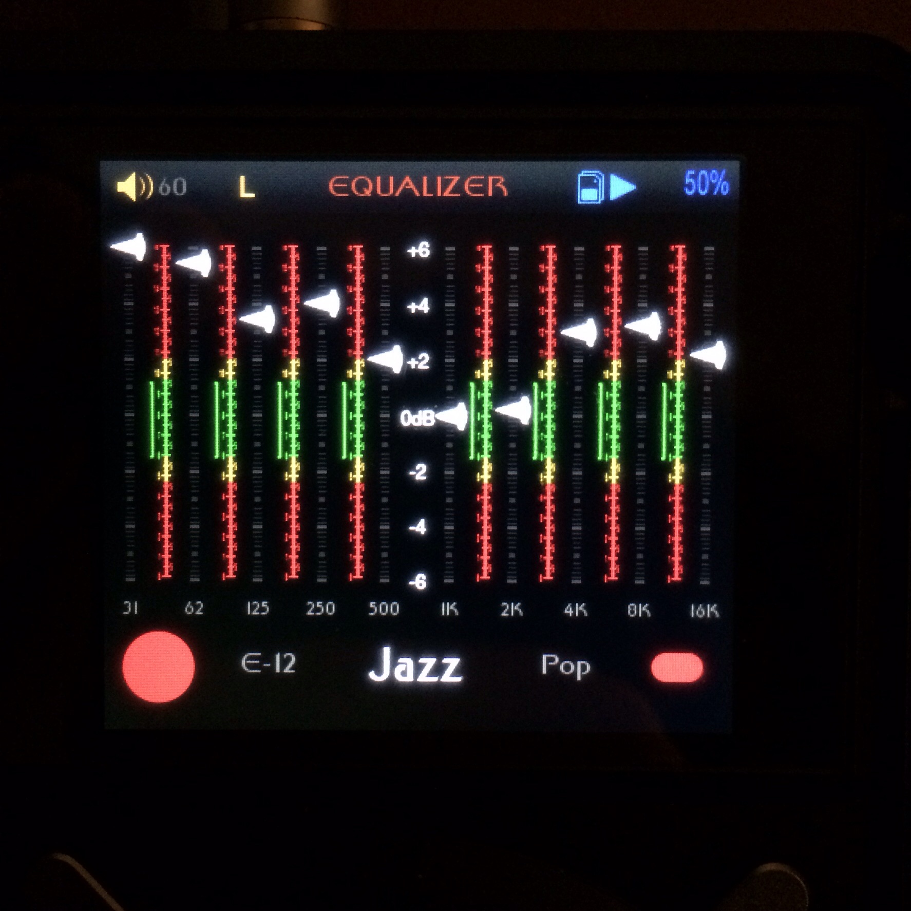
See the difference below:
 
Old

 
New


It's a subtle change but I like it. This is the one I'm rocking now, probably the most complete theme I'll ever do.
 
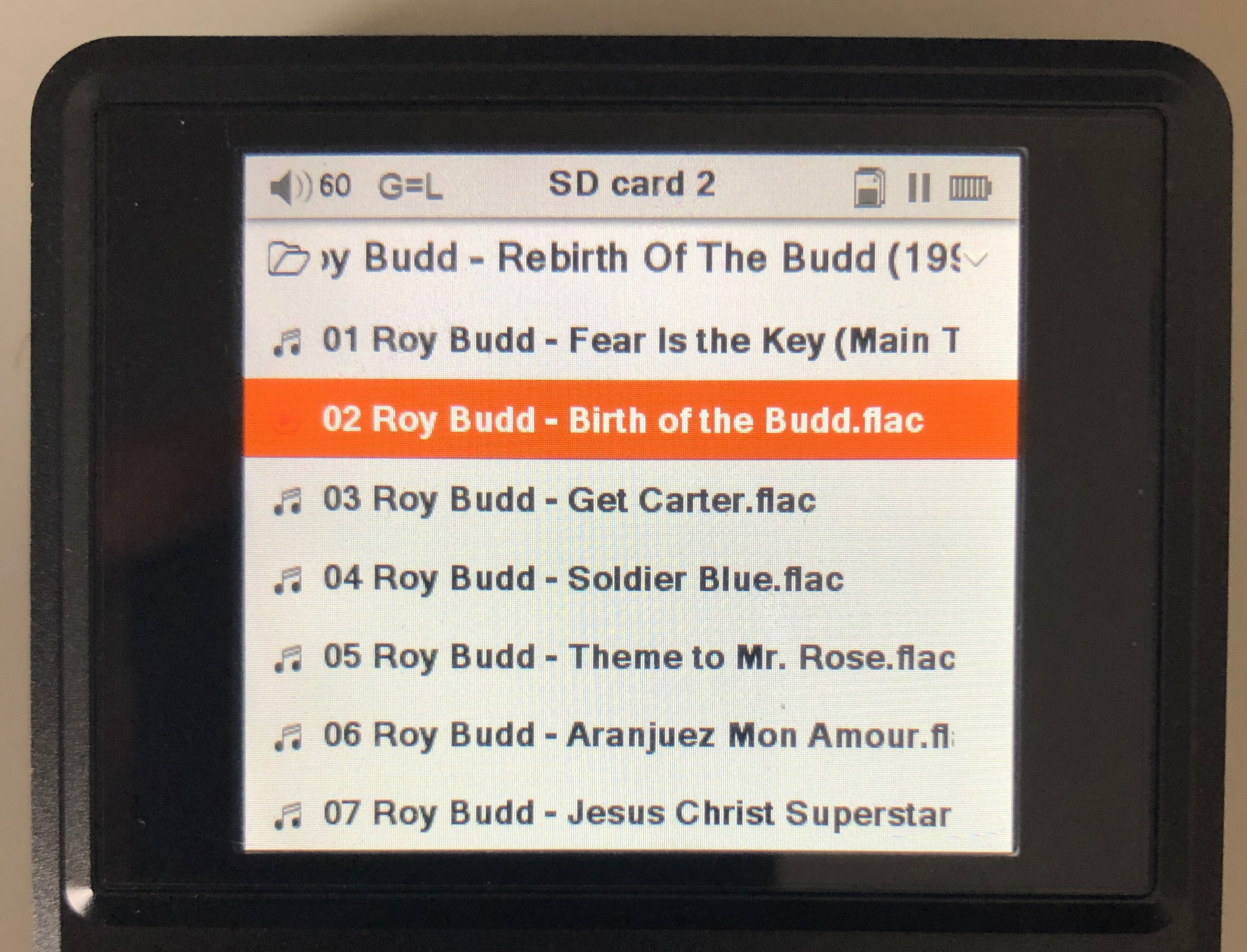
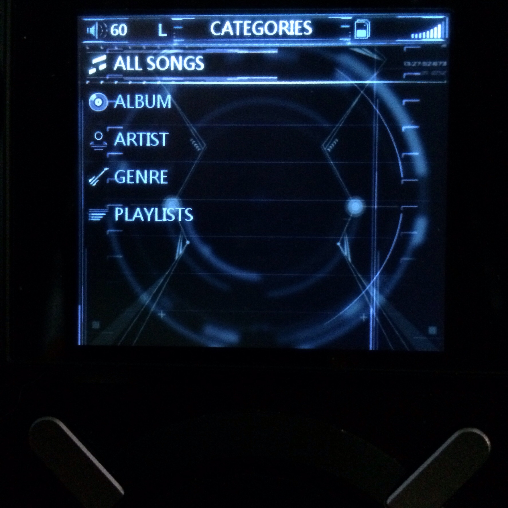
Caveat: crappy pics and all that...............
 
I'm 'Analogue-d' out.

 
I feel like this is one of those games on a restaurant placemat where you have to find the difference... and I'm failing horribly.  Can someone please clarify?  lol
 
Feb 24, 2015 at 3:55 PM Post #1,553 of 2,614
I feel like this is one of those games on a restaurant placemat where you have to find the difference... and I'm failing horribly.  Can someone please clarify?  lol


Lol.

Take a look at the blue-sh reflected light on the right of the meter face and the warm-ish reflection highlights on the left, near the browse icon and the catagories icon. There is some subtle fresnel going on all around the glass face as well in the new one.

Basically added a piece of glass over the face. It's subtle, but adds realism.

Edit: You can also see the improvement to the battery % indicator in the new one.
 
Feb 24, 2015 at 4:54 PM Post #1,554 of 2,614
Lol.

Take a look at the blue-sh reflected light on the right of the meter face and the warm-ish reflection highlights on the left, near the browse icon and the catagories icon. There is some subtle fresnel going on all around the glass face as well in the new one.

Basically added a piece of glass over the face. It's subtle, but adds realism.

Edit: You can also see the improvement to the battery % indicator in the new one.

 
Okay, yeah I see it now.  Super subtle, but those are the details that really make it special, right?  
 
Nice work, BTW.  I threw it on my X5 and I'm enjoying it so far.  :)
 
Feb 24, 2015 at 5:23 PM Post #1,555 of 2,614
Okay, yeah I see it now.  Super subtle, but those are the details that really make it special, right?  

Nice work, BTW.  I threw it on my X5 and I'm enjoying it so far.  :)


Thanks, enjoy!
 
Feb 25, 2015 at 8:07 AM Post #1,558 of 2,614
Very classy looking and I love the subtle understated details you're including.
 

Users who are viewing this thread

Back
Top