You should be glad ... Look at all the money you saved ... LOL
Think of all the cat food I could have bought!
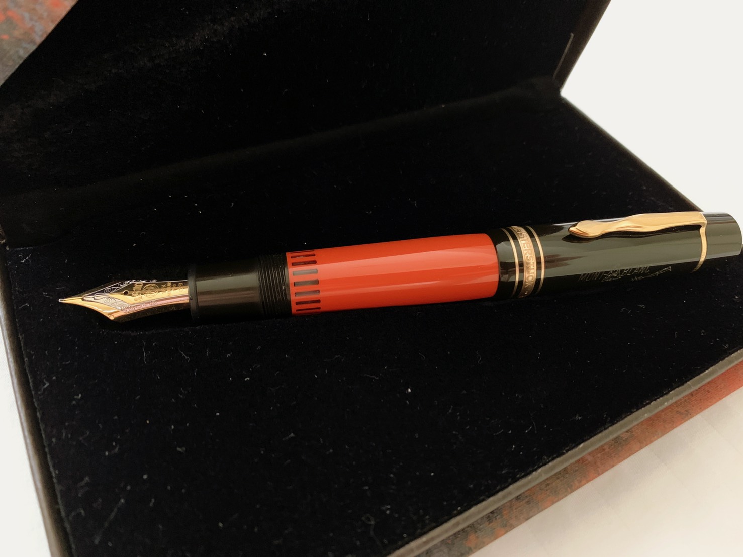
Very nicely presented, TwinQY
It's true, S.O., you are the sound of one hand clapping...
I just wanted to add, for Kobe #51, it seems that the black component is a bit more apparent on Rhodia and cheaper papers. So from a distance, it gives the impression of being slightly tealer than it really should. And on Tomoe, with a drier pen, the lighter parts of shading looks a bit grey. At its lightest, it still manages to give off the vibe of a
more saturated Shin-kai. I love it.
Another ink that looks similar in swatches online, but sans shading and sheen, and a bit more on the greener scale (by a smidgen), is Diamine's 1864 Blue Black. I say this because like #51, when it's laid down with a really wet nib, it's almost black.
I am just loving this colour. I normally don't buy extra bottles before finishing a particular colour, but I might have to for this one. It's climbed to the top of my BB list. I'm not going to say it's #1 just yet, but it probably will be in all likelihood. I've written more in my planner than I have over all of last week. In fact, I'm filling in some of the empty pages in my Hobonichi with doodles as we speak. It's the green sheen, and the lubrication, and the flow, and the perfect balance of colour. The colour does not keep or play perfectly with bad paper, but when you are like me and mainly have these things for personal usage, you have the luxury of choosing your paper. For me, that has been consistently Tomoe River.
Remaining Kobes left on the want list are:
-
#14 Maya Lapis: there are many other PPS-alikes, but this one has probably the best sheen, and just enough violet in the mix.
-
#25 Tarumi Apricot: never got to stock up on Apricot before their discontinuation, have been out of the loop so no idea where to find a place to get Kin-Mokusei via a forwarding service. Even considering the slight difference between Onago-day Honey, Apricot, Kin-Mokusei, and Tarumi Apricot, there are no oranges outside of the Sailor bunch that, to me, nails the tone and the amount of shading that gives these the fruity punch that they do.
-
*#7 Kaikyo Blue*: this is what I originally wanted to grab instead of #51, seems like it's literally a lighter version of it, but with red sheen instead of green. Would still like to get it (for the red sheen), but I haven't tried diluting #51 in a load, maybe I won't miss it then.
A comparison (ripped from Vis' review on FPN):


-
One of the greens. It's been a toss between #1, #15, #19, #28/34, #49. #28/34 seem a bit too close to Tokiwa-Matsu, from Saskia's pictures on FPN. If you were to ask me a year ago, I might have answered with #35 instead (actually, that's still up for debate;
I might also have an alternative for this one, see below), due to my love for "purer" greens. The ultimate goal is to find something different enough from Tokiwa-Matsu, that still captures the "tea-y-ness", if that make sense.
-
#32 Tamon Purple Grey: this doesn't overlap with Shigure too much, and I don't have any Poussiere de Lune left anymore either.
-
#8 Arima Amber: oh, baby.......
I've been also thinking about getting Tekkor inks that match the hex codes for #25 and #35. Vis' reviews has hex codes that match fairly well, and the parts of his reviews using Tomoe seems to match fairly well with what I see on a personal basis IRL. I don't mind losing sheen with those colours (which is why I'm not planning on matching #14; though I might get a Tekkor equivalent in the future, I'll be getting #14 regardless, all for that lovely sheen). From what I've read on the Tekkors that people have received, the performance is wonderful and problem-free, so that puts a couple of worries to bed. And the price per mL is great. Will have to find a forwarder/friend from the US though, shipping seems to be US-only right now.
The Kobes I've left out, are still very nice and unique colours in that typical Sailor way, it's just that I have to be more selective when one bottle runs for just under 40 CAD shipped. Especially considering that I had just managed to get 5x 30mL bottles for that exact price yesterday.
A lot of this brings up the question of whether the money and effort people put into imported inks is worth it. To be fair, the price does not make these more "premium" inks in anyways. In japan, they go for a similar price to many of the other offerings around - it's just that we have to bear the cost of importing, and in the case of Iroshizukus, the difference in pricing between markets. The part of this question that have to do with the economics of value, demand,
have been addressed by others in a far more eloquent manner than I would ever have time, energy, or talent to match. Ultimately, if you can maximize your enjoyment from what you buy, in a responsible manner, who is to say what you do is wrong in any way? This applies to hobbies, love, and life in general. For me, getting a bottle a month has become a nice ritual, something to look forward to, without going overboard. If you enjoy what they do for you, you should get them if you can afford it. I still feel the sting in my wallet, but I doubt I will be in a position where I become a hoarder with these, and that is enough for me.
As long as I'm pumping out this self-indulgent schiit, I might as well get into a seperate topic that's been swimming in my head. Iroshizuku inks. Everyone seems to like them. I'm not sure why I don't have any at the moment, apart from Kosomosu. I like them, and I advocate for them, but I don't have more than one bottle? How did that work out? Like R&K inks, I like the palette of colours as a whole, they are very clean, not murky (like how I find some Noodlers colours, and a couple of other brands to be), and I like the ink properties (flows like water, nice saturation), and I like the bottles, both the 50mL and the 15mL. I think it is due to: other inks already in my arsenal, or are more accessible to buy, that have prevented me from getting these; the individual colours not being as enticing as the idea of them altogether as a collective. Here's a list of each of the Iros and how I've justified not getting a bottle of the respective colour (as of yet). A couple of these I've based my opinon on usage from samples, most others from swabs IRL (thanks to our local shop, Vancouver Pen Shop), and have supplemented everything by viewing swabs and photos online (to jog my memory).
-
Asa-gao: This seems like a nice deep blue, in the line of PPS, that many seem to enjoy as their favourite Iro. I find that Kobe #14 is a bit more interesting, with a strong purple component, slightly higher saturation, and more sheen. Previous, Omas Blue got the trick done for me, but I don't have any left. This is the problem I ultimately have with Iro as a whole. The colours are solid, but perhaps a bit too simplistic compared to Sailors.
-
Aji-sai: More of a soft, duskier blurple. I could have gotten Bleu Myotisis if I had wanted a similar colour. But in the end, when it came to blurples, I like something a tad brighter and purpler, like Nioi-Sumire. It makes Aji-sai look boring by comparison.
-
Tsuyu-kusa: This is one Iro that does not get as much love by others, compared to the rest of the line, but I happen to really enjoy clear blues like this. Unforunately, it would overlap too much with what I use Serenity Blue for.
-
Kon-peki: Everyone's cerulean darling - I just happen to like Souten more. Still a pure cerulean, but the sheen is more interesting, and performance as well (nice and lubricated).
-
Tsuki-yo: Was the "blue-black" in the line before Shin-kai. Too much teal in a dark blue for me. The thread on FPN of the fellow emptying a bottle of this over time is very amusing though (or was it Ku-Jaku...?).
-
Ku-Jaku: Teal! It's the same reason I didn't get Yama-dori though - too bright. And this one doesn't even sheen as much!
-
Syo-ro: A bit too much teal (blue) for a green in theory, but looks great IRL. Hmm. This one almost gets there.
-
Shin-ryoku: A boring green by other's standards, but I like it in terms of the colour and how it fits in between other greens. This was another one I ended up considering for the longest time. If it had more yellow in it in practice...
-
Kiri-same: I don't like greys.
-
Fuyu-syogun: I don't like greys, but this seems slightly different, and would likely shine in finer nibs, as I've found from similar grey-blues. But I probably wouldn't use enough to justify a full bottle (I could say that with many inks, but I doubt I'd get past 5mL of this).
-
Yama-budo: Grapey purple. A bit too red in practice. If I am in the mood for redder purples, I'll either go for one of the more similar Diamines, or make a mix that matches (but with less red).
-
Tsutsuji: Magenta. Seems too bright for me. With pinks, I like less of a magenta and more of a peachier colour.
-
Momiji: A redder pink. A bit off IRL, compared to the swabs you see online. This one was hard to pin down in terms of why I didn't like it, but I didn't. Maybe it will grow on me.
-
Yu-yake: I have been sorely missing a solid orange for the past while. For the longest time, I had really wanted an orange, then got a bottle of Orange Indien, and was fairly content (though it could have been more red). When I moved to Tomoe River, it started working less and less for me in terms of colour. This one reminds me a bit too much of Orange Indien. For my next orange (the colour being on top of my list), I would like something more in between this and the next Iro orange - like Apricot! Which leads to...
-
Fuyu-gaki: Too red. Know it's a bit of a shader, but still, too red. I like persimmons...
-
Tsukushi: Browns are a funny thing for me. I love them, but my decision process is often to ask myself whether a particular brown can match up to Waterman Absolute Brown, and whether it would be worth it to lose the performance of Absolute Brown over it. The only browns I've ended up keeping are the Waterman, and Cacao du Bresil (which I use primarily for sketching; I couldn't go through it any faster, I've given up other inks outside of FP inks for it, and I might even look for an alternative since Herbin doesn't sell 100mL bottles of it). Tsukushi lies too much in the Absolute Brown range, and additionally, does not seem to have that lovely red sheen the Waterman has.
-
Yama-guri: Mmmh. A darker brown. But Doyou seems darker still, and, as others have put it, it acts as a "lacative" of sorts, for staining, etc. With such multifunctional capabilities....
-
Kosomosu: Peachy, blossom pink. I have it!
-
Murasaki-Shikibu: A deep purple. When it comes to purples like these, I rather dislike it when they are as straighforward as this one. Either something a little darker (like Shigure), or redder, would have been preferable.
-
Chiku-rin: A soft yellow-green. I like the colour, but would probably not use it enough to justify it. Kobe #43, Gakuen Toshi Fresh Green, seems like a more interesting version to me as well.
-
Ina-ho: I
really like the colour of this one, but again, see Chiku-rin. This would be the one I would come closest to getting though.
-
Shin-kai: This one bothered me for a while, and not in a good way. People love it. When it comes to blue-blacks though, while I do like the lack of teal, this one also has a grey component. If I wanted one with a grey component, I would have gone with something lighter and more blue, like Bleu Nuit, a favourite of mine. Or I would have gotten darker with Kobe #7. In fact, maybe I will? Sometimes it shows a bit of purple, depending on the pen. Why not Tanzinite then? And to top it off, there is good ol' Pilot BB, which is slightly bluer, but more interesting as a colour altogether (and is so cheap, and is waterproof.........????). In short, there are so many things that does something slightly better, or is similar "normal" looking as BB, but ends up doing an even better job at that.
-
Take-Sumi: It's a nice black, but if it doesn't sheen, I already have Perle Noire (and a barely-used bottle of Aurora Black) for black usage.
-
Ama-Iro: Sky blue (literally, that's its name). I might have liked this in the past (especially since it doesn't have much green in it), but not so much these days. I already have options for this colours for sketching purposes.
In short, ones I had considered the most: Ina-ho, Syo-ro, Shin-Ryoku, Chiku-rin. All greens. Huh.


")


 so.
so.

