


Quote:
lol, this is the UI of 2014, flat UI.
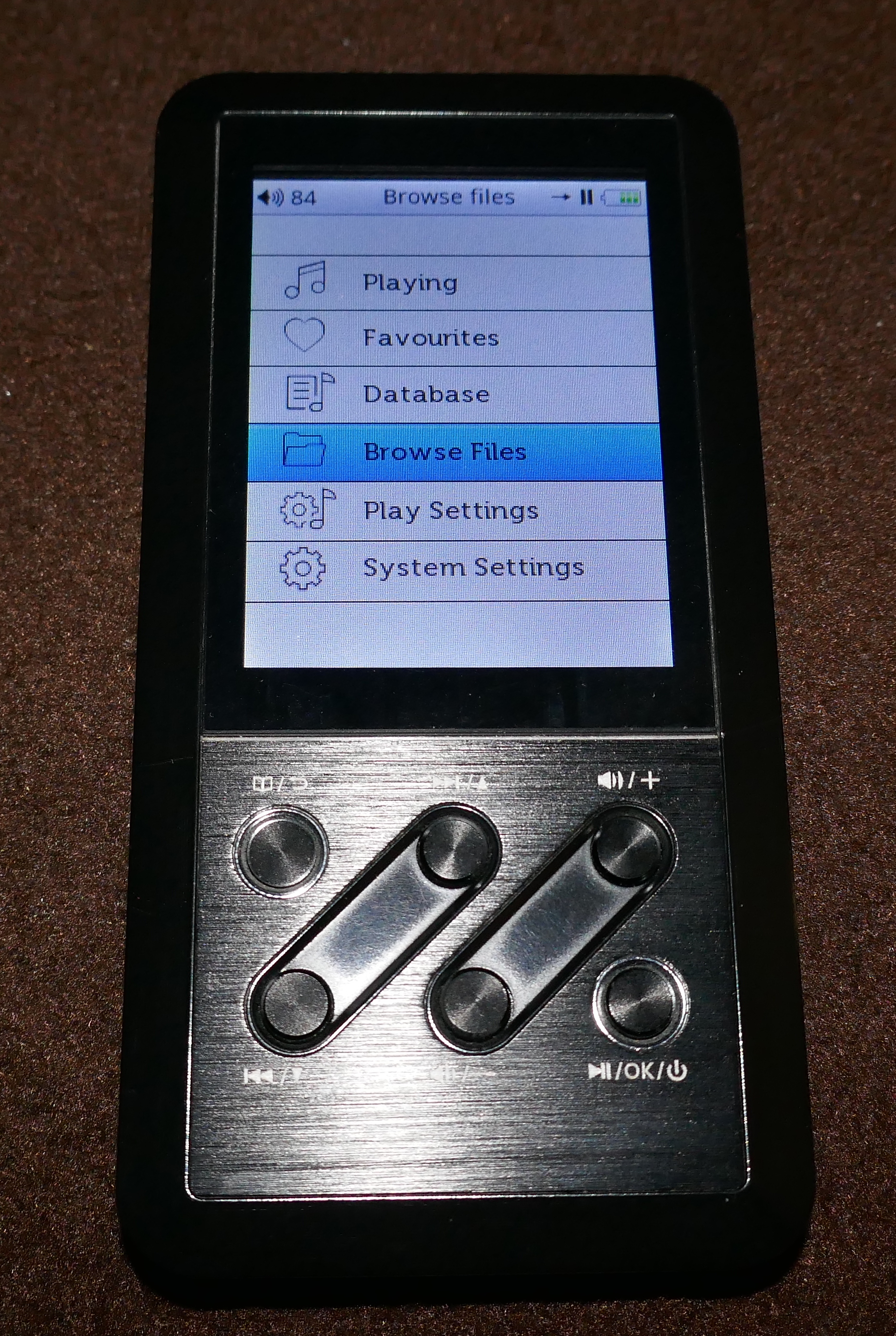
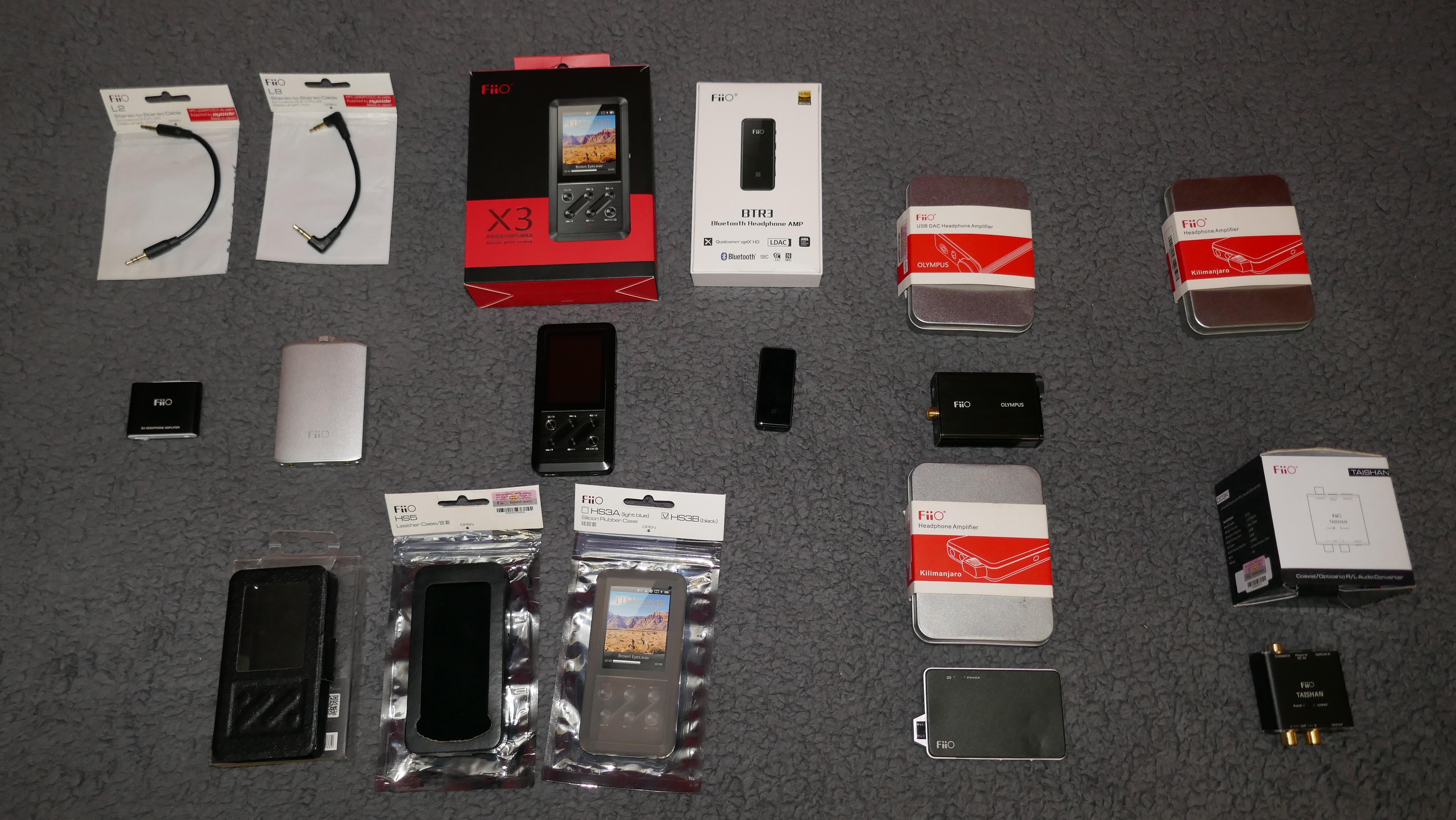
OK, back to UI, it is our first time to make an DAP so the first step is to make it easy to use and the second thing is make it looks great. another thing is that the displayer of X3 is only 240*320 and the color and visible angle
is not so good, hope the new UI of X5 will be a big step from X3 because we will use a 480*360 IPS LCD which used at blackberry 9100.
As a general principle of typography and visual design, italics (and oblique) is typically less reader friendly than the regular version of the font.
This is better, although are the thin strokes of the type as legible as some other choices at the actual size of the X3 display?
lol, this is the UI of 2014, flat UI.
OK, back to UI, it is our first time to make an DAP so the first step is to make it easy to use and the second thing is make it looks great. another thing is that the displayer of X3 is only 240*320 and the color and visible angle
is not so good, hope the new UI of X5 will be a big step from X3 because we will use a 480*360 IPS LCD which used at blackberry 9100.

|
Stay updated on FiiO at their sponsor profile on Head-Fi.


|

")


