


no longer able to view all images in a thread. that was a great feature.
You are using an out of date browser. It may not display this or other websites correctly.
You should upgrade or use an alternative browser.
You should upgrade or use an alternative browser.
New Head-Fi Update
- Thread starter akg fanboy
- Start date
- Status
- Not open for further replies.
TwinQY
Something about the rear end of a cat
Might want to update the FAQ page
About the Huddler Platform
- What is the Huddler.com platform?
- I have a great feature idea for you guys - who should I talk to?
- I would love to convert my site to the Huddler platform! Who do I talk to?
I'd like to see both the FAQ and the Support stuff get updated. When I was locked out because of the password issue, I could not find the feedback form mentioned on there (because that seemed to be Huddler-specific), nor could I find emails for any of the staff. I had to get a fellow user here to PM @AxelCloris to notify him of my problems instead. Perhaps there are other users in the same situation I was, but do not have contact with others outside of the site, and would be locked out indefinitely.
Hutnicks
Headphoneus Supremus
- Joined
- Jun 16, 2012
- Posts
- 6,625
- Likes
- 595
I'd like to see both the FAQ and the Support stuff get updated. When I was locked out because of the password issue, I could not find the feedback form mentioned on there (because that seemed to be Huddler-specific), nor could I find emails for any of the staff. I had to get a fellow user here to PM @AxelCloris to notify him of my problems instead. Perhaps there are other users in the same situation I was, but do not have contact with others outside of the site, and would be locked out indefinitely.
I am certain there are. If they happened to be a recent member they are going to be SOL for support aren't they?
gibosi
Headphoneus Supremus
- Joined
- Oct 18, 2012
- Posts
- 6,432
- Likes
- 4,838
I'd like to see both the FAQ and the Support stuff get updated. When I was locked out because of the password issue, I could not find the feedback form mentioned on there (because that seemed to be Huddler-specific), nor could I find emails for any of the staff. I had to get a fellow user here to PM @AxelCloris to notify him of my problems instead. Perhaps there are other users in the same situation I was, but do not have contact with others outside of the site, and would be locked out indefinitely.
I second this! It's a great idea. And I would further suggest that as many users are still floundering, that these links be provided on the home screen so that they can be found easily.
nick n
Headphoneus Supremus
- Joined
- Feb 3, 2011
- Posts
- 5,317
- Likes
- 1,736
One suggestion if possible.
Even changing the gray coloured areas to a blue everywhere would in my mind go a long way to making it a nicer experience.
Even a gray-blue like at the bottom right shown behind the "Head-Fi.org Mobile Site" link, or just before the FAQ link below that.
Less sterile.
One thing I should mention is that the brown areas in that top header bar that fade to blue, well here's something you can try yourself and this is gonna sound strange, but next time someone starts talking to you who you don't really want to talk to, bring up the word brown in the conversation a few times they more often than not cut it short and leave. LOL
Done it many times.
Also the brown, well it's just not a fit at all either.
Last edited:
TwinQY
Something about the rear end of a cat
Definitely, at least until the rough patches have been settled.And I would further suggest that as many users are still floundering, that these links be provided on the home screen so that they can be found easily.
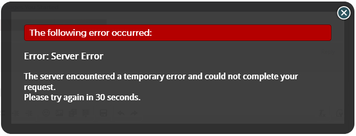
Also, do the staff have a master list of current complaints? That might be something worth updating in the OP, or to be kept as a sticky. If not, I bet a couple of us could volunteer to aggregate something of that kind. I see a lot of issues being raised that are duplicates of previous ones. The security errors on mobile, for one.
I feel like the current theme is very generic and not very cohesive. It gives no indication that I am viewing Head-Fi (just having that logo at the header is not enough). The quote boxes are just Xenforo's stock blue, for instance. It doesn't even have to look like the old site, in terms of the colours, but just something more cohesive would be nice.One suggestion if possible.
Even changing the gray coloured areas to a blue everywhere would in my mind go a long way to making it a nicer experience.
Even a gray-blue like at the bottom right shown behind the "Head-Fi.org Mobile Site" link, or just before the FAQ link below that.
Less sterile.
One thing I should mention is that the brown areas in that top header bar that fade to blue, well here's something you can try yourself and this is gonna sound strange, but next time someone starts talking to you who you don't really want to talk to, bring up the word brown in the conversation a few times they more often than not cut it short and leave. LOL
Done it many times.
Also the brown, well it's just not a fit at all either.
Did not see this edit until after I posted this. Why that brown? This isn't the Ubuntu forums circa '08. We can beat this.
Last edited:
Double-A
Formerly known as KingOfTheWild.
I am certain there are. If they happened to be a recent member they are going to be SOL for support aren't they?
I was in that situation and, failing to find a contact form, I went to Facebook for updates on the status of the website. Finally, after waiting for a short while without anyone posting and saying that all the bugs were fixed, I retried logging in and it worked without me having to reset my password or anything.
Argyris
Head-Fi's third most long-winded poster.
Did not see this edit until after I posted this. Why that brown? This isn't the Ubuntu forums circa '08. We can beat this.
I miss the days of brown 'buntu. It was a simpler time. We hadn't seen Unity or Gnome Shell yet, and we weren't in the era where every Yet-Another-Ubuntu-Spinoff-With-A-DE-We-Found-In-The-Closet-Next-To-The-Mothballs variant was given official release status. Everybody knew default Ubuntu was ugly and everybody changed it, except for that one guy who defended it, and we all supposed he just did it to spite us and probably was rocking Clearlooks or something...
Oh, wait, we're supposed to be talking about Head-Fi. The basic functionality issues have already been hashed out, so I'll just concentrate on design and aesthetics. A short list of my main gripes:
-The overall design is too bright and too poorly-differentiated. Especially in a darkened room, it's like staring into a thermonuclear explosion. Or reading the Wikipedia article about thermonuclear explosions. A subtle color (or just a medium gray) for the page background would fix this. In addition, sections and headings are not well enough defined, and the effect worsens on the kinds of less well-calibrated screens most people will be looking at this on. My MBP makes the gray box around posts and the light gray-on-white headings (e.g. "Share This Page") obvious, if still too light. Other screens I have access to show virtually no difference between this very light gray and white.
-Unless I'm missing something obvious, there's no easy way to get from the homepage to a user's profile. There's an option for this right at the bottom of the page, but it actually takes you to the profile edit page, which is not what most people likely want.
-Navigation in general is confusing, involving several different kinds of interface elements (e.g. nav bars, hamburger menus, sidebars, tabs, quick links in the site banner). Some of this might be platform-restricted, but if at all possible, try to cut down on the number of different interface elements. In the very least, there should be a drop down menu in the top nav bar for all the profile options (profile page, account editing, news feed views, etc.), rather than forcing users to click the hamburger menu and then drill down through the sidebar options that appear. Reading this thread, I see that many have had trouble discovering this, and the alternative of consulting the upper right hand corner of the page in the site banner seems similarly opaque to many users (not to mention limited in scope compared to what's behind the hamburger menu). Often times the desired functionality is there, but just offering the ability to accomplish a task is not enough. If the interface makes it difficult to discover, many users will just give up or assume they can't do what they want.
That's probably enough for now. These are the main issues that consistently bother me about the new update, and in the case of the first two, fixes should be relatively straightforward. The third might be a bit more difficult given potential platform limitations, but I would find it very hard to believe there isn't at least some design latitude allowed on a platform that's designed to be used by and tailored to the specific needs of a wide variety of sites.
Last edited:
TwinQY
Something about the rear end of a cat
Right: so the old background color used to be #E7EAF3 instead of pure white (literally, it's #FFFFFF). I don't mind the background color for the post containers (old one was #F1F1F1), but that #FFFFFF needs to get the F out of there.-The overall design is too bright and too poorly-differentiated. Especially in a darkened room, it's like staring into a thermonuclear explosion. Or reading the Wikipedia article about thermonuclear explosions. A subtle color (or just a medium gray) for the page background would fix this. In addition, sections and headings are not well enough defined, and the effect worsens on the kinds of less well-calibrated screens most people will be looking at this on. My MBP makes the gray box around posts and the light gray-on-white headings (e.g. "Share This Page") obvious, if still too light. Other screens I have access to show virtually no difference between this very light gray and white.
I think the "Welcome back XXX" on the top right of the banner links to the user's profile page.-Unless I'm missing something obvious, there's no easy way to get from the homepage to a user's profile. There's an option for this right at the bottom of the page, but it actually takes you to the profile edit page, which is not what most people likely want.
The rest, completely agree with.
Argyris
Head-Fi's third most long-winded poster.
I think the "Welcome back XXX" on the top right of the banner links to the user's profile page.
The rest, completely agree with.
It doesn't appear on the homepage, though (at least for me). All I get is a centered Head-Fi logo. Which, thinking about it, is another element of inconsistency. Why not simply have the exact same banner everywhere? In fact, the homepage seems oddly detached from the rest of the site, as though it's worked on separately and fixes that apply to it don't propagate elsewhere. It doesn't have the font overflow issues in the nav bar in Safari that the rest of the site does, and it has the unique top banner.
TwinQY
Something about the rear end of a cat
Hmm, you're right. I never go to the homepage, so it didn't occur to me that the header on there would be different from other pages.It doesn't appear on the homepage, though (at least for me). All I get is a centered Head-Fi logo. Which, thinking about it, is another element of inconsistency. Why not simply have the exact same banner everywhere? In fact, the homepage seems oddly detached from the rest of the site, as though it's worked on separately and fixes that apply to it don't propagate elsewhere. It doesn't have the font overflow issues in the nav bar in Safari that the rest of the site does, and it has the unique top banner.
TwinQY
Something about the rear end of a cat
I don't know if others have mentioned this, but I would really like the ability to multi-quote posts in PMs. Typing out the format string is not impossible, just a hassle.
x RELIC x
Headphoneus Supremus
It doesn't appear on the homepage, though (at least for me). All I get is a centered Head-Fi logo. Which, thinking about it, is another element of inconsistency. Why not simply have the exact same banner everywhere? In fact, the homepage seems oddly detached from the rest of the site, as though it's worked on separately and fixes that apply to it don't propagate elsewhere. It doesn't have the font overflow issues in the nav bar in Safari that the rest of the site does, and it has the unique top banner.
Hmm, you're right. I never go to the homepage, so it didn't occur to me that the header on there would be different from other pages.
I don't know if others have mentioned this, but I would really like the ability to multi-quote posts in PMs. Typing out the format string is not impossible, just a hassle.
Not related to PMs but for general postings press the +Quote button and then in the area where you compose your reply press the Insert Quotes button. It worked for me in this post.

Now, if we could only adjust the size of pictures we upload.....
Last edited:
Rob80b
Headphoneus Supremus
Hi Guys
Maybe just a case of "can't see the forest for the trees" but after clicking on mobile at the bottom right I see nowhere to get back to the desktop mode (I'm on a desktop)...even if I log out and purge my cookies.
Maybe just a case of "can't see the forest for the trees" but after clicking on mobile at the bottom right I see nowhere to get back to the desktop mode (I'm on a desktop)...even if I log out and purge my cookies.
Rob80b
Headphoneus Supremus
Never mind......found it...one needs to click on the top right and then at the bottom on the black info page.
- Status
- Not open for further replies.
Users who are viewing this thread
Total: 4 (members: 0, guests: 4)
