32 Ohm Audio- The Logo Contest
Aug 28, 2009 at 5:32 PM Post #32 of 49
Quote:

Originally Posted by donunus /img/forum/go_quote.gif
I like the left one too but the proportion on the bottom right one just seems more friendly to be able to be put anywhere especially at smaller sizes. The only possible thing that 32 ohm audio might not be able to use these for is if they don't want to be associated with a tube(for the right) or a speaker(for the left).


I agree with your comments entirely. I tend to always scan potential logos for durability. In other words, which logos won't grow irritating a year or two from now. Fonts are often the first things that "die" in a logo and lead to brand changes soon after launch. Of course, that is something you want to avoid!
 
Aug 28, 2009 at 5:35 PM Post #33 of 49
Quote:

Originally Posted by GTRacer /img/forum/go_quote.gif
10092095.jpg


Here are my entries.


dem are purdy! Nice work.
 
Aug 28, 2009 at 7:33 PM Post #35 of 49
Great job guys. Here are my attempts. I left them just as line drawings so ken could choose his own colors.

32ohm-1.jpg


32ohmaudio-1.jpg
 
Aug 29, 2009 at 2:06 AM Post #37 of 49
Quote:

Originally Posted by donunus /img/forum/go_quote.gif
Sweet!


Quote:

Originally Posted by EllisU /img/forum/go_quote.gif
dem are purdy! Nice work.


Thanks guys!

Oh and there's something wrong with the spacing on the first logo, probably due to the way acrobat scaled it down (just printscreened it as I didn't want to open Illustrator). It's all evenly spaced on the source file.
smily_headphones1.gif
 
Aug 29, 2009 at 4:34 AM Post #39 of 49
I really love clieos' submissions.
 
Aug 29, 2009 at 4:42 AM Post #40 of 49
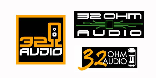
32ohm2.jpg

Mine up there (the all black one) isn't as elaborate and eye catching as the others but I did them because I feel that they would integrate well if used as a logo on a website... Take the headfi logo for example on the site and replace it with that one... You have something that just can perfectly blend well with its environment. If you had very colored logos, They would only integrate really well if you matched the website colors according to the logo.
biggrin.gif
 
Aug 29, 2009 at 7:36 AM Post #41 of 49
have you guys found a winner already? I might get some fonts in my pc and make some more with cool effects yet be subtle at the same time
smily_headphones1.gif
 
Aug 29, 2009 at 9:39 PM Post #43 of 49
Ok we have a Winner.

First the runner up is

GTracer

10092095.jpg


and the winner is.... ClieOS

32ohmlogo.jpg


I have asked him to make me the logo with the circuit board that uses the fonts from the one that has the speaker built into the Ohm symbol, but we are pretty sure we are going to use his creations.

GTracer and ClieOS please email me your shipping address so I can send you the prizes.

I want to thank everyone who participated!

Ken
 
Campfire Audio Campfire Audio - Nicely Done. Stay updated on Campfire Audio at their sponsor profile on Head-Fi.
 
https://www.campfireaudio.com/ Support@campfireaudio.com

Users who are viewing this thread

Back
Top