Custom Video Game Box Art
Oct 28, 2012 at 3:14 PM Thread Starter Post #1 of 7

Zombie_X

Headphoneus Supremus
Joined
Sep 3, 2008
Posts
4,637
Likes
358
Location
Beyerdynamicland
Hi all,
 
I've started making custom video game box art and my first attempt at it in four years went quite well. I will be making more as time goes on.
 
Here I made a cover and spine card for Biohazard 2 (aka Biohazard 1.5). The abck cover will be uploaded once it's complete though.
 
EDIT: Here's the final design for the entire box art.


Oct 28, 2012 at 4:12 PM Post #3 of 7
Hi,
 
Biohazard 1.5 is an unreleased game. It was the prototype version of Biohazard 2 (Resident Evil 2). Currently there is some modding team out there that has their hands on a copy of it and is modding it to be more complete, then they will release it.
 
Quote:
Oh nice!
 
EDIT:
Wait, wasn't RE 1.5 something that was never released? Or is that different from Biohazard 1.5?

 
Oct 29, 2012 at 4:10 AM Post #4 of 7
Quote:
Hi,
 
Biohazard 1.5 is an unreleased game. It was the prototype version of Biohazard 2 (Resident Evil 2). Currently there is some modding team out there that has there hands on a copy of it and is modding it to be more complete, then they will release it.
 

I remember reading about Biohazard 1.5 on a finnish RE fansite when I was a lil' kid. I had no idea something like this was happening, would be really cool to get to play it
 
Nov 9, 2012 at 10:49 PM Post #5 of 7
Hi guys,
 
I finalized the design for the abck insert and the CD label. I also remade the front and spine to be 4x that of their original resolution.
 
Dec 7, 2012 at 10:15 PM Post #6 of 7
Hey guys,
 
Here's my Custom art for Resident Evil 2, for the USA. Mostly everything here was made from scratch.


Dec 15, 2012 at 2:18 AM Post #7 of 7
I like it. I'm no art critic, but here's something you might want to consider: the text. It's a bit harsh on the background. It doesn't 'fade in' to the back ground, which gives it noticeable edges. I think that makes it less pleasing to look at (though it feels 'retro', in a sense). 
 
Take a look at (for example) the original box art:


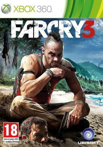
Notice how the text is calling attention to itself, but it's not as 'sharp' in contrast to the background since it fades into it. If you take another game, for example, Far Cry 3 (chosen because that's the game I'm currently playing 
smily_headphones1.gif
 ).


I know it's not the best box art ever, but take it as an example. Notice how there is a slight shadow/halo given to the text (if you want a clearer view, go here: http://www.amazon.com/Far-Cry-3-Xbox-360/dp/B0050SYV70/ and click the picture so you can zoom in on it).
 
If there's not a shadow, there's probably a border that transitions into the background (for example, Mass Effect 3). Again, I'm not a graphic designer, etc. so I don't know what exactly the term is, the theory behind it, etc. Just something I've noticed. Have a look through more to see what I mean, and get some ideas. Portal 2, Call of Duty 4, and Uncharted 2 are also good examples.
 
Hope this helps :)
 

Users who are viewing this thread

Back
Top