Vote the new FiiO LOGO patterns you like!

We would like to get your suggestion of which logo pattern is suitable for us now.

  • FiiO New Logo No.1

    Votes: 47 9.6%
  • FiiO New Logo No.2

    Votes: 10 2.0%
  • FiiO New Logo No.3

    Votes: 61 12.4%
  • FiiO New Logo No.4

    Votes: 22 4.5%
  • FiiO New Logo No.5

    Votes: 350 71.4%

  • Total voters
    490
May 30, 2021 at 5:40 AM Post #37 of 113
We found that our brand name FiiO is easy to be written wrong as fiio or Fiio. With developments of our brand ,changes of our products positioning and target users, now we are considering to change FiiO to be FIIO. Our team has designed several new LOGO patterns.
We would like to get your suggestion of which logo pattern is suitable for us now. Kindly vote it for us !
1.jpg2.jpg3.jpg40.jpg5.jpg
voted...
 
May 30, 2021 at 6:00 AM Post #38 of 113
We found that our brand name FiiO is easy to be written wrong as fiio or Fiio. With developments of our brand ,changes of our products positioning and target users, now we are considering to change FiiO to be FIIO. Our team has designed several new LOGO patterns.
We would like to get your suggestion of which logo pattern is suitable for us now. Kindly vote it for us !
I'm confused by you thinking that people are misunderstanding your current logo.

I have always assumed that the name of your brand was (phonetically) 'fee-oh'.

Have I been getting it wrong? Is it F 2 oh, or F 2 zero?

If I was correct in the first place, then changing your logo is only going to mess things up.
 
May 30, 2021 at 6:25 AM Post #39 of 113
I'm confused by you thinking that people are misunderstanding your current logo.

I have always assumed that the name of your brand was (phonetically) 'fee-oh'.

Have I been getting it wrong? Is it F 2 oh, or F 2 zero?

If I was correct in the first place, then changing your logo is only going to mess things up.
I pronounce it "fye-oh" as in Hi Fi and IO as in input/output.
 
May 30, 2021 at 6:36 AM Post #41 of 113
I definitely think the old logo could be improved upon. I'm not a fan of using two different fonts for the Fii and the O, and I don't particularly like the Fii font either.

Having said that, I would absolutely keep the FiiO, that is to say, the capital F and O and lower case ii. I think that is what gives the logo its unique character, and creates interesting symetry.
 
Last edited:
May 30, 2021 at 7:21 AM Post #42 of 113
Couple of observations (from a personal point of view):

- Any gap in the letter ‘O’ makes the letter look like a ‘D’ (eg No. 1 & 2) or a ‘G’ (No. 3).

- Making the double ‘i’ uppercase (II) leaves me wondering if the letters might be double ‘L’ in lowercase (ll).

FiiO is perfect case-wise. It’s also looks cool imo.

As for the examples, on its own the No 5 is my favourite, however the slanting No 4 design isn’t far behind and actually gets my vote as it compliments the hexagonal design language of the forthcoming M11 Plus and M17 models.

As before I recommend replacing with lower case ‘i’’s

Hope this helps.
Agree. II makes a confusion for general public, by design

Mispresentation:
Roman number II, and if spacing is too narrow(which I think there is an intent) “II” will be taken as one character, either “I” or double small “L”.

#4 looks like some US made fighting jet, “F110” nah.. may look cool for some military fan, but that’s a copycat of RSA Audio’s naming US made fighter jets: RSA SR-71 Blackbird etc. Above all FiiO is not US fighter jet manufacturer, and is not US-based company, why need to name after those right?

I’d vote #5 for readability, with exception of changing to small “ii” which basically stays the same to the current one.

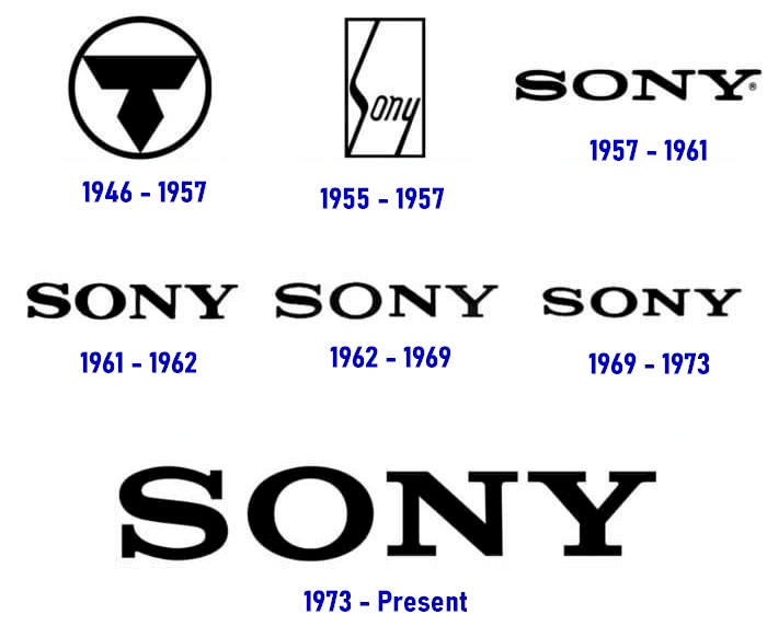
I worked for SONY and I feel FiiO has the potential of SONY capability in a long run, as a customer since your old cheap plastic-made $6USD E3 portable amp, and now makes one of the best DAPs in the world.

I may advise to take a look at SONY’s logo history, they have been consistent over half a century with only minor changes.

If you can come a corporate philosophy like “born for music” with “F” and “O”, it is still acceptable to symbolize the ii to like slash type F // O, still needs to keep small ii though. So that F and O could stands out with some sort of consistency remained.
But it needs some good corporate philosophy.

Oh wait! I forgot FiiO’s chinese character “飛傲”
飛, Fei : “Fly”
傲, Ou: Pride, Proud. if you can relate this to “O something “ That may makes sense as FiiO’s company name actually has original corporate philosophy.

AC738FF5-27F0-41B1-9AC8-F1F468D361BA.jpeg
 
Last edited:
May 30, 2021 at 9:11 AM Post #45 of 113
I think it's a dumb decision.
If you have a "problem" with the actual logo, imagine with these new ones.
Some looks like F110, some like F2O and even one looks like FiiD.
Seriously guys, it won't change a thing and will probably bring more confusion than clarification.
You should at least keep the dots over the i's.
 
Last edited:

Users who are viewing this thread

Back
Top