


Strangelove424
500+ Head-Fier
- Joined
- Apr 4, 2012
- Posts
- 805
- Likes
- 221
We’ve read about the loudness war, we can hear it in our music, but I started wondering if there was an easy way to analyze the dynamic range compression in a mix (the loudness) by looking at measurements of the music itself. Usually this is done with a peak meter, but the music doesn’t always have to peak over 0db to be loud or have its dynamics squashed. The peak meter is just showing us the tip of the iceberg, and there’s a lot we don’t see with a peak meter alone. I recently tried looking at the spectrogram in Foobar, and found this pretty interesting. A spectrogram analyzes the frequency distribution, and displays density of sound information at any given frequency with black. So white in the following images is quiet, black is loud. The vertical axis is the freq range, horizontal axis time. What you are looking at below is a comparison of Bob Dylan’s The Times They Are A Changin’ on 1964 mono vinyl release* vs the modern CD Remaster for a Greatest Hits downmixed to mono. Both sources were ripped into digital file formats and compared in Foobar.

(click to expand: http://cdn.head-fi.org/9/95/953a19b1_1964monovsCDremaster_441downconvert.jpeg)
The CD remaster doesn’t ever get so bad that it peaks over 0db, but the quietness of the vinyl release is demonstrable just by looking at the spectrogram. There is also less emphasis on the midrange on the CD, making it sound thinner. The CD gets loud and screechy at times, the vinyl in a comparison balanced and polite, with better dynamics when Dylan really does pick up energy.
While the audio industry wants to sell us more bits and bytes, they seem to be avoiding the essential problem of quality mastering. So while one struggles to hear any difference in quality between the $15 CD he bought or the $30 HD track he DLed, the quality in difference between mastering jobs can be clearly demonstrated and measured. And I also believe it's sorely obvious to our ears, unlike larger formats/file sizes.
I created this thread because I was hoping to compare experiences, methods, or software tools people have run across which would allow music listeners to see with their own eyes the quality of a master, and the amount of dynamic range compression or loudness that went into the mix. Or conversely, how well balanced and dynamic it is. Perhaps by exchanging information with each other about different albums, we can find out what the best mastered version is, and use objective information to arrive at a conclusion of what’s the best release version is to purchase.
* Edit 9/21/2104: MindsMirror clarified an important point about the use of spectrograms: higher sample rates will place more white area in the diagram due to the FFT size used to generate the graph, and does not have anything to do with the actual sound. "It is the reason why a perfect sine wave does not appear as a perfectly thin line, it is blurred, especially in the lower frequencies when it is displayed on a log scale like that." This is an important aspect of using spectrograms, so sample rates must be downconverted before comparing masters with this technique. Images have been updated with downconverted sample rates.
___________________________________________________________________
LINKS
Links provided throughout the discussion will be posted here as a centralized resource.
Bob Katz, Loudness, War & Peace: http://www.youtube.com/watch?v=u9Fb3rWNWDA
Thomas Lund on Loudness Wars: www.youtube.com/watch?v=BhA7Vy3OPbc (If anyone one can find part2 let me know)
Bob Katz on the Loudness War I: www.youtube.com/watch?v=XCd6MHlo_iA
Bob Katz on the Loudness War II: www.youtube.com/watch?v=5FVF9vRLyVc
Bob Katz on the Loudness War III: www.youtube.com/watch?v=tPwni7yvSQc
Friedemann Tischmeyer w/ collected statements: www.youtube.com/watch?v=qUcgg2vMX_s
Downmixing to mono in Audacity: http://www.youtube.com/watch?v=ZJ-Nq-os2YI
Best free software for audio: http://www.audioholics.com/how-to-shop/best-free-audio-software
Audacity: http://www.audacity.sourceforge.net/
Dynamic Range Album List: http://dr.loudness-war.info/
Foobar Dynamic Range Plugin: http://dr.loudness-war.info/downloads/foo_dynamic_range_1.1.1.zip
___________________________________________________________________________
TOOLBELT
Peak Meter
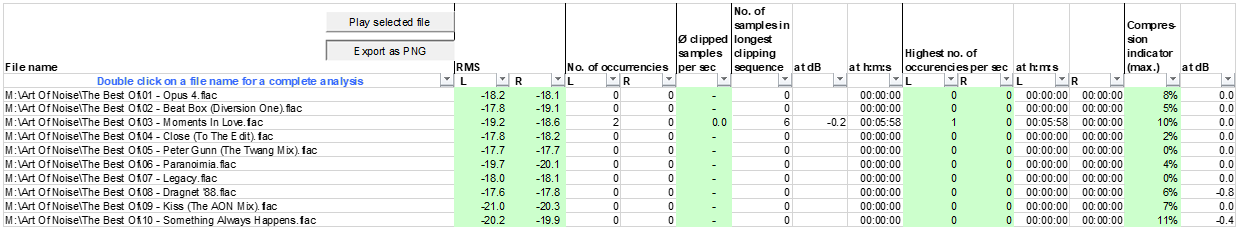
There are rules to handling audio, and the most basic rule is that no signal should ever go over line level (0db). From Wikipedia: “Clipping is a form of waveform distortion that occurs when an amplifier is overdriven and attempts to deliver an output voltage or current beyond its maximum capability. Driving an amplifier into clipping may cause it to output power in excess of its published ratings.” It is the job of the amplifier to receive line level input and amplify that signal. When the line level signal is over 0db, it is impeding on the amp’s design limits for headroom. If an album violates the 0db rules, it is in technical violation of the rules for audio distribution/broadcast, and can lead to premature equipment failure. A clip or two in an otherwise well-mastered album is not necessarily a sign of a “bad” master. But with excessive clipping, especially in combination with squashed dynamics, it is a major indication of a badly produced master. Peak meters are available for free in Foobar, but can also be found within the freeware program Audacity (for all OSes). The Foobar peak meter looks like a typical analogue peak meter, and displays the current peak levels in the music, leaving a faint ghost line for a second or two. There is also a real time peak meter in Audacity, but by analyzing the waveform in Audacity (see next entry) we can see all the peaks in a song at once, marked either by a red line or specific clipping analysis. After importing a song into Audacity, goto View->ShowClipping. To perform an in-depth clipping analysis, goto Analyze->FindClipping. The lower the threshold samples, the longer the scan will take (it takes a fraction of a second to scan) but the more clipping it will catch. Lower start and stop threshold samples will catch the most incidents of clipping.
Foobar: http://www.foobar2000.org/download
Audacity: http://www.audacity.sourceforge.net/
Analysis for clipping in Lady Gaga’s Poker Face:
Foobar real time peak meter (clipping both channels at time of capture)

Audacity “Show Clipping” Option checked

Audacity w/ “Show Clipping” checked and “FindClipping” scan with sample threshold of 1

Waveform Analyzer
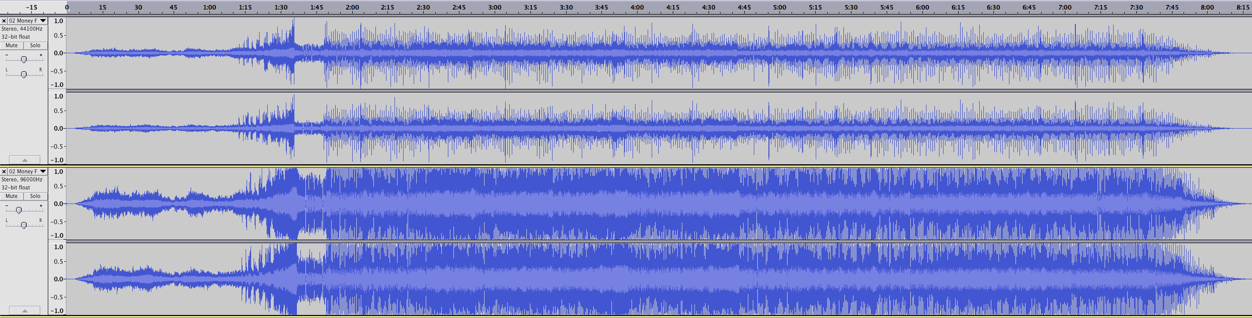
A waveform, like a peak meter, is a measure of signal amplitude, but it changes over time and is designed to highlight dynamics in a signal’s amplitude/loudness. Large changes in amplitude indicate a dynamic track, while the flat-line plateau we see on many new records indicates a loud, compressed mix. When a mix is always loud, it is really always quiet. Perception in dynamics and energetic shifts in music require us to perceive a loudness shift, and an increase in the signal. In the words of Bob Katz, “things need to get quiet before they can get loud, you need a decrescendo after every crescendo”. But if the source is always loud, always hovering near it’s peak, and there are no “quiet” moments, our ears adapt with their own kind of sound normalization, they literally tighten up their anvils and stirrups and shut off to the constantly high amplitude in the signal. The nuances of the track become hidden, it becomes hard for the brain to pick out details, so what do we do? Turn up the volume! Then our ears adapt again. What do we do next? Turn up the volume again! The dog keeps chasing its own tail until we eventually need to sit in a quiet room with a Tylenol.
Waveforms can be analyzed in any professional audio program, or the professional-grade freeware Audacity available here:
http://www.audacity.sourceforge.net/
This a sample waveform analysis of some rock'n'roll through the years... the notoriously loud and dynamically squashed Red Hot Chili Peppers’ Californication (CD version), and below it a dynamic version of Hotel California (on both vinyl and CD).

Loudness/Dynamic Range Meter
These wonderful tools make it very easy to measure peak, loudness (the average level of the waveform), and dynamic range (min/max of the waveform) all in one meter. It is made by DR, which is also the website that hosts dynamic range list for a large assortment of popular albums (link below). There is both a Foobar plugin and stand-alone app available for download.
FoobarPlugin: http://dr.loudness-war.info/downloads/foo_dynamic_range_1.1.1.zip
Windows App: http://dr.loudness-war.info/downloads/DR-Meter-1_4a.zip
OSX App: http://dr.loudness-war.info/downloads/DR-Offline-Meter-for-MAC.zip
Album list: http://dr.loudness-war.info/
A huge thanks to member RRod, who recompiled a DR meter for Linux (successful with Ubuntu 14.04). Copied from post #59 of this thread:
"There's a github project for a Linux-native dynamic range meter:
https://github.com/adiblol/dr_meter
It is, however, horribly out of date (last update was 3 years ago). I went ahead and did what I could in terms of updating the function definitions, and I got it to compile if I left in one deprecated function call. Here are the files (they compile for me on Ubuntu 14.04 with the latest libav file installed):
https://drive.google.com/folderview?id=0BwmVtb5IwniEalgtWVhCNFFJTGs&usp=sharing" - RRod
These are sample Dynamic Range readings from popular music, roughly a generation apart:
Awolnation’s Sail (2011)

Awolnation’s Burn It Down (2011)

Beastie Boys’ Intergalactic (1998)

Beastie Boys’ Song For the Man (1998)

Michael Jackson's Smooth Criminal (1987 - this version released on CD early 90's)

Michael Jackson's Thriller (1982 - this version released on CD early 90's)

Spectral Analysis
We often analyze FR graphs for headphones to death, but are willing to pick up and listen to any master we find. Often times the frequency colorations we obsessively avoid (such as V-curves) are far more emphasized in the track than even between two sonically opposed headphones. A spectrum analyzer will only tell us what frequency we hear at any given sample, and makes it almost impossible to compare two masters. A spectrogram on the other hand, makes that possible by graphically depicting the frequency range over time.
Although I started this thread discussing the spectrogram, this form of analysis has its downsides. First off, it’s hard to read a spectrogram and apply that in context to an actual song. At best, we can compare two master to confirm a difference, or specific trait (like a heavy V-curve) in one master. Otherwise, on its own, there’s not much we can gain. Mastering is a creative process, you cannot look at the frequency balance alone and make a decision about whether one master sounds a particular way, or better than the other. Use discretion when analyzing the frequency spectrum of a track. A headphone or an amp can be neutral, but a song can never be (nor should). When it comes to frequency analysis, always compare things in relation to one another, i.e. the same song between two master and realize that your ears are the ultimate judge, the spectrogram can only hint at differences your ears should already be hearing. A free to use spectrogram is included in both Foobar and Audacity.
This video is a helpful guide to exploring Audacity's Spectrogram:
https://www.youtube.com/watch?v=7WYw3qoTdU4
Options for setting Audacity's spectrogram:
http://manual.audacityteam.org/o/man/spectrograms_preferences.html
In the following sample is a comparison between Bob Dylan's The Times Are A Changin' in vinyl and CD Greatest Hits remaster. If you were to take these songs into Audacity, they would both show relatively dynamic waveforms, yet the CD Greatest Hits version is hard for me to listen to. It's not a loudness issue though. Once I looked at it in the spectrogram, I realized it was due to the tone. Keeping in mind black=harmonic activty and white=lack of activity, the CD shows more harmonics in the lows and highs compared to vinyl, leaving a relatively sucked out midrange.
This is a common technique used (often but not always in combo with dynamic range compression) to make songs "stick out more" on the iTunes store or on radio, thus leading to more sales. The songs that sound the most "bassy and detailed" will most likely sell the most. Producers know this and push engineers to make the sound more "engaging" to digital store window shoppers. However, after long listening sessions this V-shaped emphasis can become fatiguing, or in the case of ancient recordings of a nasally singer such as Dylan, just torture from the start (with all respect to Dylan, the master poet that he was)...
Diffmaker/Null Testing
Note: I was in the process of creating audio samples of null/difference tracks for a number of different masters of the same song, but am having issues due to timing differences. This method may not be a reliable way to analyze differences in masters. If I can find a way around these timing differences, and this becomes fruitful, I will update the post. In the meantime, I thought it would be a good idea to leave a link to Diffmaker and the Audacity tutorial here since null testing is extremely powerful, and at the very least, it can be used to pinpoint the exact differences (or lack thereof) between a hi-res/lossless file and a down-converted copy.
Diffmaker is a free program that allows you to perform null comparisons quickly and with ease. Diffmaker can match the waveforms of two files, match the levels, and then output the differences between the two tracks (in addition to creating ABX tests with those two tracks). Diffmaker can be used to objectively and incisively compare all sorts of changes, including physical components in a signal chain (such interconnects and wire), DSP, and converted formats. It is available here: www.libinst.com/Audio%20DiffMaker.htm Use with caution, may destroy prejudices.
Screenshot of the easy-to-use Diffmaker UI:

This tutorial (http://sdk.bongiovidps.com/2013/09/26/audio-null-test/) demonstrates the process for null testing tracks in Audacity (remember to match levels when using this technique. Changes in gain between tracks will not be adjusted for as they are in Diffmaker, but this can be helpful in case you are trying to find gain differences). Thanks to Roly1650 for the link.
In Conclusion
I started this thread after having a few drinks and playing with the spectrogram in Foobar while listening to different masters. What started out as a random impulse has evolved into a consolidated list and a multi-pronged approach to analyzing a master without any cost to the listener. You just need a computer. The effort could possibly save us all a lot of time and money in the long run, especially if we share results. Save your fellow Head-Fiers a few bucks, and let them know what masters to stay away from! I intend to do that continually, and will use this thread to highlight both the dissapointing masters I run across as well as the rewarding ones that I think are worth listening to. Well mastered music should be respected, applauded, and elevated above the loud fray with our own adoration. That said, I don't see the trend for the loudness war getting any better, despite the software advancements in loudness normilzation. Hopefully threads like this, in due time, will center less around pointing out badly engineered music, and more about honoring well engineered music.
Happy listening!
(click to expand: http://cdn.head-fi.org/9/95/953a19b1_1964monovsCDremaster_441downconvert.jpeg)
The CD remaster doesn’t ever get so bad that it peaks over 0db, but the quietness of the vinyl release is demonstrable just by looking at the spectrogram. There is also less emphasis on the midrange on the CD, making it sound thinner. The CD gets loud and screechy at times, the vinyl in a comparison balanced and polite, with better dynamics when Dylan really does pick up energy.
While the audio industry wants to sell us more bits and bytes, they seem to be avoiding the essential problem of quality mastering. So while one struggles to hear any difference in quality between the $15 CD he bought or the $30 HD track he DLed, the quality in difference between mastering jobs can be clearly demonstrated and measured. And I also believe it's sorely obvious to our ears, unlike larger formats/file sizes.
I created this thread because I was hoping to compare experiences, methods, or software tools people have run across which would allow music listeners to see with their own eyes the quality of a master, and the amount of dynamic range compression or loudness that went into the mix. Or conversely, how well balanced and dynamic it is. Perhaps by exchanging information with each other about different albums, we can find out what the best mastered version is, and use objective information to arrive at a conclusion of what’s the best release version is to purchase.
* Edit 9/21/2104: MindsMirror clarified an important point about the use of spectrograms: higher sample rates will place more white area in the diagram due to the FFT size used to generate the graph, and does not have anything to do with the actual sound. "It is the reason why a perfect sine wave does not appear as a perfectly thin line, it is blurred, especially in the lower frequencies when it is displayed on a log scale like that." This is an important aspect of using spectrograms, so sample rates must be downconverted before comparing masters with this technique. Images have been updated with downconverted sample rates.
___________________________________________________________________
LINKS
Links provided throughout the discussion will be posted here as a centralized resource.
Bob Katz, Loudness, War & Peace: http://www.youtube.com/watch?v=u9Fb3rWNWDA
Thomas Lund on Loudness Wars: www.youtube.com/watch?v=BhA7Vy3OPbc (If anyone one can find part2 let me know)
Bob Katz on the Loudness War I: www.youtube.com/watch?v=XCd6MHlo_iA
Bob Katz on the Loudness War II: www.youtube.com/watch?v=5FVF9vRLyVc
Bob Katz on the Loudness War III: www.youtube.com/watch?v=tPwni7yvSQc
Friedemann Tischmeyer w/ collected statements: www.youtube.com/watch?v=qUcgg2vMX_s
Downmixing to mono in Audacity: http://www.youtube.com/watch?v=ZJ-Nq-os2YI
Best free software for audio: http://www.audioholics.com/how-to-shop/best-free-audio-software
Audacity: http://www.audacity.sourceforge.net/
Dynamic Range Album List: http://dr.loudness-war.info/
Foobar Dynamic Range Plugin: http://dr.loudness-war.info/downloads/foo_dynamic_range_1.1.1.zip
___________________________________________________________________________
TOOLBELT
Peak Meter
There are rules to handling audio, and the most basic rule is that no signal should ever go over line level (0db). From Wikipedia: “Clipping is a form of waveform distortion that occurs when an amplifier is overdriven and attempts to deliver an output voltage or current beyond its maximum capability. Driving an amplifier into clipping may cause it to output power in excess of its published ratings.” It is the job of the amplifier to receive line level input and amplify that signal. When the line level signal is over 0db, it is impeding on the amp’s design limits for headroom. If an album violates the 0db rules, it is in technical violation of the rules for audio distribution/broadcast, and can lead to premature equipment failure. A clip or two in an otherwise well-mastered album is not necessarily a sign of a “bad” master. But with excessive clipping, especially in combination with squashed dynamics, it is a major indication of a badly produced master. Peak meters are available for free in Foobar, but can also be found within the freeware program Audacity (for all OSes). The Foobar peak meter looks like a typical analogue peak meter, and displays the current peak levels in the music, leaving a faint ghost line for a second or two. There is also a real time peak meter in Audacity, but by analyzing the waveform in Audacity (see next entry) we can see all the peaks in a song at once, marked either by a red line or specific clipping analysis. After importing a song into Audacity, goto View->ShowClipping. To perform an in-depth clipping analysis, goto Analyze->FindClipping. The lower the threshold samples, the longer the scan will take (it takes a fraction of a second to scan) but the more clipping it will catch. Lower start and stop threshold samples will catch the most incidents of clipping.
Foobar: http://www.foobar2000.org/download
Audacity: http://www.audacity.sourceforge.net/
Analysis for clipping in Lady Gaga’s Poker Face:
Foobar real time peak meter (clipping both channels at time of capture)
Audacity “Show Clipping” Option checked
Audacity w/ “Show Clipping” checked and “FindClipping” scan with sample threshold of 1
Waveform Analyzer
A waveform, like a peak meter, is a measure of signal amplitude, but it changes over time and is designed to highlight dynamics in a signal’s amplitude/loudness. Large changes in amplitude indicate a dynamic track, while the flat-line plateau we see on many new records indicates a loud, compressed mix. When a mix is always loud, it is really always quiet. Perception in dynamics and energetic shifts in music require us to perceive a loudness shift, and an increase in the signal. In the words of Bob Katz, “things need to get quiet before they can get loud, you need a decrescendo after every crescendo”. But if the source is always loud, always hovering near it’s peak, and there are no “quiet” moments, our ears adapt with their own kind of sound normalization, they literally tighten up their anvils and stirrups and shut off to the constantly high amplitude in the signal. The nuances of the track become hidden, it becomes hard for the brain to pick out details, so what do we do? Turn up the volume! Then our ears adapt again. What do we do next? Turn up the volume again! The dog keeps chasing its own tail until we eventually need to sit in a quiet room with a Tylenol.
Waveforms can be analyzed in any professional audio program, or the professional-grade freeware Audacity available here:
http://www.audacity.sourceforge.net/
This a sample waveform analysis of some rock'n'roll through the years... the notoriously loud and dynamically squashed Red Hot Chili Peppers’ Californication (CD version), and below it a dynamic version of Hotel California (on both vinyl and CD).
Loudness/Dynamic Range Meter
These wonderful tools make it very easy to measure peak, loudness (the average level of the waveform), and dynamic range (min/max of the waveform) all in one meter. It is made by DR, which is also the website that hosts dynamic range list for a large assortment of popular albums (link below). There is both a Foobar plugin and stand-alone app available for download.
FoobarPlugin: http://dr.loudness-war.info/downloads/foo_dynamic_range_1.1.1.zip
Windows App: http://dr.loudness-war.info/downloads/DR-Meter-1_4a.zip
OSX App: http://dr.loudness-war.info/downloads/DR-Offline-Meter-for-MAC.zip
Album list: http://dr.loudness-war.info/
A huge thanks to member RRod, who recompiled a DR meter for Linux (successful with Ubuntu 14.04). Copied from post #59 of this thread:
"There's a github project for a Linux-native dynamic range meter:
https://github.com/adiblol/dr_meter
It is, however, horribly out of date (last update was 3 years ago). I went ahead and did what I could in terms of updating the function definitions, and I got it to compile if I left in one deprecated function call. Here are the files (they compile for me on Ubuntu 14.04 with the latest libav file installed):
https://drive.google.com/folderview?id=0BwmVtb5IwniEalgtWVhCNFFJTGs&usp=sharing" - RRod
These are sample Dynamic Range readings from popular music, roughly a generation apart:
Awolnation’s Sail (2011)
Awolnation’s Burn It Down (2011)
Beastie Boys’ Intergalactic (1998)
Beastie Boys’ Song For the Man (1998)
Michael Jackson's Smooth Criminal (1987 - this version released on CD early 90's)
Michael Jackson's Thriller (1982 - this version released on CD early 90's)
Spectral Analysis
We often analyze FR graphs for headphones to death, but are willing to pick up and listen to any master we find. Often times the frequency colorations we obsessively avoid (such as V-curves) are far more emphasized in the track than even between two sonically opposed headphones. A spectrum analyzer will only tell us what frequency we hear at any given sample, and makes it almost impossible to compare two masters. A spectrogram on the other hand, makes that possible by graphically depicting the frequency range over time.
Although I started this thread discussing the spectrogram, this form of analysis has its downsides. First off, it’s hard to read a spectrogram and apply that in context to an actual song. At best, we can compare two master to confirm a difference, or specific trait (like a heavy V-curve) in one master. Otherwise, on its own, there’s not much we can gain. Mastering is a creative process, you cannot look at the frequency balance alone and make a decision about whether one master sounds a particular way, or better than the other. Use discretion when analyzing the frequency spectrum of a track. A headphone or an amp can be neutral, but a song can never be (nor should). When it comes to frequency analysis, always compare things in relation to one another, i.e. the same song between two master and realize that your ears are the ultimate judge, the spectrogram can only hint at differences your ears should already be hearing. A free to use spectrogram is included in both Foobar and Audacity.
This video is a helpful guide to exploring Audacity's Spectrogram:
https://www.youtube.com/watch?v=7WYw3qoTdU4
Options for setting Audacity's spectrogram:
http://manual.audacityteam.org/o/man/spectrograms_preferences.html
In the following sample is a comparison between Bob Dylan's The Times Are A Changin' in vinyl and CD Greatest Hits remaster. If you were to take these songs into Audacity, they would both show relatively dynamic waveforms, yet the CD Greatest Hits version is hard for me to listen to. It's not a loudness issue though. Once I looked at it in the spectrogram, I realized it was due to the tone. Keeping in mind black=harmonic activty and white=lack of activity, the CD shows more harmonics in the lows and highs compared to vinyl, leaving a relatively sucked out midrange.
This is a common technique used (often but not always in combo with dynamic range compression) to make songs "stick out more" on the iTunes store or on radio, thus leading to more sales. The songs that sound the most "bassy and detailed" will most likely sell the most. Producers know this and push engineers to make the sound more "engaging" to digital store window shoppers. However, after long listening sessions this V-shaped emphasis can become fatiguing, or in the case of ancient recordings of a nasally singer such as Dylan, just torture from the start (with all respect to Dylan, the master poet that he was)...
Diffmaker/Null Testing
Note: I was in the process of creating audio samples of null/difference tracks for a number of different masters of the same song, but am having issues due to timing differences. This method may not be a reliable way to analyze differences in masters. If I can find a way around these timing differences, and this becomes fruitful, I will update the post. In the meantime, I thought it would be a good idea to leave a link to Diffmaker and the Audacity tutorial here since null testing is extremely powerful, and at the very least, it can be used to pinpoint the exact differences (or lack thereof) between a hi-res/lossless file and a down-converted copy.
Diffmaker is a free program that allows you to perform null comparisons quickly and with ease. Diffmaker can match the waveforms of two files, match the levels, and then output the differences between the two tracks (in addition to creating ABX tests with those two tracks). Diffmaker can be used to objectively and incisively compare all sorts of changes, including physical components in a signal chain (such interconnects and wire), DSP, and converted formats. It is available here: www.libinst.com/Audio%20DiffMaker.htm Use with caution, may destroy prejudices.
Screenshot of the easy-to-use Diffmaker UI:
This tutorial (http://sdk.bongiovidps.com/2013/09/26/audio-null-test/) demonstrates the process for null testing tracks in Audacity (remember to match levels when using this technique. Changes in gain between tracks will not be adjusted for as they are in Diffmaker, but this can be helpful in case you are trying to find gain differences). Thanks to Roly1650 for the link.
In Conclusion
I started this thread after having a few drinks and playing with the spectrogram in Foobar while listening to different masters. What started out as a random impulse has evolved into a consolidated list and a multi-pronged approach to analyzing a master without any cost to the listener. You just need a computer. The effort could possibly save us all a lot of time and money in the long run, especially if we share results. Save your fellow Head-Fiers a few bucks, and let them know what masters to stay away from! I intend to do that continually, and will use this thread to highlight both the dissapointing masters I run across as well as the rewarding ones that I think are worth listening to. Well mastered music should be respected, applauded, and elevated above the loud fray with our own adoration. That said, I don't see the trend for the loudness war getting any better, despite the software advancements in loudness normilzation. Hopefully threads like this, in due time, will center less around pointing out badly engineered music, and more about honoring well engineered music.
Happy listening!

