Hardly the case, I was referring to the CONTROL ICONS on the screen, try to "click" on the return icon and home icon on the top left and right, you really must look at the screen and AIM at the icon in order to do that, if iBasso didn't design their UI around touch screen route, a screen of that size is perfect.
By the way, if there is a pool, I'll opt to remove the album art and give more space to the text information on the Now Play screen and album screen, the album art is far too small to be appreciated, so might as well to deploy the space to improve the content and readability of the text content.


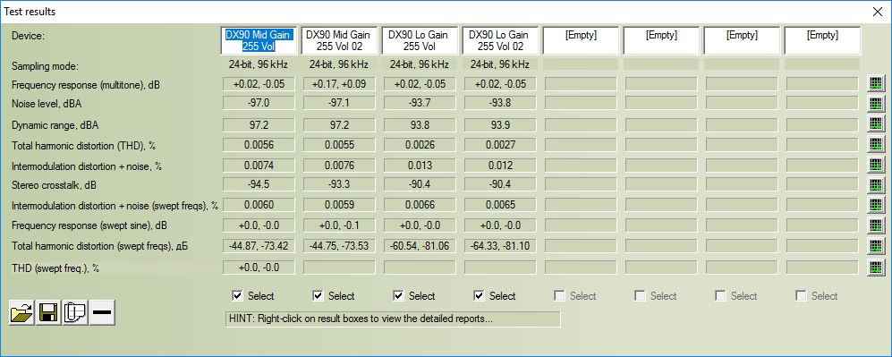


")
