


Someone work this into a mod
Surely it would be very alluring...do not dare to make such request as me am only a user..haha
Someone work this into a mod
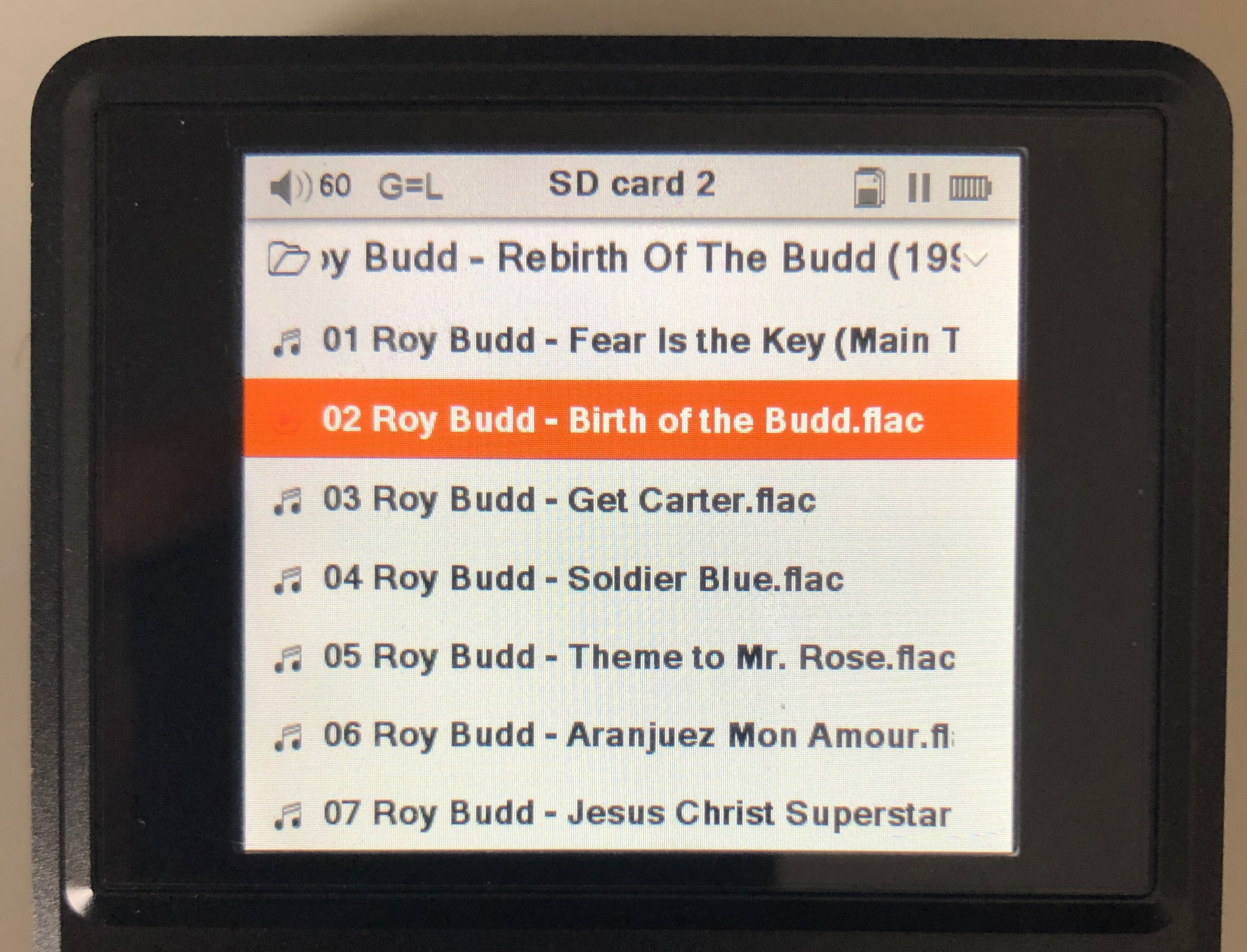
I got this bug, i do not know if it is present for anybody else, or if it was there before the latest firmware:
So i go to folder browsing, and i enter a folder.
The last item in the list,
for example card1/linkinpark/meteora, i am in this folder, if i browse the files within, the last one does not have top and bottom white line, it has only top, like the bottom last line of screen was cut. Anyone can tell me if this also happens to them, or if i can debug it?
[i am using my own theme, and i am also wondering if this happens on the original, you do not see both under and over the text red lines]

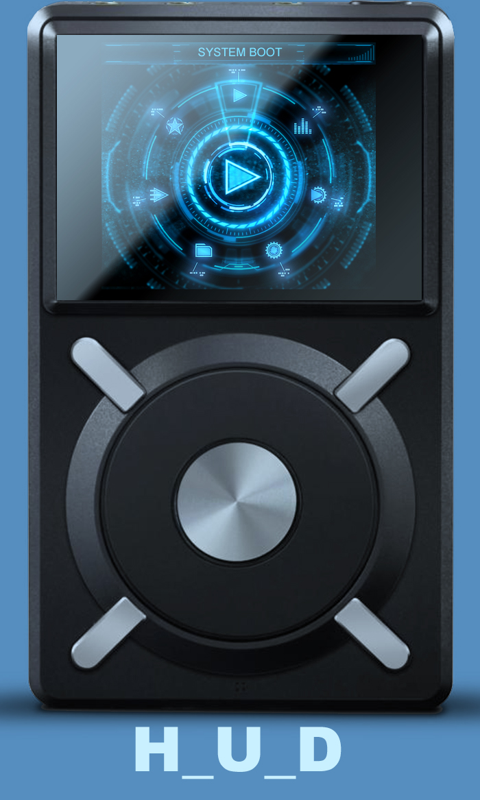
H_U_D_ is up!!!!
Two versions, one that covers up all album art (HUD_Primary) and one that leaves the album art as is (HUD_AlbumArt).
")
That's the default behaviour.
My suggestion would be to reduce the vertical size of the highlight bar by a pixel or two, but then you may need to reposition the lines in the background image(if using any) if they don't line up. Best thing to do is to try it and see what happens.
Great Relic, even down to the Updating Media animations. We are all spoilt for choice, but this goes into my top four, all on rotation.
Only theme that could break into my choices now be Girl Girls Girls (Motley Crue album) as alluded to above
EPIC!!! LOL!!!
So is it done HBB?


Some hoodlums vandalized a H_U_D ad in Chicago (it's being investigated...I'm in Japan...my hands are clean..I have no idea)
Yes V1.0 is done. I may have to offer an alternate no album art version.
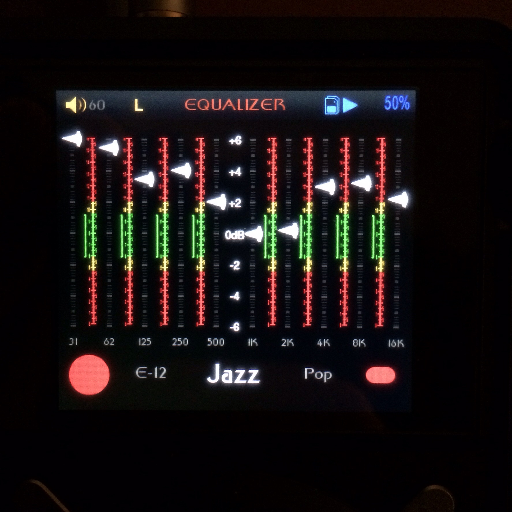
The EQ is awesome. It took my mind a bit to get used to it but either your term relevant was ahead of my mind curve or I found it's value. Cans of course are not trimmed zero. Even LCD and such have late spikes and dips and when EQ'ing it can be easy to forget that zero on the DAP is not zero for the cans. Every time I look at the eq I am aware of that and I changed some pre-sets and it makes sense. It will be improved upon and some tweaks but just a few.
I did a vid but the camera battery died and I spent most of my time on a girls ass.
This one is well executed. Thanks for reaching out for some of my feedback.
I don't even know what an X5 is but this Theme changed my life!!
-Peter Travers
Tell HBB I don't hit click till I see the money transfer..
Don't type that part of course
The Launcher.
Relic..I'll mention him off the bat to discuss signatures. Relic is like a guy with ornate doors all fitted out so you know before you enter it's gonna be nice. The grand staircase or the Grand Piano on a slightly raised stage just inside will not surprise you. You knew coming in it was going to be good.
Everything is perfect. His paintings are bubble balanced. You could take out a level and check but he already did. He imagined you'd check cuz he would.
I do.
I check everything that hangs on my wall with a bubble balance. I got like 5 laying around. If I go into a restaurant or anyplace and they have a painting off balance I leave.
No ****.
I walk out the ******* door. Did it 2 weeks a go. My chick hates it but if the staff didn't notice or didn't care... those are 2 good enough reasons to keep my cash in my pocket.
My stuff is lined up all around and it is checked for balance (Japan has lots of mini earthquakes).
My launcher was forced by a top bar to be balanced...all at the same height....no f'ing way!!. I took care of that in my last two of the "Hi" series by making it seem to be kinda not really there. I would not line up 2 hangings on a wall at an identical height. They would be perfectly balanced Hor/Ver themselves but would be askew relative to one another.
My launcher is not just an exercise in different it's an exercise in gaining comfort with my own device.
This launcher does that. I got my full screen images and the user gets the preview left and right but it doesn't take over the spot being focused on. I could make the current selection a solid but that destroys the point of all the other transparency. It would jump out at you. I don't want it to.
It rotates in the wheel direction and is aesthetically pleasing to my O.C.D eyes
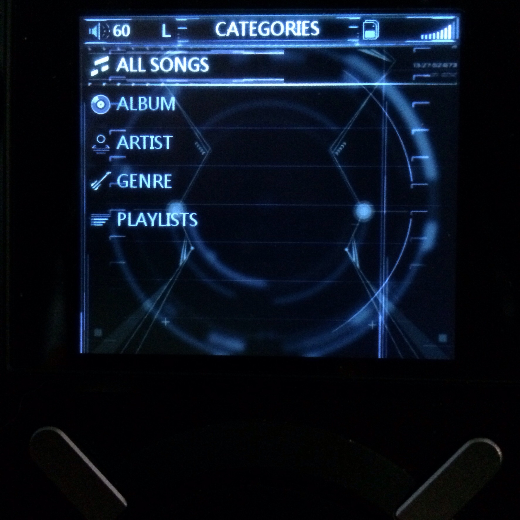
Underneath
There are 2 times when the same image or bg will be seen My music and Categories and the category sub screens. There are a lot of times so this jumped out at me in full size. It's an amazing image. Give this to a University art class with 30 students and ask for an intro, the image is the body and an outro...you'll get 30 different stories. It's ...I got lucky.
The folders are now dark and the highlight is a slate fade. Matches the theme and gives enough contrast.
Fast Picking
This needs to be the highest contrast for me as I am in a song and looking for a nearby song. An image or photo is going to be a distraction but this spinning album into a rainbow was perfect. Faded with a highlight that simulates the old Nakamichi decks with dark red/orange plastic covering white lights making them orange. Love it.
EQ
I am an EQ fanatic. Comes from my Car audio experience where it isn't even an option. You HAVE to use one.
I was looking for another thing when the thing was staring me in the face.....A freq graph *facepalm*
A DAP with no eq is not flat it's your gears factory tuned curve. Everything done by eq is relative to the cans/IEM response curve not the 0dB. This will be the default for now going forward but will be made more accurate and matching. Forgive the infancy of it and look forward to the development of it. Once you get your brain on it you cannot go back. I kinda NEED this. I changed some presets just by calculating the things wrong with existing ones. It is functionally better. For me. I think folks who look at graphs a lot will like this a lot once it is polished.
No Album art
As soon as I saw this...I thought it looked like my chick.
Same hair,body...hips are identical.
I'm a hips guy. I spent a while moving her enough to the left to keep that back in view. I just loaded music...it has no art and not a **** was given. It's totally matching the theme. Progress bar is red with a blue musical note at the tip.
This is version 1.0
Feedback is usually asked for and Romani helped me get to here by noting some stuff I missed but I made this in this way and aside from the no album art it's gonna stay this way unless I choose otherwise. I doubt it. Just polishing maybe.
Video stops abruptly because the camera battery died. So that is the video it gets. It looks better in hand anyway.
Link to fw https://app.box.com/s/z5lveiu5di38s6iacyv9ow41ywqp09fj
")
Glad to see more people exploring the separate EQ bg! Opens up a lot of ideas.
Nice Carel.


