IEMS - DD: IMR Ozar, Hifiman RE800 Silver, Hiby Hela, Tipsy Ttromso, Moondrop Aria Snow, HZ Heart Mirror, Tripowin TC01, CCA CRA, Blon BL03, KZ DQ6, Sennheiser IE80, Final Audio E3000, SGOR Venus, KBEAR KS1, Reecho SG01, Massdrop x HiFiMAN RE-00 BA: Noble Kaiser Encore, KZ AS16 Pro, Noble X (Massdrop), Etymotic ER4 Planar: Letshouer S12 Hybrid: Mangird Tea 2, BQEYZ Wind, Aurisonic Harmony, Kbear KB04, CCA CRN Tribrid: Tri i3 pro, Geek Wold GK10, Geek Wold GK80,
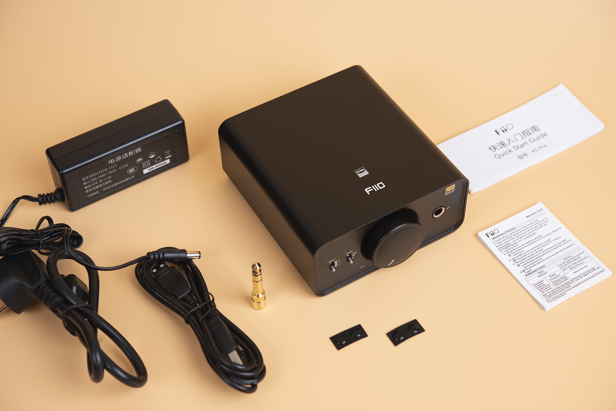
Headphones -Focal Stellia, Sennheiser HD6xx (x2, 1 stock, 1 closed back mod), Fostex TH-X00, Audeze EL8, Hifiman HE400i, Sony MDR-1A, B&W P5 (S1) Electonics: Main - Wiim Pro > Hifman Ef600. Office - Tempotec Serende X > iFi Zen Can. Home Office - Tempotec V6 > Xduoo MT-602. Portable - Tempotec V6, Hiby RS2


")


