[Unofficial Theme] Head-Fi Modern Classic: A more functional Head-Fi [Fixes bugs from the new facelift]
Feb 2, 2016 at 10:51 AM Thread Starter Post #1 of 27

getclikinagas

500+ Head-Fier
Joined
Mar 13, 2012
Posts
745
Likes
849
Head-Fi has undergone a facelift, both functional and cosmetic. While some features are welcome and enhance the experience, there are a few bugs and some changes that hamper functionality.
 
I've made a feedback thread ([Feedback] Regarding the new changes made to Head-fi (Dec 2015)), and listed the pros and cons (along with potential solutions). Please contribute to the thread, be it positive or negative. This will help the Head-fi admins and Wikia understand and correct issues that they may have missed.
 
Until they get around to addressing the issues, there is a way to fix some of the bugs and enhance the functionality of the site. This started as a group effort on OCN(overclock.net) where similar changes were made. A theme was designed that fixed and enhanced the site in multiple ways.
I have adapted the code to suit Head-Fi and have also added some code of mine to fix some additional issues. It goes without saying that the credit goes to the OCN members. The code I’ve contributed will be added to their next update. A huge thanks to all the Head-fiers who reported issues with the facelift.
 

Anyway, the install instructions are simple:
 
Step1: Install Stylish and a javascript-enabler (Choose version depending on your browser) (For Safari: Stylish; js-enabler)
 
Step2: Install Head-fi and Headfi-addon (Please install both as they...um..complete each other)
 
And that’s it.
 
More info:
Stylish is used to make styling changes like fonts, colors, borders, margins etc.
The js-enabler is used for new links. Like the PM and sub links, one click login link.
 

The feature list:
  1. One click Log-in that can be autofilled. No more long winded multi-click log-in process.
  2. Nav bar is now classic Head-Fi-Blue instead of Morose-Black.
  3. The Nav bar will no longer obscure the post header (when following a link/anchor).
  4. Links for Private Messages and Subscriptions are on the navbar instead of in the profile menu, for easy access.
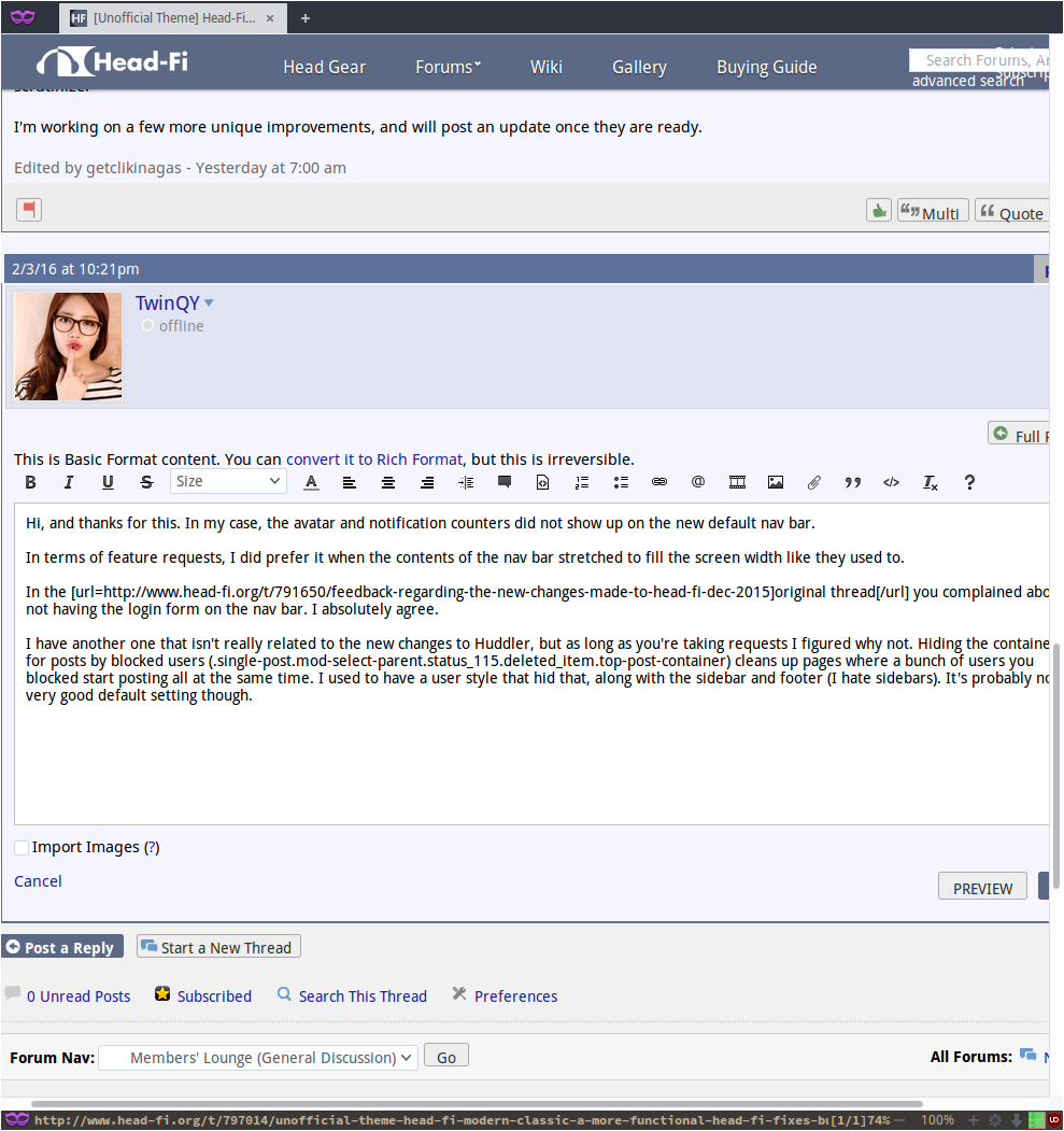
  5. Notification counters (red) for PMs and Subscriptions that appear alongside the links, and only if unread. Counter will no longer show on Avatar
  6. Profile menu will not collapse for half a second if the cursor accidentally falls off the menu. No longer need to carefully follow the very narrow path from the Profle button to the menu. Gap between menu and nav bar is now absent.
  7. The search menu is now on the Nav bar. No extra careful hover required. Text can be drag-dropped.
  8. When a PM thread is opened, the page will autoscroll to the latest message in the thread. 
  9. High res avatar will replace the default low res blurry avatar.
  10. "Edit Signature" is on the profile menu.
  11. "View All Drafts" is on the Profile Menu.
  12. Few color corrections site-wide
 
Screenshots:
 
Logged in:


Logged out:

 
Try the theme. If you have any suggestions or feature requests, let me know. 
smile.gif
 
 
*Update:
  • (4-Dec-16) When a PM thread is opened, the page will autoscroll to the latest message in the thread. 
 

For the brave:
I am maintaining a "HF-Beta" theme in parallel with the "Headfi" modern classic theme, that contains some experimental features(that work due to active feedback I receive from users like James444 and TwinQY). Link here
 
  1. Auto hide nav bar when scrolled down.
  2. Nav bar will reappear when cursor is in the nav bar area.
  3. Private messages and subscriptions links and counters will still be visible when the nav bar is hidden.(So that one doesn't miss any new notifications)
  4. Avatar is moved further right and will remain visible when nav bar is collapsed. This aids in immediate cursor positioning(which would otherwise require). Plus the avatar doesn't overlay anything important.
  5. Search bar is now longer
 
Feb 2, 2016 at 2:56 PM Post #2 of 27
  Try the theme. If you have any suggestions or feature requests, let me know. 
smile.gif


@getclikinagas: I tried your theme and it is awesome!!! Easy as pie to install, and fixes almost all issues I had with the new navigation bar. Didn't know that a custom theme was even possible, until I stumbled upon your feedback thread, so huge thanks for your time, effort and dedication!
 
Oh, and here's hoping that the powers that be will try this too, see the difference and consider it for a future upgrade. Would be nice if your unofficial theme became some day... official.
smile_phones.gif
 
 
Feb 2, 2016 at 3:55 PM Post #3 of 27
when headfi added the moving banner and my login would require much clicks and retyping my password each time, I was all
headfi Y U do it????????


then @getclikinagas came with his script changes, I feared it would be complicated stuff with H4cKs from the NSA that I could never undo, but turns out it's up in a few clicks(about as much as for me to log in without it), and you can remove it anytime you want.
so after my first try when it was actually working, I felt


and now I just don't think about logging in or the top overlay masking part of the page for no reason, I'm pretty much like this

 
Feb 3, 2016 at 9:54 AM Post #4 of 27
I'm glad you liked the theme guys 
beerchug.gif

 
Disabling the theme is also a one click affair.
The code just plays with the appearance and position of links and elements. No H4cKs from the NSA. Also, the code is available(via the links) for anyone to scrutinize.
 
I'm working on a few more unique improvements, and will post an update once they are ready.
 
Feb 4, 2016 at 1:21 AM Post #5 of 27
Hi, and thanks for this. In my case, the avatar and notification counters did not show up on the new default nav bar.

In terms of feature requests, I did prefer it when the contents of the nav bar stretched to fill the screen width like they used to.

Edit: Also, with this user style, putting the search bar on the nav bar has it overlapping significantly with the notifications/avatar when the window is at a width <1240px.

Having the search bar disappear when the window is under that width would be ideal. I did not notice the search bar at first as the Strict list for Firefox's Tracking Protection blocks yui.yahooapi.com, which provides almost all of the Javascript capabilities like the toolbar for the Post Editor, among other things. My other extensions have always whitelisted it.

In the original thread you complained about not having the login form on the nav bar. I absolutely agree. I just realized that it was added on the home page - I installed the script after I had logged in.

I have another one that isn't really related to the new changes to Huddler, but as long as you're taking requests I figured why not. Hiding the containers for posts by blocked users (.single-post.mod-select-parent.status_115.deleted_item.top-post-container) cleans up pages where a bunch of users you blocked start posting all at the same time. I used to have a user style that hid that, along with the sidebar and footer (I hate sidebars). It's probably not a very good default setting though.
 
Feb 4, 2016 at 12:33 PM Post #6 of 27
Hi, and thanks for this. In my case, the avatar and notification counters did not show up on the new default nav bar.

In terms of feature requests, I did prefer it when the contents of the nav bar stretched to fill the screen width like they used to.

Edit: Also, with this user style, putting the search bar on the nav bar has it overlapping significantly with the notifications/avatar when the window is at a width <1240px.

Having the search bar disappear when the window is under that width would be ideal. I did not notice the search bar at first as the Strict list for Firefox's Tracking Protection blocks yui.yahooapi.com, which provides almost all of the Javascript capabilities like the toolbar for the Post Editor, among other things. My other extensions have always whitelisted it.

In the original thread you complained about not having the login form on the nav bar. I absolutely agree. I just realized that it was added on the home page - I installed the script after I had logged in.

I have another one that isn't really related to the new changes to Huddler, but as long as you're taking requests I figured why not. Hiding the containers for posts by blocked users (.single-post.mod-select-parent.status_115.deleted_item.top-post-container) cleans up pages where a bunch of users you blocked start posting all at the same time. I used to have a user style that hid that, along with the sidebar and footer (I hate sidebars). It's probably not a very good default setting though.

Thank you for the feedback and suggestions. I'll work on them(browser window width, blocked user posts).
 
Feb 9, 2016 at 12:12 AM Post #7 of 27
@TwinQY
@james444
Let's discuss the avatar twitch issue in this thread (although the feedback thread could do with a bump once in a while). I've quoted the relevant comments in the spoiler below

Quote:
  Has anyone noticed how the avatar picture on the nav bar seems to "twitch" up and down when scrolling? I think I've seen it flicker sometimes even without scrolling.

 
Originally Posted by getclikinagas /img/forum/go_quote.gif
 
  Ha, I just saw the repositioning with my own avatar!
eek.gif

 
@getclikinagas: maybe these hints can help you find the cause:
  1. Using the Modern Classic Theme, the effect only occurs on top of the page, right after switching between the wide and narrow bar. I never see it while scrolling further down the page.
  2. Using your HF-Beta Theme, I don't see it at all.

 
There seems to be a avatar repositioning sequence built into the website when the nav bar becomes the floating/sticky nav bar. But the transition times on this sequence is zero, and therefore, not seen.
One feature of the theme is preventing the profile menu from collapsing immediately (similar to the way the forum menu behaves). This requires a transition. For consistency sake, I applied the same effect to the profile menu button. Thus the transition time also applies to the built in repositioning sequence which is why one sees the twitch. Since the twitch happens at
Using the short code I pasted above fixes it for me. But, different avatars seem to behave differently. I will try to come up with a workaround that applies universally. (Or disable the profile button behavior)
If possible, could you show me what the twitch looks like in your case?  I only have my avatar behavior as reference.
Note: Could you check if you see this behavior with the theme disabled? If this is theme specific, let us port the discussion to the theme thread. That way, this will not be confused as a native Head-fi issue (although it's a side-effect of the changes)
 
Quote:
  Actually, the Beta version has the nav bar transparent after scrolling

The Beta theme has an "Auto-hide nav bar" that will reappear when the cursor is in the area.
Also, there is a translucent nav bar(upon scroll down) effect. It's greyed out atm in the beta code, but you can enable it if you'd like to try that.
 
  Unfortunately nothing there. I also played around with removing the 1px border around .user-avatar, as well as other margins relating to the avatar image. At first I thought it made it less prone to trigger, until it occurred again. This is now on a fresh profile in Firefox, nothing adjusted apart from the user style. I will continue to play around to see if anything can be done.

I do not have the constant repositioning problem upon every scroll action like you do. Could you check if this happens with the theme disabled? I'd like to rule that out first.
Also, could you let me know what you've used to screencorder you've used to generate the gfy. 


The Beta theme has an "Auto-hide nav bar" that will reappear when the cursor is in the area.
Also, there is a translucent nav bar(upon scroll down) effect. It's greyed out atm in the beta code, but you can enable it if you'd like to try that.

I think I had referred to that by accident. It had not showed as being commented out when I diffed it with the original (might have uncommented it by accident).
Speaking of which, would you or any of the people on OCN be open to opening a Github repo or similar for merging pull requests for "Classic" themes in general?
 
I do not have the constant repositioning problem upon every scroll action like you do. Could you check if this happens with the theme disabled? I'd like to rule that out first. Also, could you let me know what you've used to screencorder you've used to generate the gfy. 

The avatar does appear for me on the default theme now with the fresh profile, but the movement does not exist. It seems to be related to the user style, thus I'd be happy to continue the discussion on the theme thread.
 
I'm using ffmpeg through ffcast for recording

Thanks.
Can you remove the following from the code(it's right at the top. 2nd set to be precise). Let me know if the twitch persists
 
.ui-header-fixed li.profile .user-avatar{
display: block;
opacity:1;
transition:0s 0.55s;
}
.ui-header-fixed li.profile .user-avatar:hover{
opacity:1;
transition:0s;
visibility: visible;
}
 
 
Quote:
 
  Actually, the Beta version has the nav bar transparent after scrolling, which renders the issue moot! I would consider this to be fixed since the nav bar is no longer visible when the movement occurs. When I last checked, the Beta version had been identical to the main release, so I didn't think to check the changes getclikinagas had been making.

 
Nope. As long as I keep the mouse inside the nav bar, it doesn't disappear. I can still scroll with the scroll wheel and go from wide to narrow bar and back again. And contrary to the MC Theme, I see no repositioning issue with the Beta.

 
That's because I've applied my *fix* in the Beta and not in the MC theme, as I was unsure if this was an issue related to my avatar in particular. I've update the MC theme with the *fix*. Please let me know if it is fixed.
 
Feb 9, 2016 at 2:01 AM Post #8 of 27
 
That's because I've applied my *fix* in the Beta and not in the MC theme, as I was unsure if this was an issue related to my avatar in particular. I've update the MC theme with the *fix*. Please let me know if it is fixed.

 
Seems fixed, thanks.
smile_phones.gif
  (At least with Chrome here at work. Will check with Firefox later at home.)
 
Feb 9, 2016 at 2:07 AM Post #9 of 27
Originally Posted by getclikinagas /img/forum/go_quote.gif
 
Thanks.
Can you remove the following from the code(it's right at the top. 2nd set to be precise). Let me know if the twitch persists
 
.ui-header-fixed li.profile .user-avatar{
display: block;
opacity:1;
transition:0s 0.55s;
}
.ui-header-fixed li.profile .user-avatar:hover{
opacity:1;
transition:0s;
visibility: visible;
}

Fixes it in the non-beta (which I've not updated). With the beta, scrolling with the nav bar in focus to keep it from being hidden, it seems to behave fine regardless of the inclusion/exclusion of the code. I'd say we're all good for now :)
 
Feb 11, 2016 at 12:47 AM Post #10 of 27
Made changes in the "Head-fi-addon". To update, simply right click "Head-fi-addon" in the addon manager and click "Find updates". (Or just remove it from your addon list and reinstall using the same link
 
  1. High res avatar will now replace the default low res blurry avatar.


For the brave:
I am maintaining a "HF-Beta" theme in parallel with the "Headfi" modern classic theme, that contains some experimental features. Link here
 
  1. Auto hide nav bar when scrolled down.
  2. Nav bar will reappear when cursor is in the nav bar area.
  3. Private messages and subscriptions links and counters will still be visible when the nav bar is hidden.(So that one doesn't miss any new notifications)
  4. Avatar is moved further right and will remain visible when nav bar is collapsed. This aids in immediate cursor positioning(which would otherwise require). Plus the avatar doesn't overlay anything important.
  5. Search bar is now longer
 
Feb 11, 2016 at 1:24 AM Post #11 of 27
Didn't know I was brave
wink.gif
, but I just looove the Beta theme. Gives me maximum screen estate for reading and still keeps the nav bar accessible. Excellent work, thanks!
 
Feb 11, 2016 at 3:43 AM Post #13 of 27
  Didn't know I was brave
wink.gif
, but I just looove the Beta theme. Gives me maximum screen estate for reading and still keeps the nav bar accessible. Excellent work, thanks!

All Beta testers are brave
beerchug.gif

 
The beta theme is not a broken mess thanks to your feedback and suggestions. (I should mention that in the OP)
 
Feb 11, 2016 at 4:55 AM Post #14 of 27
  I like this theme very much! Installation procedure is very smooth as well. Haven't tried the beta though.
 
Thanks @getclikinagas


Thank you for trying the theme
smile.gif
. If you find any more bugs or have any suggestions, let me know.
 
The great thing about the way "Stylish" works is that you can install multiple themes and Enable/Disable them instantly with one click(in the addons menu).
 
Feb 11, 2016 at 5:40 PM Post #15 of 27
 
  1. High res avatar will now replace the default low res blurry avatar.

Thanks for this (as well as for moving it to the far right)!
 
I have a couple of observations, mainly related to the HF-Beta theme.
 
- Positioning of elements in the nav bar, in particular the search bar. They are currently absolutely positioned, which does not work well for every page width.
 
- Adding some sort of transition delay as the nav bar hides/appears would make things less visually jarring. (This should be possible right? I don't know much about CSS)
 
- The white text on the subscription/PM links could be changed to something more visible when the nav bar is collapsed. I have it currently set to black. Ideally, a background image/element would make the effect look more integrated. To be honest, I don't really see the usefulness of having the avatar/links visible altogether.
 
- This might be a bug on my end, but the avatar flickers in and out repeatedly when focusing on it specifically.
 

Users who are viewing this thread

Back
Top