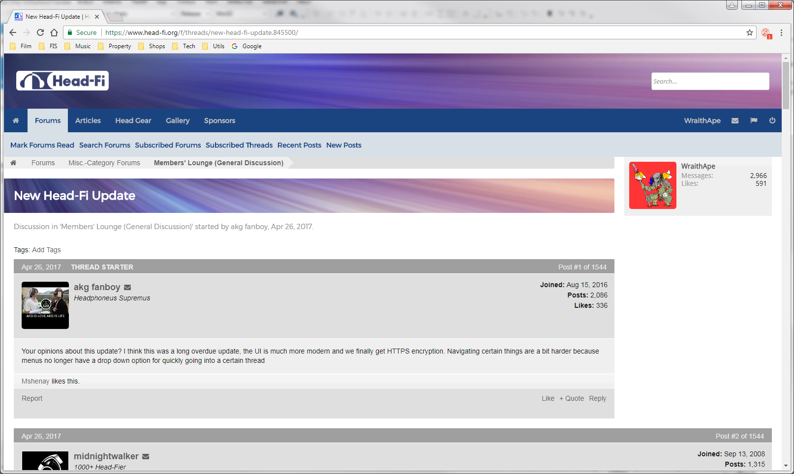
05/08/17 Update
As you’ve likely already noticed, we pushed an update to the site today. This update is a collection of the the Head-Fi community's most commonly requested features and changes. We’ve been listening to everyone’s feedback since we switched to the new platform, and we’ve been working to implement as many community requested changes as we reasonably could. This is not a comprehensive list, but here are some of the biggest changes in this update:
 (Updated header and navigation bar)
Search:
(Updated header and navigation bar)
Search:
We received overwhelming feedback that Head-Fi’ers wanted the ability to search within a thread without leaving the page. We made this one of our highest priorities for this update. A new search bar with additional functionality, including “search this thread only,” has replaced the previous one. The advanced search page is still available for those who want to fine tune their searches.
Private messaging:
We’ve added a PM link next to the avatars (visible in the mobile screenshot below) to make it easier for Head-Fi’ers to quickly PM one another. You can also access PMs by clicking someone’s avatar and choosing “Start a Private Message.” These options are in addition to the methods already in place, so no matter how you prefer to start a PM, you can use whatever method feels most comfortable. You can also view your most recent private messages directly in the navigation bar.
 (Account settings)
Navigation:
(Account settings)
Navigation:
The navigation bar is now a permanent fixture at the top of the browsing window. Many of you remembered this from the Huddler platform and requested it. Now, navigation will always be available at the top of the page on both desktop and mobile view.
We’ve added easy access to account settings via a new dropdown in the navigation bar. Simply click on your username (as seen in the screenshot above) to access. This is replacing the Quick Navigation page.
Those who use the site primarily on mobile devices should have an easier time browsing the forums with the navigation changes that were made. Head-Fi’ers can now directly access their subscriptions from mobile view using the new persistent navigation bar.
 (Updated mobile view and navigation)
Layout:
(Updated mobile view and navigation)
Layout:
There is no longer a need to choose between mobile and desktop view by clicking “go to mobile site” or “switch to desktop view.” The site now scales automatically to the device you’re using. Those who were frequently switching between desktop and mobile devices should appreciate this change (I know I certainly do).
Another area where we received a lot of feedback was that the site didn’t take advantage of a display’s real estate when viewing full screen. We’ve configured the site to display full-width, resulting in less negative space when viewing fullscreen on widescreen monitors.
Reputation:
We’ve pulled the numerical reputation data from the Huddler platform and ported it into XenForo’s Like system. You’ll now see the collective number of “+1”s received on both Huddler and XenForo. Note: We do not currently have the ability to add comments to likes, but we’ll look into the possibility of adding this functionality later.

We’re far from done making improvements to the new platform, but we wanted to make sure that our community had access to all of the new features and improvements as quickly as possible. Over the coming days you’ll continue to see adjustments as we hear your feedback and work your suggestions into the platform. We won’t be able to accommodate every single request, but we’ll try our best to implement as many as reasonably possible. We’re currently working on adjustments to the site’s look (including the addition of a
highly requested dark theme) in order to improve the overall feel on the new platform. We want Head-Fi to feel inviting to all who visit.
Head-Fi wouldn’t be what it is today without the community, and we’re working hard to make sure that everyone finds the new platform not just as welcoming as it was when we were on Huddler, but even more so.
From everyone here at Head-Fi, thank you so much for the patience you’ve shown us so far. We know this hasn’t been as smooth a transition as we’d like, but we’re getting there. Thank you for all of the feedback you’ve provided to help us get where we are today, and we’re going to continue listening to that feedback as we push forward.
We’ll see you on the forums.