Chinchy
1000+ Head-Fier
- Joined
- Apr 16, 2003
- Posts
- 1,111
- Likes
- 10
Got any links to the Dani Trio pens? I.e. manufacturer and stuff? I realize I can look on Google, but then I'd have to sift and filter.

| Originally Posted by mattigol Thanks for your advice regarding inks. I will most likely get blue ink and keep it. I have seen the MB blue which turns into a blackish blue after drying. I'd rather find something that stands out more. Maybe the Waterman Florida Blue is what the doctor ordered. |
| Originally Posted by Chinchy Got any links to the Dani Trio pens? I.e. manufacturer and stuff? I realize I can look on Google, but then I'd have to sift and filter.
|


| Originally Posted by Vertigo-1 Well...a lot of them aren't particularly expensive and aren't FPs. Pens that have a certain high tech look to them is what I go after usually. I cut back a lot of my more expensive FPs last year that weren't getting used. My fancier and main rotation of pens currently includes: Dani Trio Tamenuri FP Dani Trio Wakasa-nuri FP Visconti Wall Street blue celluloid FP Pilot Myu FP Montblanc Starwalker Metal/Rubber BP Montblanc Starwalker resin RB Montblanc Jules Verne BP |
| Originally Posted by Vertigo-1 http://www.danitrio.com
But be ready for some sticker shock...they're at the height of their Maki-e work now and some of their pens cost more than a a nice new car.
|
| Originally Posted by Chinchy Out of curiosity, how is your Tamenuri finished? I was reading the website and it lists Togidashi or Hana-nuri. |

| Originally Posted by Vertigo-1 Waterman Florida Blue is more of a purple blue. If you're looking for a true, vivid shade of blue, than go with Noodler's Blue. Or if you want a true shade of darker blue, go with Private Reserve American Blue, or DC Supershow Blue. I like blue myself, and most of my pens are filled with Noodler's Blue. If you want a really interesting ink color, try Private Reserve Blue Suede...it's a crazy greenish/bluish color that tends to show off different shades once it dries. Shading can occur with any ink but it's particularly easy with Blue Suede, when using a fine nibbed pen. Looks really cool and stands out a lot when you can get it show on an envelope. It's an effect you could never hope to achieve with a BP or RB. |


| Originally Posted by mattigol Thanks for these tips. Here are Noodler's and Private Reserve Blue Inks, courtesy of the www.theinkednib.com: I like Noodler's Ottoman Azure and Private Reserve's Naples Blue the best, but the PR suede sure is looking good too. If I am lucky, I might have a 2nd FP soon to use them both!
|
| Originally Posted by Vertigo-1 I didn't really like Ottoman Azhure too much myself...it comes out more of a darkish green than that bright blue that the chart shows there. Using finer or wider nibs didn't change it either. There are some people that got a bottle that is that blueish color, so there are variances out there...it's just luck of the draw on that particular color. The chart is pretty accurate on Naples Blue and Blue Suede, if you're using a medium nibbed pen. With finer nibbed pens, Naples Blue is totally a bright turquoise, and Blue Suede is much brighter than that chart shows. You can sort of see the shading effect that Blue Suede has in the very first thin line on the left. Naples Blue actually shades pretty well too, and you can see a bit of it in the waves there from the crest to the trough. I have bottles of both myself but haven't filled any pens with them lately...both colors are definitely a bit too bright for business-like situations. |
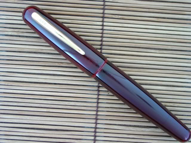
| Originally Posted by Vertigo-1 Both my Wakasa-nuri and Tamenuri have a Togidashi finish. Burnished to a high glossy gleam. It gives it a very shiny, mirror-like appearance. |
| Originally Posted by Vertigo-1
|

