Thank you AsianInvasion for this wonderful work of art!
I am new here to Head-Fi, to the X5, and to the new world of high-resolution audio for that matter. What can I say... I am coming out of the closet and embracing all the new and wonderful things about digital audio that I have all but completely ignored over the recent few years.
I must admit though, as much as I love Harmony in its elegance and simplicity, I had to delve into it and make a few tweaks for my own personal tastes. I wish I could share this with you, but at this time I am traveling in China and many of the Drop box, Google Drive, and other "sharing" websites are blocked and inaccessible to me at this time
. It was a quirk that I could download this in the first place.
Also, this is my very first post here. I cannot upload pics, unfortunately. So a meager explanation of my changes must do...
First of all, my eyes aren't what they used to be. I cannot see the little "tick" on the "Playing" screen to see whether I have already made the song a favorite or not. So I changed the color of the "tick" (the check-mark). I used the original orange-ish color from the X5 standard theme to make it a little bit more pronounced. Now I can see it just fine.
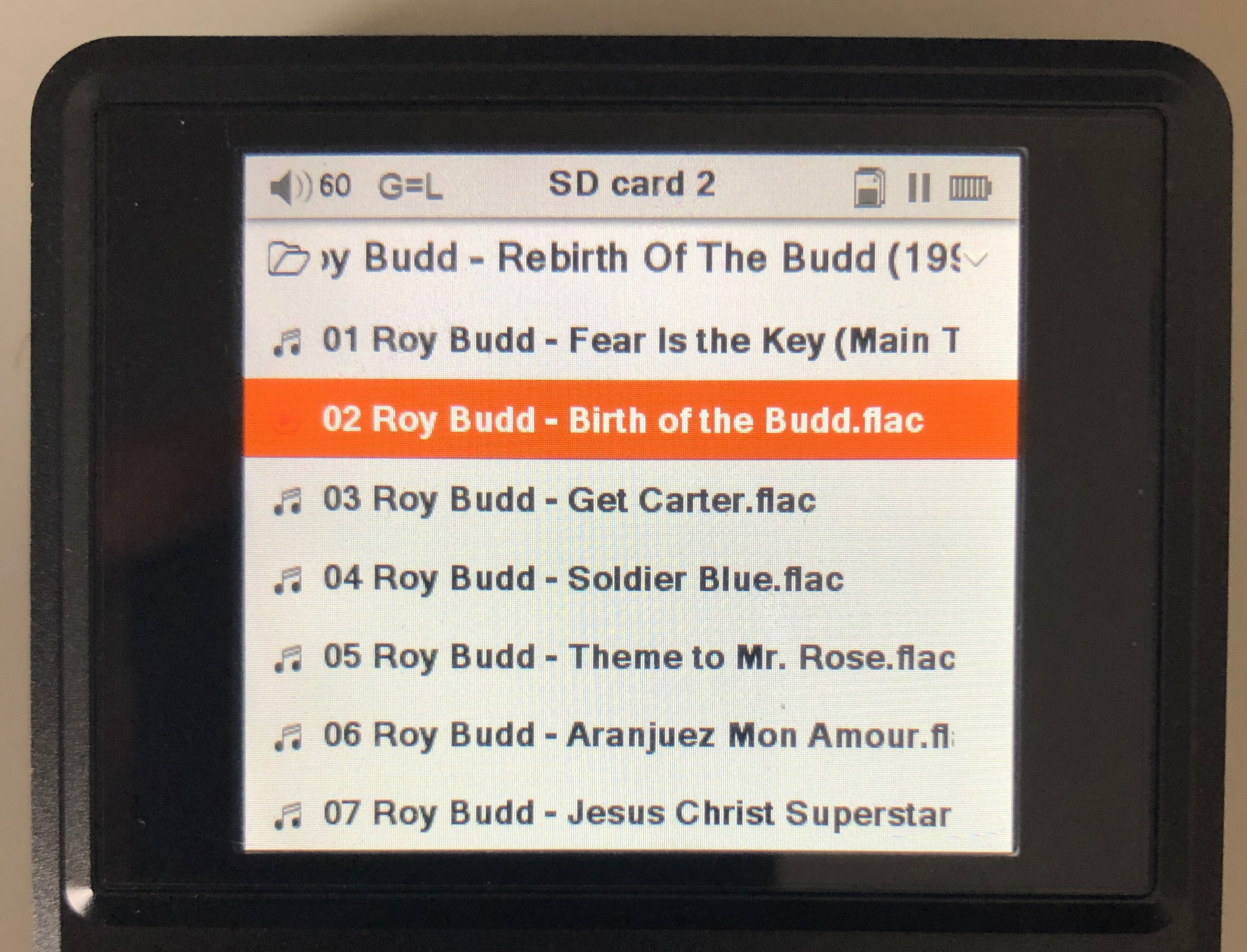
Second... I love my album art! Forgive me. I am old school. Like vinyl days old school. When artist(s) spent a lot of money just on album art to help define the (Vinyl) album (Iron Maiden's Eddie comes to my mind immediately). It still happens. A little. Anyway, I hated how the album art was restricted to the little shadowed rounded square on the "Playing" screen, don't get me wrong it was very well done, but to someone who loves the album art... it was a bit restricting. So... I opened it up. A lot. Just simplified your nicely shadowed rounded corner area to a little 2 pixel border. Worked out for my needs
.
Then there are those screens that are just to white. For instance, the "charge" screen. I substituted the "white" bg.png for an expanded "playing" "default_bg" image. This toned down the theme quite a bit, and made it more reasonable for me to look at all the time. I did this for all the "white" background images.
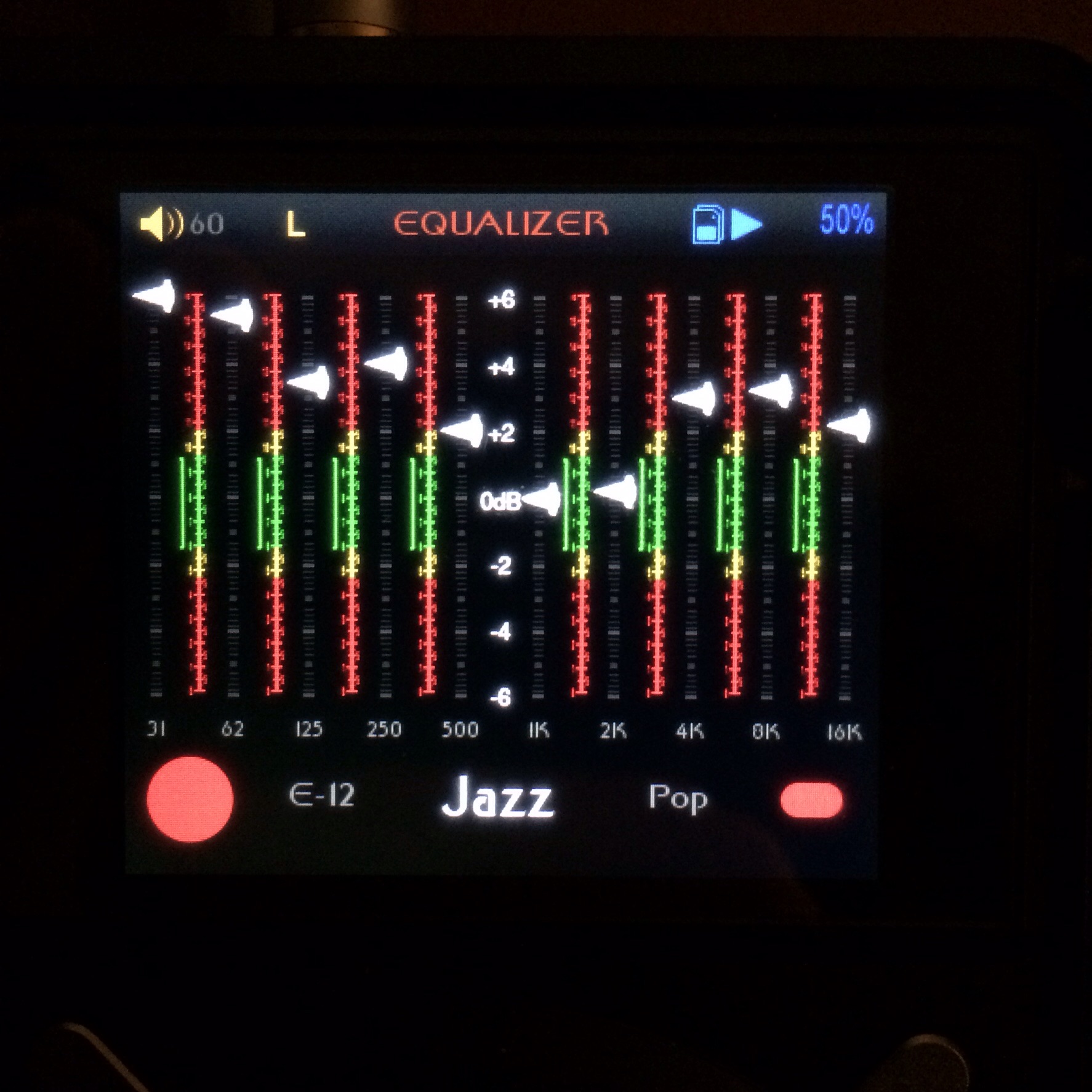
Last, but not least, in my humble opinion. I didn't like the renaming of the EQ settings. So I renamed back to almost original. "EQ1", "EQ2", etc. just doesn't do it for me. I need a little more description.
Anyway... Love the theme! Even though I had to mod the mod
As a new X5 owner, I am loving everything about the X5 so far. I am sure there are better DAP's, but for a lot more money. For the money, the X5 cannot be beat. It sounds awesome! Performs as expected! There are features that I would like to see in future firmware's, but at the moment I cannot complain. The X5 far exceeds my near, dear and recently deceased MS Zune 120GB. One thing is for sure... I need a better set of IEM's/Phones. Sad it is to say, my current best set of phones is from Bose. I know, I know... forgive me, I am new to all of this "audiophile" tech that has exploded in the last few years!
The only that troubles me is having read the last few pages of this thread. And the mention of a X5II! I just bought my X5, and to learn there may be a a X5-2 out soon is a little troubling to my wallet.