Fiio X5 - Custom/Modded firmwares
Feb 17, 2015 at 2:49 PM Post #1,427 of 2,614

 
Lunar - A visit to the future
 
Features:
  1. Launcher uses extremely high quality renders
  2. Futuristic look and feel with brushed aluminum, neon blue lights, etc.
  3. Beauty without compromising function
 
Sorry that the theme took so long after I posted the renders a long time ago; tons of changes and bug fixes were required to make the theme usable.
 
The tiny thumbnails above look terrible compared to the full resolution renders... browse the full size renders under the downloads to see them instead.


Downloads
 
Here
 
The renders in full HD (They look great as wallpapers)


Release Notes
 
  1. Name of the mod/theme: Lunar/Lunar Fiio Logo
  2. Version of the firmware: 2.4
  3. Languages: All


Some information
 
  1. Feel free to use this theme as a base for other themes
  2. I will take all feedback into consideration
  3. All graphics are made by me or are modifications of the original images by Fiio
  4. I can't keep making one theme a day, so I'll stop mass-producing themes for now
  5. Next theme will be simple, most likely somewhere between Harmony and Solar
  6. This will replace Elegance unless someone requests me to continue Elegance
 
Feb 17, 2015 at 4:42 PM Post #1,430 of 2,614
^but...i just flashed the Harmony II '_'...
 
Feb 17, 2015 at 5:04 PM Post #1,431 of 2,614
I think that it might be a good idea to re-organize the first post with the number of themes increasing.
 
Here's an idea using tables:
 
Firmware NameModderScreenshots or VideosDownload
Fragments II
AsianInvasion
 
Screenshot
 
Regular
Unbranded
Modification of Fragments II
Username here  
Video
 
Regular
 
Another theme
 
Username here
 
Screenshot and video
 
Regular
Another theme
Username here  
Screenshot
 
Regular
Recolored
 
As long as the screenshots are resized to be small, I think they can be embedded into the table. Embedding videos might make the page load a lot slower though.

 
Feb 17, 2015 at 7:48 PM Post #1,432 of 2,614
Noticed the "favorites" with marker on blank CD's AND the other suggest about the musical symbol....nice job and awesome way of asking,getting and executing feedback.
 
BTW...fancy, busy......
 
 
If I wanted simple I'd use my ipod classic which i never do. I love the maximizing of the X5 screen resolution and the tweaks that can be done within the boundries of the frame work and love the intro/outro vids.. If they let us use 28 frames lets use em...and you do...nice job. I will vid this later.
 
Your Intro post template will be used by me in future updates and releases as it is very noob non member friendly
 
 I support any changes to the archive except credits to re-mods like the darkening of a theme. That's a "tweak" not a mod and should sit below in a sub list where it can be named "User mods of Themes" The design is not there's the hours and hours of creation is not but the observation and tweaking and sometimes improving is but that is an investment of time and thought not on par with make a theme.
 
You put a video next to a user Modification. Good luck to them because I will never video a user mod not done by the creator.
 
Great ideas to organize since your a machine
biggrin.gif

 
Feb 17, 2015 at 10:27 PM Post #1,434 of 2,614
 
 I support any changes to the archive except credits to re-mods like the darkening of a theme. That's a "tweak" not a mod and should sit below in a sub list where it can be named "User mods of Themes"


TypeFirmware NameModderScreenshots or VideosDownload
Original Fragments II
AsianInvasion
 
Embedded images.
Videos should be URLs
 
Regular
Unbranded
Mod- Same as above -Username hereOnly URLsDark background
Mod- Same as above -Username hereOnly URLsReversed scrolling
Original
 
Another theme
 
Username here
 
Embedded images.
Videos should be URLs
 
Regular
Original
Another theme
Username here  
Embedded images.
Videos should be URLs
 
Regular
Recolored
Mod- Same as above -Username hereOnly URLsMod description


Feb 18, 2015 at 4:31 AM Post #1,436 of 2,614
OCD. :blink:

Yup. :eek:

Challenge accepted. :D

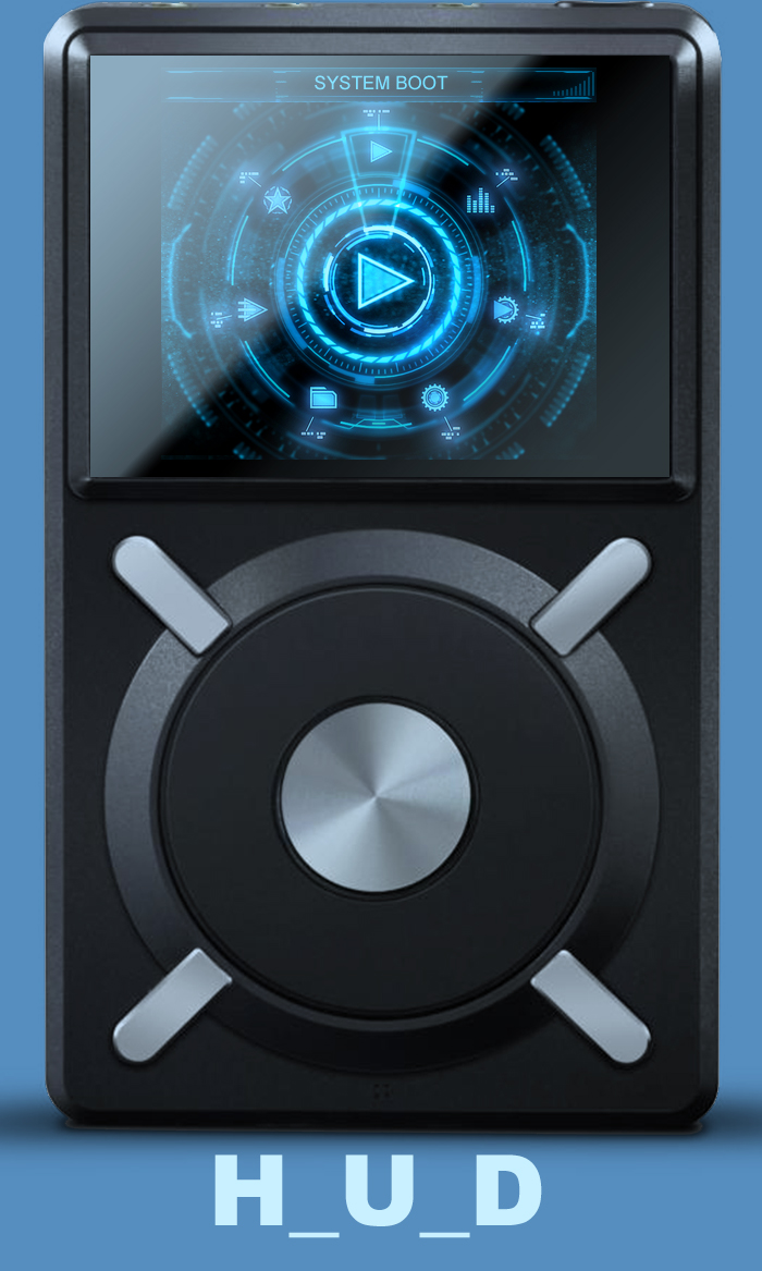
I've gone through and did a mockup of the shortcuts and alert icons. I went with a Chord Hugo indicator style as that seemed like the best way to tie the icons to the meter. I like what I did for the Now Playing shortcuts icons and the Play Settings and System Settings icons (I need to add some space between the low/high gain buttons). Notice how I don't use 'on' and 'off' text. I like it much better without as I feel that green is enough to say 'on'.

For the warning messages and alerts I enlarged and painted out/softened some edge details of the smaller icon to quickly see if my proof of concept would work. It does. Now I just need to create a cleaner larger icon and apply it to ALL THE OTHER DAMN ICONS FOR SHORTCUTS AND ALERTS - so many different sizes! I know, it would have made more sense to start with creating the bigger icon first but I honestly didn't think I'd take it this far.

I mean, this is one very involved mod!! You should see all the .PSD files with the amounts of layers, and the 3d scenes, and renders for the animation. A lot of custom rendered images and Photoshop tweaks to real world images, as well as all the tweaks to the FiiO icons. It just goes on and on and on........

Now I want to use the Hugo icon idea for the screen brightness adjustment and music updating sequence as well as the large battery charging icons when plugging in to a charger. Imagine the button increasing in brightness for the screen brightness. Or the icon cycling from red to green for the battery charging. Oh, the possibilities!!

Check out the proof of concept...............


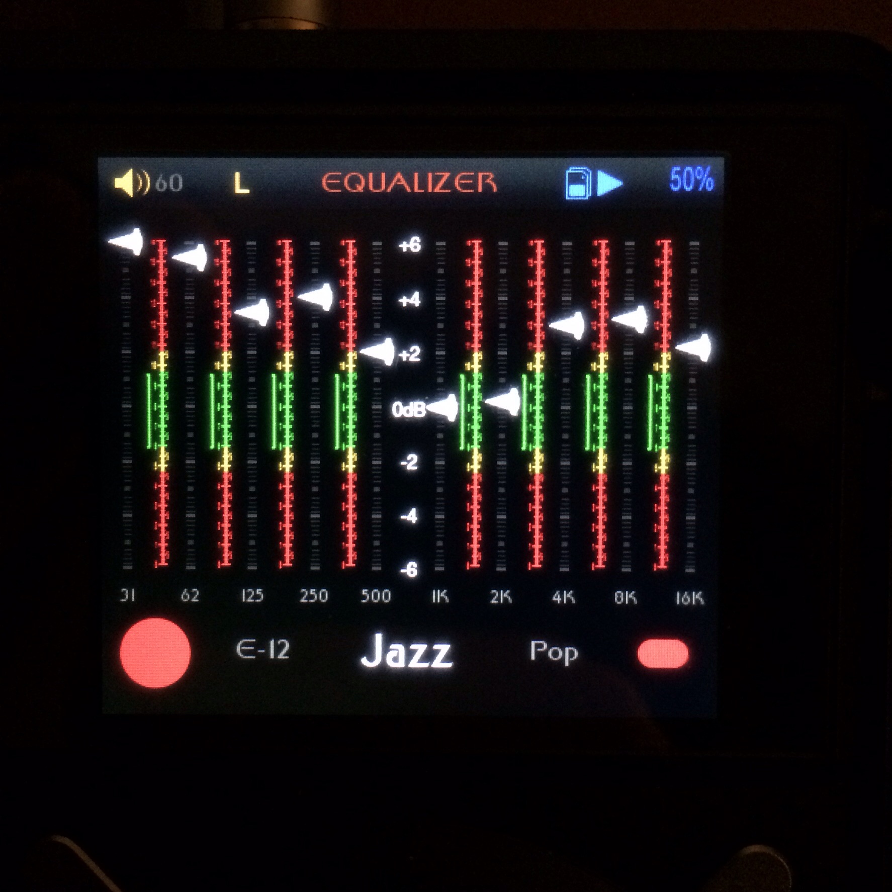
I also am going to ditch the EQ glow under the slider as there is just no way to make it work the way I want it to.

Aaaaaaand, I tweaked the needle's shadow for the Play Settings and System Settings position in the main menu screen. Easter Egg - Anyone notice the slight drop shadow beneath the icon when the needle is over it in the main screen? Muhahaha!


I'll be finishing this in a couple days (or weeks :blink:) as I really have to get some REAL work done first.

Apologies for the über long post. LOL!
 
Feb 18, 2015 at 5:38 AM Post #1,437 of 2,614
I mean, this is one very involved mod!! You should see all the .PSD files with the amounts of layers, and the 3d scenes, and renders for the animation. A lot of custom rendered images and Photoshop tweaks to real world images, as well as all the tweaks to the FiiO icons. It just goes on and on and on........

Now I want to use the Hugo icon idea for the screen brightness adjustment and music updating sequence as well as the large battery charging icons when plugging in to a charger. Imagine the button increasing in brightness for the screen brightness. Or the icon cycling from red to green for the battery charging. Oh, the possibilities!!
 

The glass effect works very well to complement the main theme.
Don't forget to cycle through the colurs of the rainbow for the volume control... actually the Hugo uses a huge range of colur for the volume - many many shades before even getting to red, so it would be a bit impractical.
I wouldn't recommend the Hugo system for battery life indication or charging, though. Charging is a plain white LED and Blue for fully charged, going through Green, Yellow (almost indistinguidshable from Green) to Red and then flashing Red is going to confuse everyone, when the screen allows us to show the text percentage or a graphic display very clearly.
 
Feb 18, 2015 at 5:42 AM Post #1,438 of 2,614
The glass effect works very well to complement the main theme.
Don't forget to cycle through the colurs of the rainbow for the volume control... actually the Hugo uses a huge range of colur for the volume - many many shades before even getting to red, so it would be a bit impractical.


I can't do anything with the volume control. All FiiO has allowed is to use the arcs that exist and an image with or without transparency for the volume knob. I so wish they had implemented it differently so we could do a knob rotation or changing colours, etc.

Good suggestion though!!

Edit: The things that can be animated are the ones with multiple images. Given the limited space for the FW and the amount of images allowed some of the animation might look choppy. I'll try to minimize this as much as possible.
 
Feb 18, 2015 at 5:56 AM Post #1,439 of 2,614
...........................

I wouldn't recommend the Hugo system for battery life indication or charging, though. Charging is a plain white LED and Blue for fully charged, going through Green, Yellow (almost indistinguidshable from Green) to Red and then flashing Red is going to confuse everyone, when the screen allows us to show the text percentage or a graphic display very clearly.


I'm not going to use it for the indicator, just when its off and plugged in to a charger. Those default giant battery icons are hideous but I haven't been able to think of anything else for a replacement. It's 10 images to cycle from red to green. Should look cool.

If it doesn't I'll find something else.

:beerchug:
 
Feb 18, 2015 at 6:04 AM Post #1,440 of 2,614
I'm not going to use it for the indicator, just when its off and plugged in to a charger. Those default giant battery icons are hideous but I haven't been able to think of anything else for a replacement. It's 10 images to cycle from red to green. Should look cool.

If it doesn't I'll find something else.

beerchug.gif


Ah.. good. So you can choose which speed looks best by using 1,2 or 5 frames of green then red.
 
 Even on the many android apps involving battery icons, nobody seems to have got away from the ugly battery image you mention. A glass one may fit your theme

but I think the LED representation will look better.
 

Users who are viewing this thread

Back
Top