1) You can change the names if you like, it's super duper easy to do. Not being dismissive, but I suggest you try.
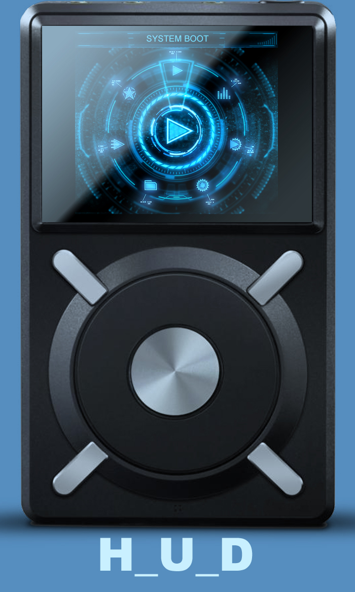
2) I agree which is why I designed it with the logo. If I have time in the next couple weeks I might have a look at it. I wouldn't enlarge the logo as I feel it would look garish.
3) Sorry, I just disagree with this. Feel free to paint out the blue-ish color for your theme but I really prefer a black screen.
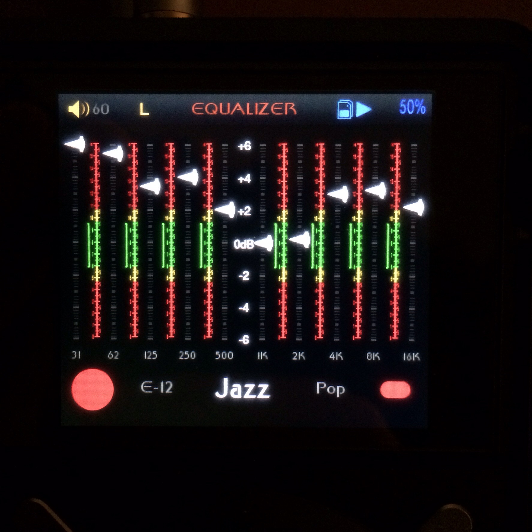
4) I did shuffle them and I like the volume and gain together. When music is playing it doesn't feel so offset with the play/pause icons visible. I have some ideas about this though, but again, I'm really, really busy right now. Unfortunately we can't brighten the color of the volume numbers next to the icon (unless someone else knows a way) but I have an idea to make it visually work. Again, busy.
Thanks for the input and I appreciate the feedback. But as mentioned before you can dive in and play with it your self if you're in a hurry.