


Hawaiibadboy
BANNED
Downloaded and updated. I have that image now and it looks awesome. Not sure if I'm imagining stuff but did you decrease the brightness of the "X5 Settings" image in the main menu? For some reason, that reduced brightness looks natural for the "Equaliser" and "Playback Settings" main menu images, but not for this "X5 Settings" one. Maybe I am being too pedantic with your theme.
You got good eyes. I toned it down as the bright gold was such a departure from the rest of the hardware screens. I may switch it if I can find a vintage Hi Fi image. It is the odd child of the bunch. I considered a version of the image now in the background of the settings.(hmmmmm) I am thinking about that.
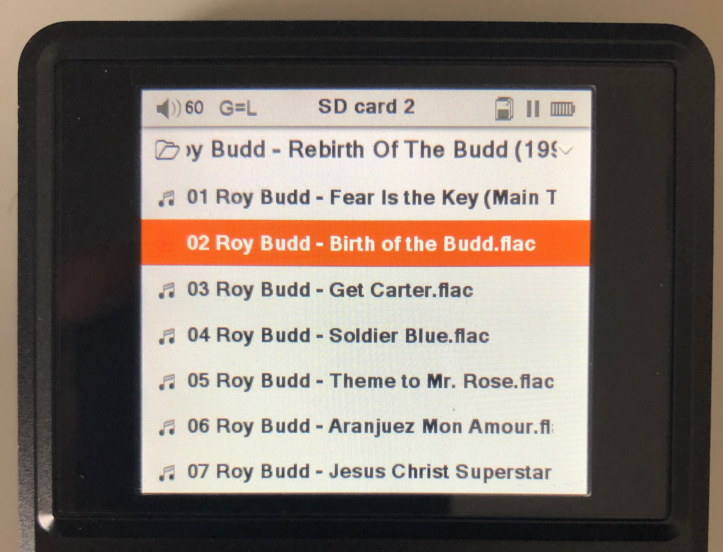
If you go to play by category>>>album>>select album the title will now be in bold gold font...just an experiment
Your observations help a lot so never hesitate. User feedback it HUGE. Thank you!!!
EDIT
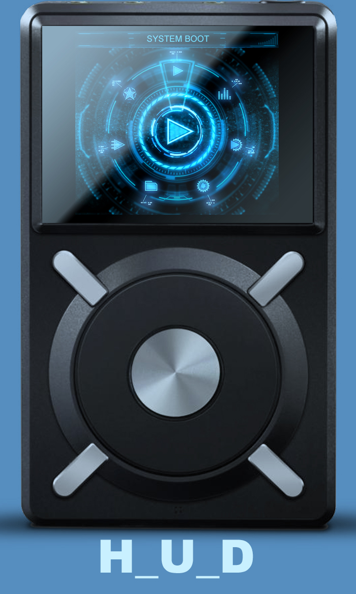
New start up screen coming

YES YES YES HQ!!!!!!
Wooo Hooooo!!!
I do believe it is spinning this album which goes with the whole theme

FW not updated yet
Updated https://www.dropbox.com/s/cm9crr1vb55w41v/x5.fw?dl=0
I spent 5 hours looking for a vid...to hack and trim and had to use a guy testing a stylus but his hand was dropping the needle and he's spinning an apple records (maybe Beatles) record so it was worth it. It's crystal ******* clear too.
I'm learning.
Sorry folks gotta go along with my curve but it's almost done.
Alright it will never be done but it's ready for it's closeup.
I skipped dinner. I'm an O.C.D having moron......oh well


") Maybe change the colour tone of that image so it isn't so gold and so the brightness can be turned back up? So what updates have you made in the latest link you posted? Just need to know what I'm in for
Maybe change the colour tone of that image so it isn't so gold and so the brightness can be turned back up? So what updates have you made in the latest link you posted? Just need to know what I'm in for  ).
).


